Key Dates
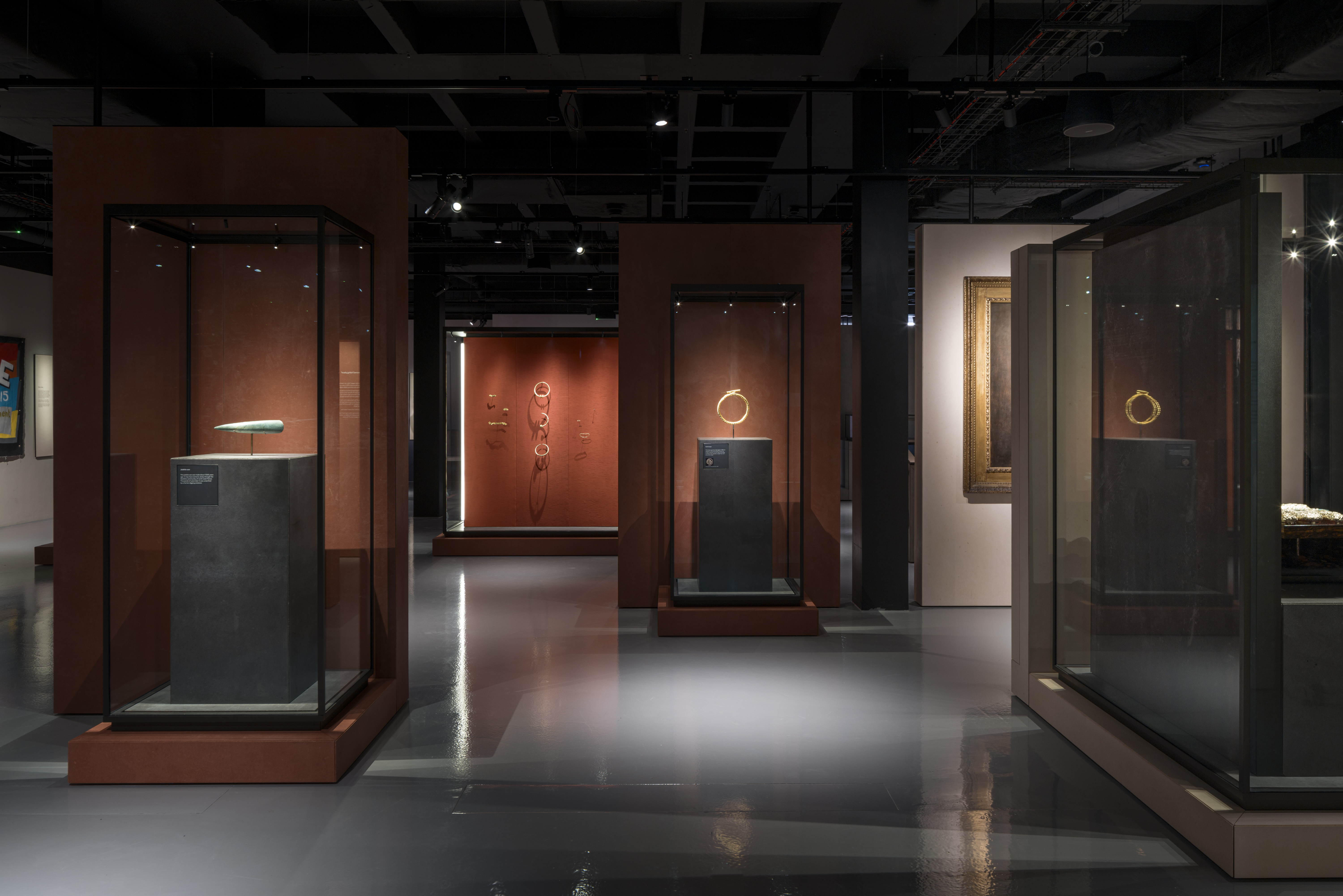
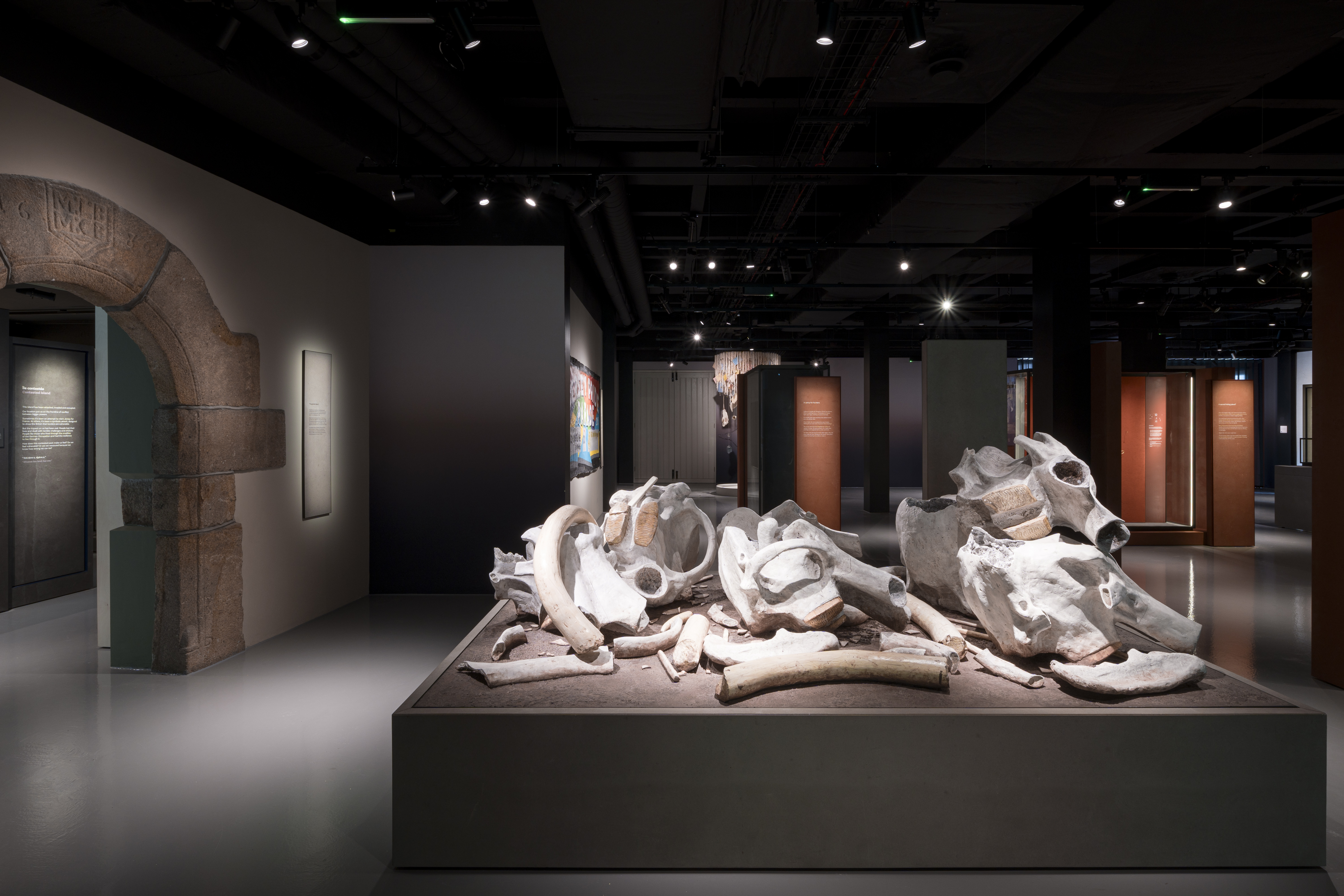
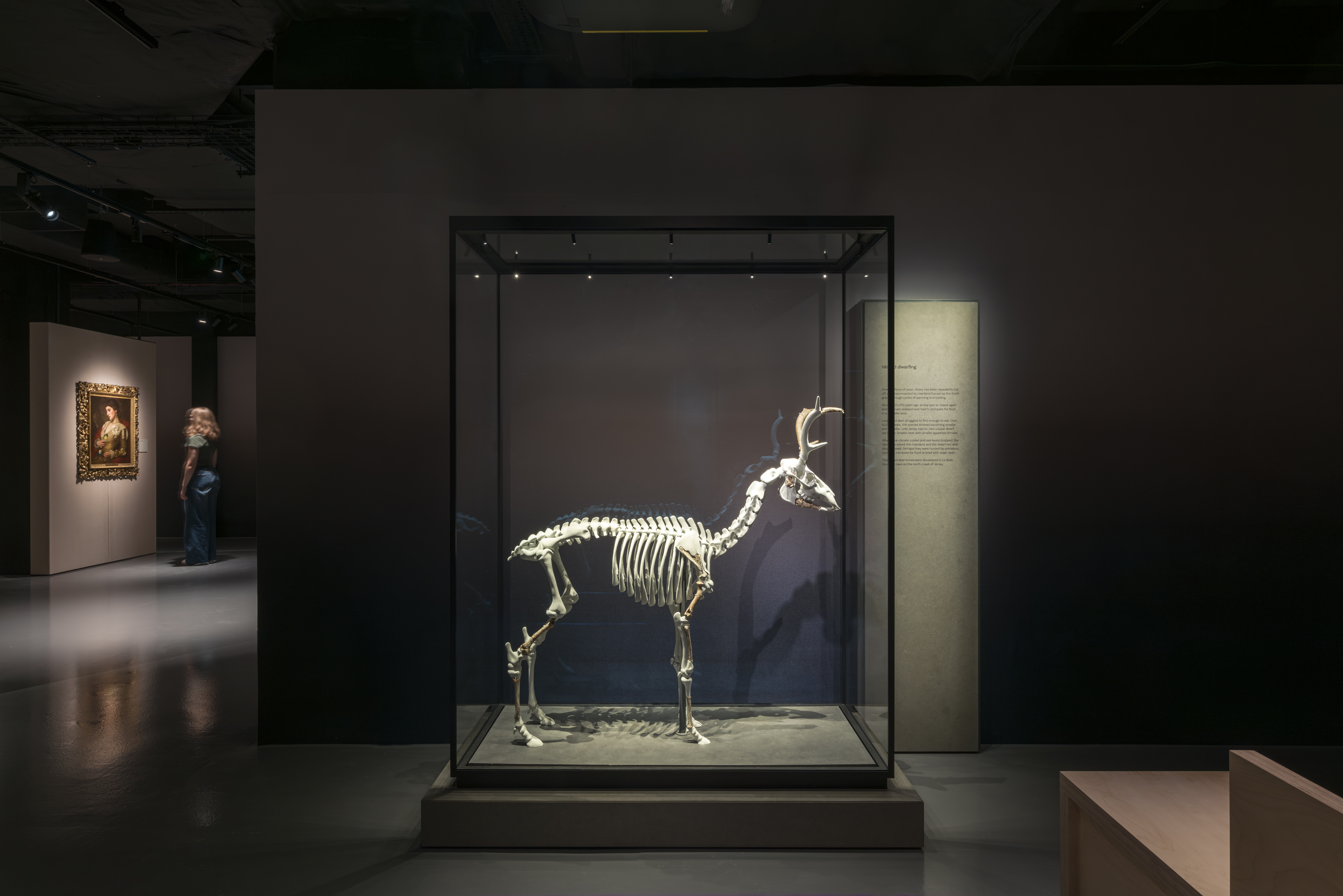
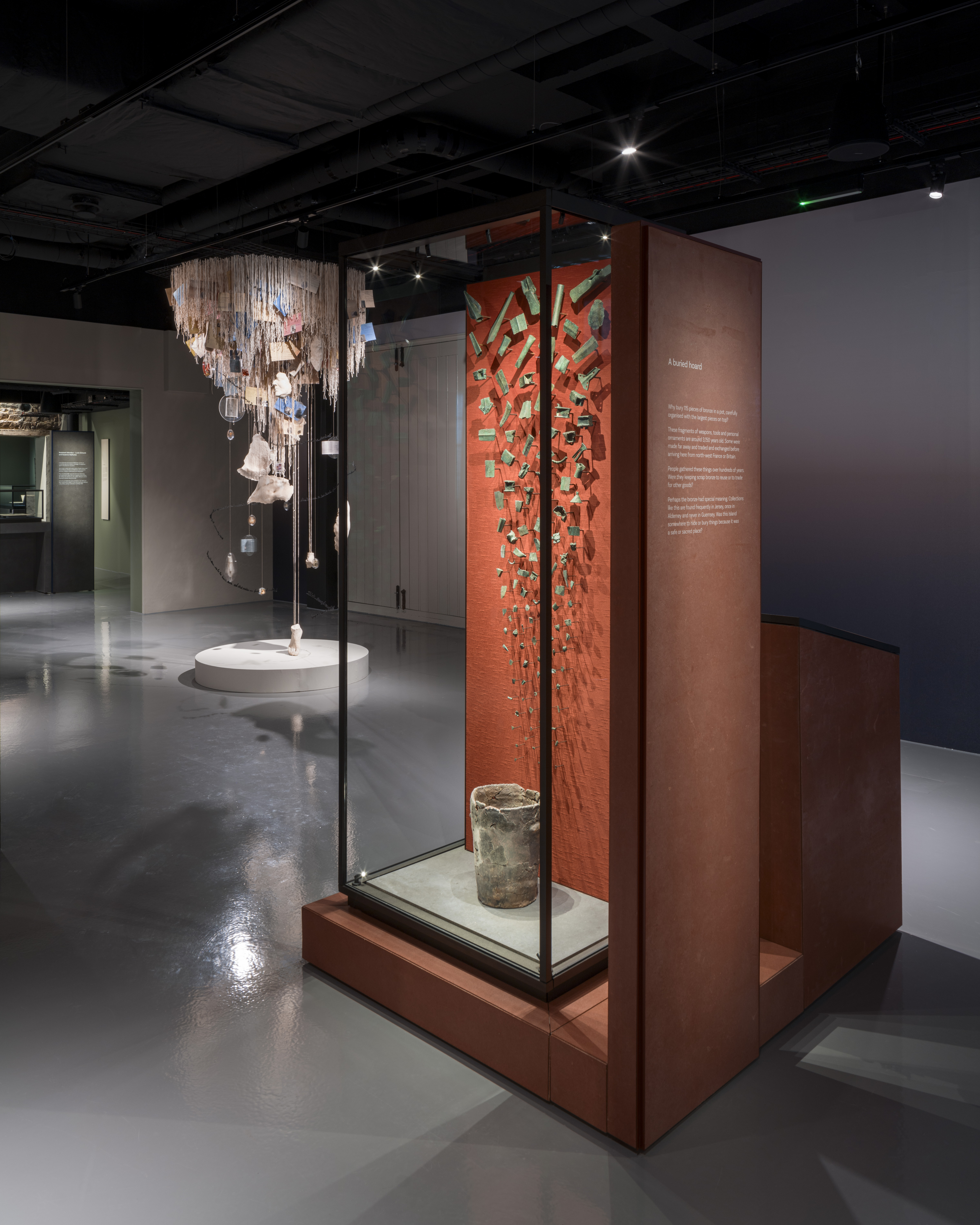
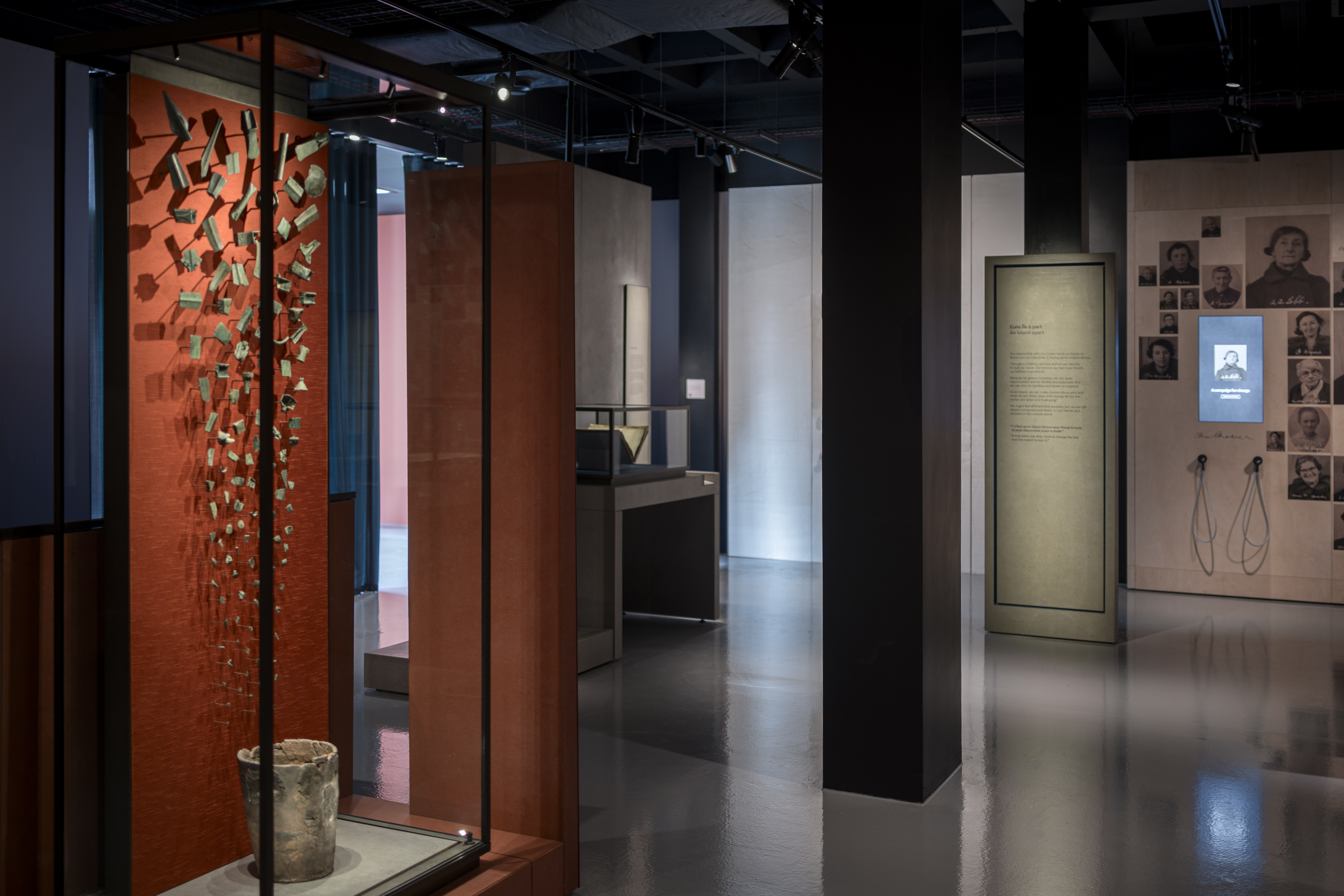
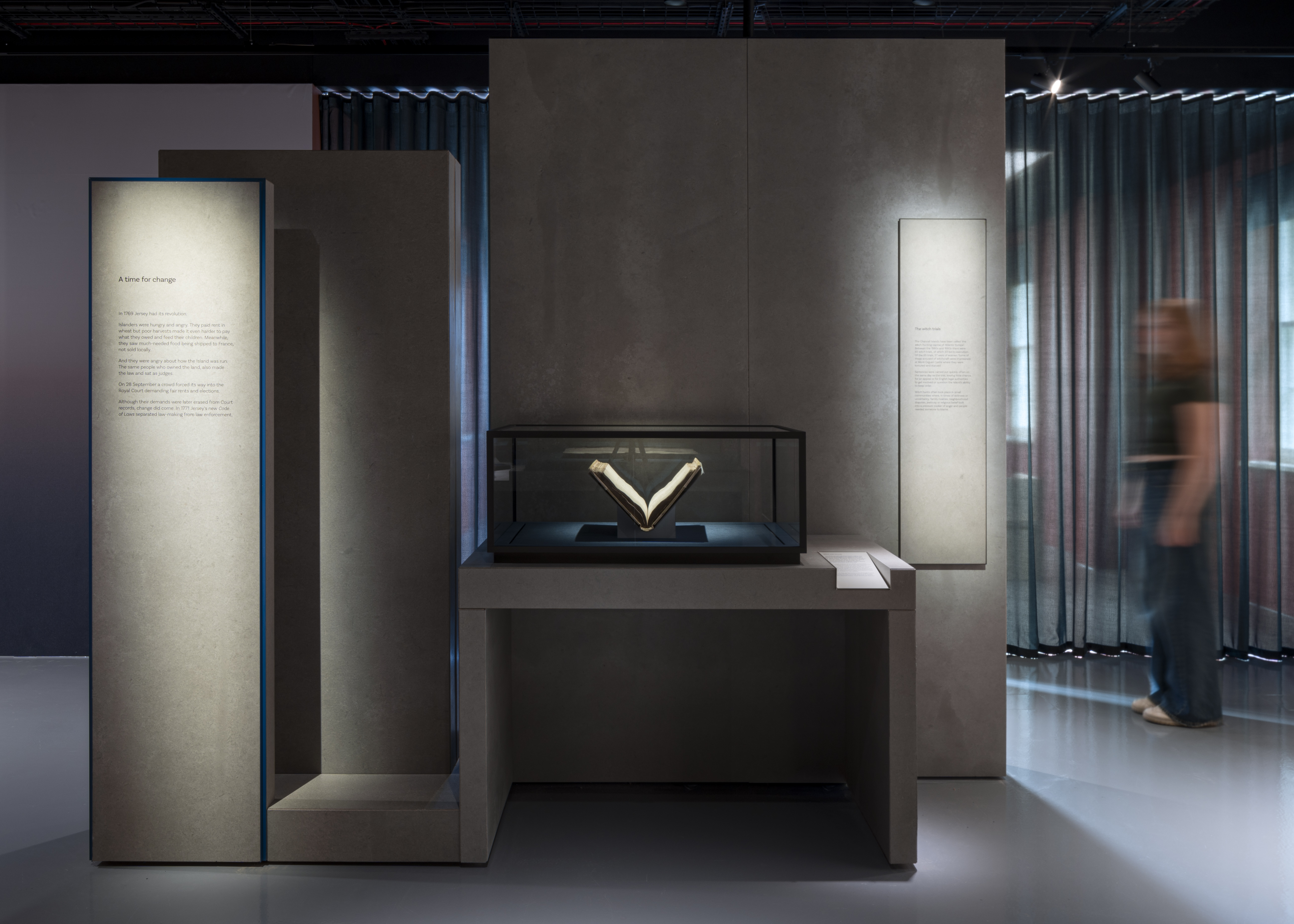
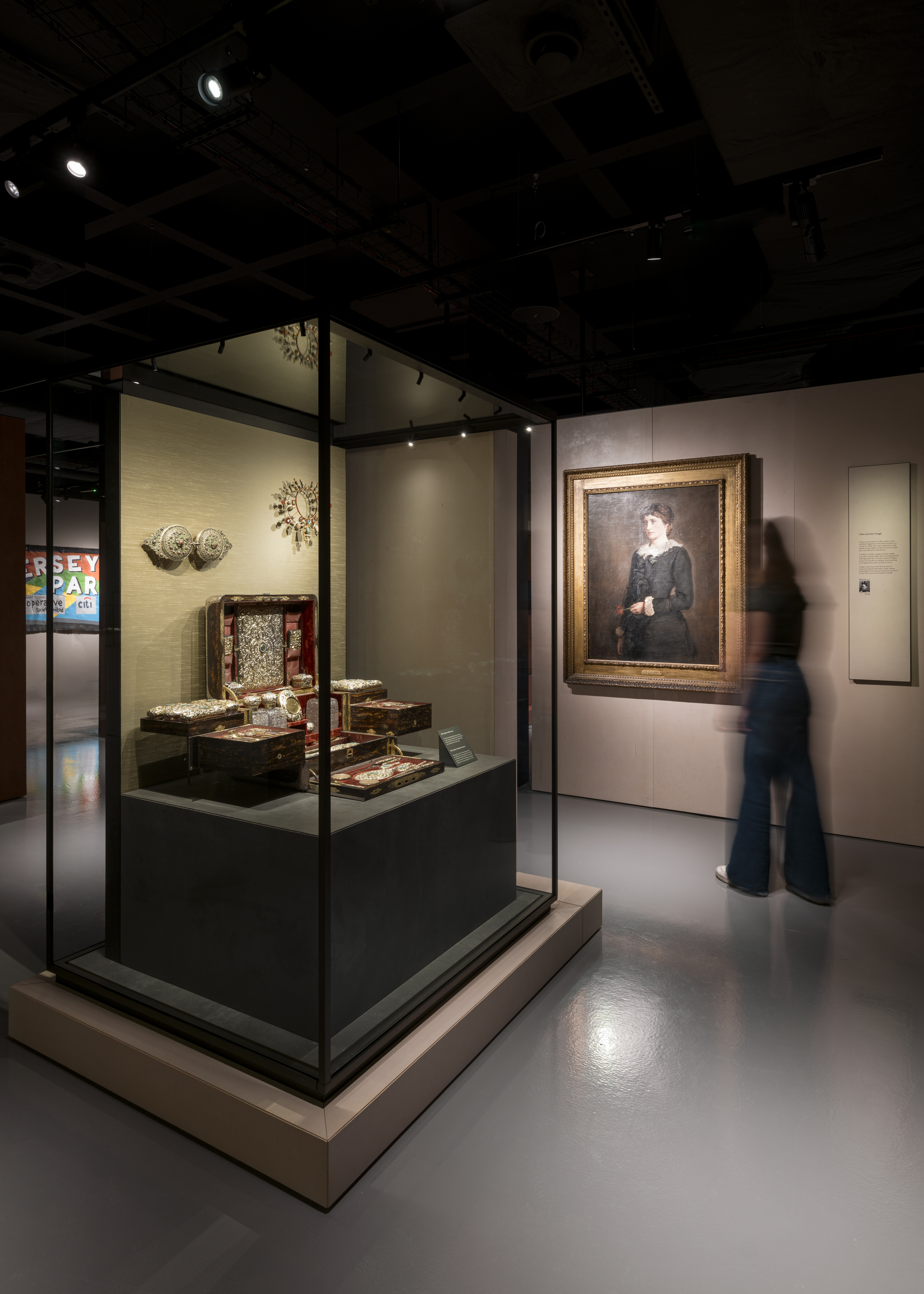
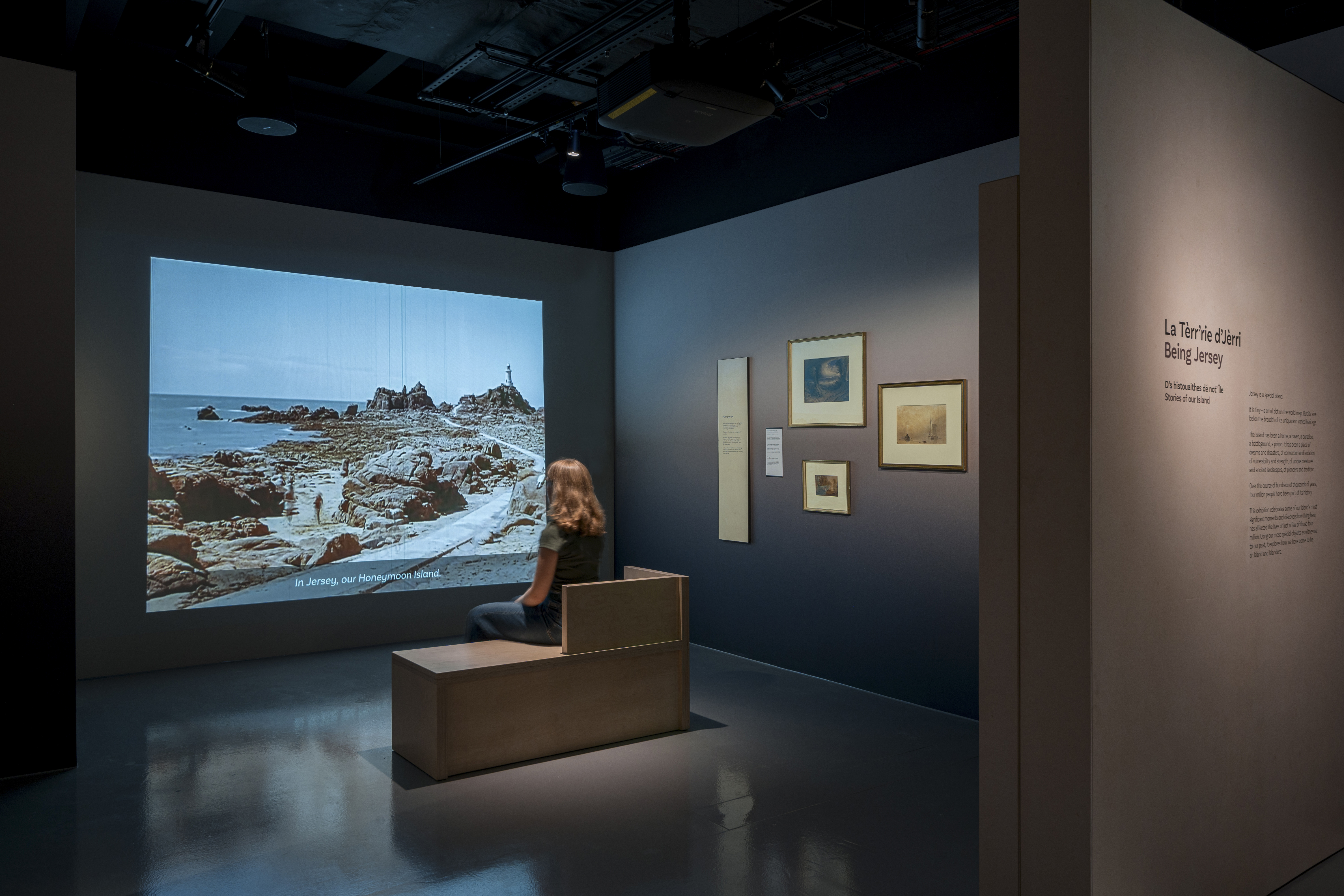
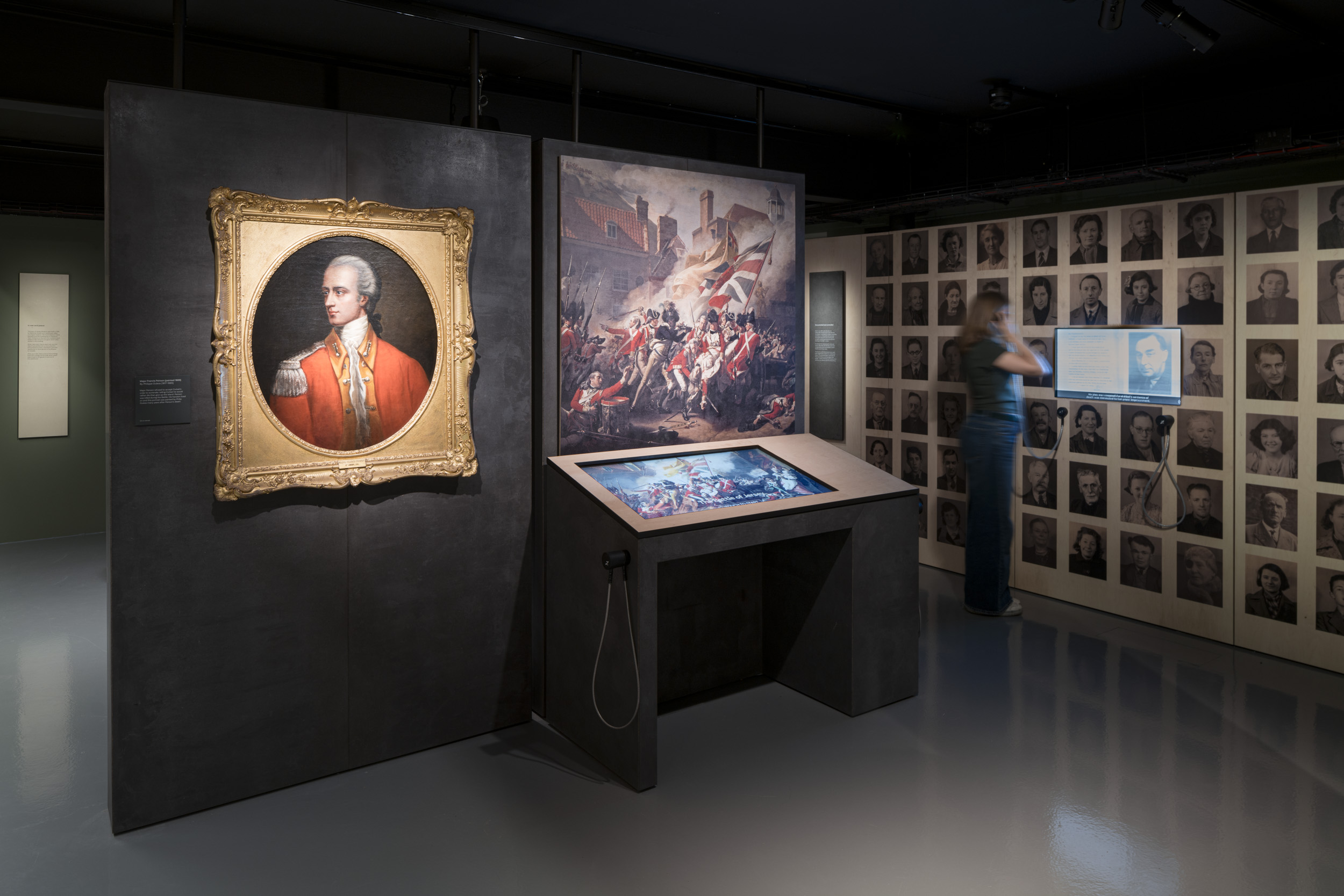
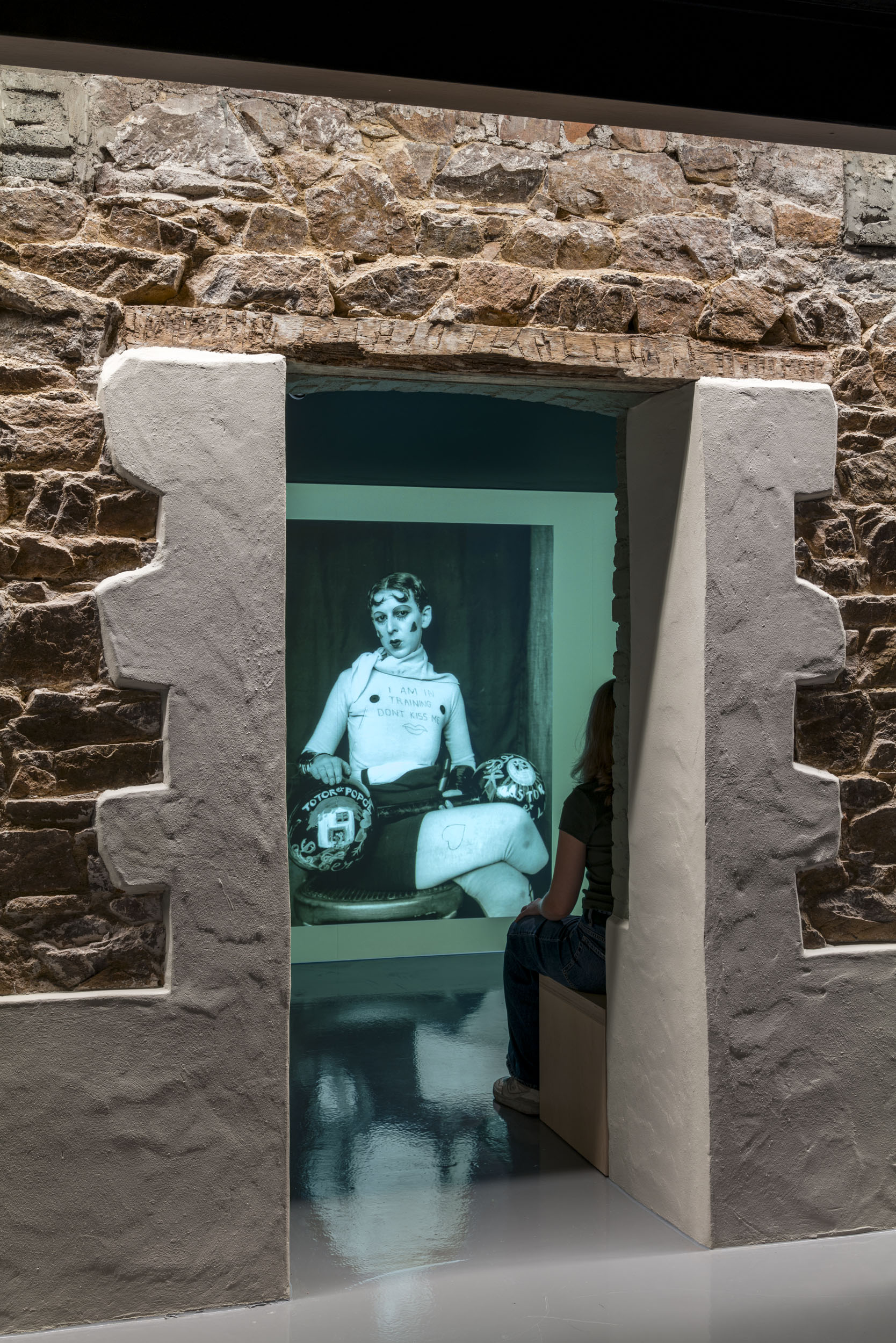
Image Credit : Gareth Gardner

Project Commissioner
Project Creator
Project Overview
This new, permanent 485 sq m exhibition at The Jersey Museum celebrates some of the Island’s most significant moments. Using special objects as witnesses, it involved the complete transformation of a previous permanent exhibition, with a clear directive to undertake a totally new approach.
The exhibition title - La Tèrr’rie d’Jèrri – d’s histouaithes dé not’ Île / Being Jersey – Stories of our Island’ - is in English and Jèrriais, the traditional language of the Jersey people. The use of this historic, Norman Romance language is in decline, but the Museum is one of the institutions actively seeking to preserve it through its role as keeper and protector of the Island’s heritage.
The exhibition is structured around the overall theme of ‘Islandness’, considering the Island through literal and metaphorical perspectives. Although individual, these narrative islands come together to tell the story of the uniqueness of Jersey.
Team
Lead, PM, Build Management, Curatorial, Conservation, Mounting: Jersey Heritage Design: Nissen Richards Studio Lighting Design: Studio ZNA Setworks Contractor: MER Showcases: Floria D.sign AV Software: Elbow AV Hardware: D J Willrich Basebuild Contractor: V&V Builders & Stonemasons M&E: Ennis Interpretation Consultant: Lucy Harland, Lucidity Media
Project Brief
The existing exhibition had become outdated and the new iteration needed to be more flexible, whilst extensive in scope, covering the Island’s history from the Ice Age to the present. Objects in the permanent collection needed to be celebrated more, with their narrative to the forefront.
The designers took inspiration from Jersey’s unique landscape, where the beach and seascape are dominant and the physical impact of the Island is so strong. Colours and textures are very particular to the Island, from the sunset to the beach and water. The design team explored this, researching new materials it had never used before and prototyping to ensure they evoked a real feeling of the Island.
This research and exploration led to a specific ‘Jersey palette’, with tonal, earthy colours in the main space and a more intense palette used to represent a shift in mood as the subject matter darkens.
Project Need
The exhibition’s aims included a larger number and broader range of people able to learn about Jersey’s heritage. Visitor figures rose by 83%, but this figure has to be offset by free entry being introduced just prior. The exhibition alone was solely responsible for a 24.5% visitor increase.
The exhibition importantly includes new stories, voices and/or different tellings of known stories e.g witch trials; 20th century immigration; women’s suffrage; Occupation and disability stories, with information from the exhibition now being used in schools as part of Island identity teaching.
The Jèrriais exhibition title and Jèrriais expressions (‘ditons’) were used to emphasise Island themes, along with interpretation and sound. Fonts were prototyped to ensure they were flexible enough to cope with multiple Jèrriais accents.
In terms of materiality, the palette was made up of design ideas directly informed by the marks, traces, grooves and layers of the Island’s geology, whilst also considering the expanse of the Island and ideas relating to drama, light and colour from the sea, sky and horizon lines.
The concept of tide and time influenced ideas about layering and the leaving behind of transient and permanent marks. Textures relating to the landscape included specific pigments and textures that could be rough, raw and earthen. The land’s stories suggested the development of a design language that sought to hold, imprint, etch and carve information.
Design Challenge
When it came to exhibition content, the big question was whether to organise thematically or chronologically. The final answer is a mixture of both, examining the nature and history of the island through thematic viewpoints. The exhibition is broken down into six ‘island’ spaces, with a central object case in each allowing for stories to unfold around it in a cluster.
Although the narrative islands are individual story groups that can be enjoyed in any order, they are of course located next to other story groups, which made the sequencing and interrelation important, in order to feel natural to visitors.
Accessibility was prioritised, with a desk-based accessibility audit at design phase and changes made as a consequence. An accessibility check was completed during build phase and some changes were made – mostly to AV content touch locations, plus added subtitles. A post-completion accessibility audit by an auditor living with disabilities – a wheelchair user with limited hand movement – was successfully passed with no changes required and very positive feedback.
Lucy Harland of Lucidity Media was employed as a specialist interpretation consultant to create a framework considering the best ways to engage visitors in stories and create opportunities for emotional engagement. Academic experts fact-checked everything throughout. A local artist call-out was made to create new works. The business case was presented to Jersey Heritage’s Board of Trustees, successfully gaining considerable financial investment.
Sustainability
The key to sustainability on this project was building in flexibility, so that the Museum could change and evolve the exhibition over time without having to strip it out. AV content adds this extra flexibility also.
Local companies were used for the install, including base build contractors, M&E, small carpentry works and local artists.
Louise Downie, Curation and Experience Director at Jersey Heritage, commented: ‘Nissen Richards Studio have created an exhibition which is, like our island, beautiful, breathtaking, emotive and atmospheric. They understood our overall exhibition concept of ‘Islandness’ in developing a palette of colours, textures and materials that reflect the physical environment of the Island and translated curatorial interpretive framework and intent into a design scheme which conveys the key messages and themes in a strong visual identity.
‘The exhibition includes a variety of object types – archaeology, social history, paper archives and art – a conservation challenge which Nissen Richards Studio took on with knowledge, professionalism and meticulous attention to detail. Nissen Richards Studio also comprehended Jersey Heritage’s need to future-proof the exhibition, creating a flexible design with room to grow.’
Interior Design - Gallery - Exhibition
Open to all international projects this award celebrates innovative and creative building interiors, with consideration given to space creation and planning, furnishings, finishes, aesthetic presentation and functionality. Consideration also given to space allocation, traffic flow, building services, lighting, fixtures, flooring, colours, furnishings and surface finishes. <div><b>
</b></div>
More Details