Design Champion
NAB
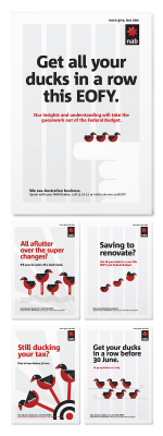
NAB EOFY campaign
Advertising - Print | Commissioner: NAB | Creator: Principals
The end of the financial year (EOFY) triggers a good opportunity for Banks to have a conversation with their customers about various finance related topics, whether it’s a message about the Federal budget or getting your home loan in order. We were given the opportunity to take a great idea developed by the Bridge last year around “getting your ducks in a row” and applying the new NAB brand identity to refresh this campaign for 2013 EOFY. The campaign was then implemented by various NAB comms teams.
NAB Split banking campaign
Advertising - POS | Commissioner: NAB | Creator: Principals
This was a retail campaign developed for NAB that targets split banking customers, encouraging them to re-think their promiscuous banking behaviour and to consolidate their banking with NAB. The campaign idea, developed by Clemenger BBDO Melbourne, tapped into the insight that by having accounts with multiple financial institutions Australians were making their banking more difficult and confusing than it needed to be. This lead to the idea of “Multiple Bank Disorder”. We were asked to help visualize this idea using NAB’s flexible identity system.
NAB Traveller card campaign
Graphic Design - Illustration and Type | Commissioner: NAB | Creator: Principals
The objective of the campaign was to create awareness and drive sales of the
NAB Traveller Card. The campaign idea of “Pay like a local” was developed by Clemenger BBDO Melbourne, and we were asked to help visualize this concept and make the most of NAB’s flexible brand identity to create something that would generate interest and really cut through in a cluttered market


.png)


