


Image Credit : Larry Vila Pouca (Design Director/Photographer)
Merren Spink (Art Director/Lead Designer)
Project Overview
Nestled in the heart of inner Melbourne, The Vellum is no ordinary hotel. A destination of refined character and contemporary elegance, it invites guests into a world where heritage architecture meets modern luxury. A hotel that speaks volumes without saying a word.
This fictitious boutique hotel was created as part of a bold creative brief from paper merchant Spicers. Tasked with promoting their Fedrigoni Specialties paper range, Spicers challenged Seesaw to create an inspiring campaign demonstrating their premium stocks' beauty, versatility, and sustainable innovation to designers, specifiers, and brand owners.
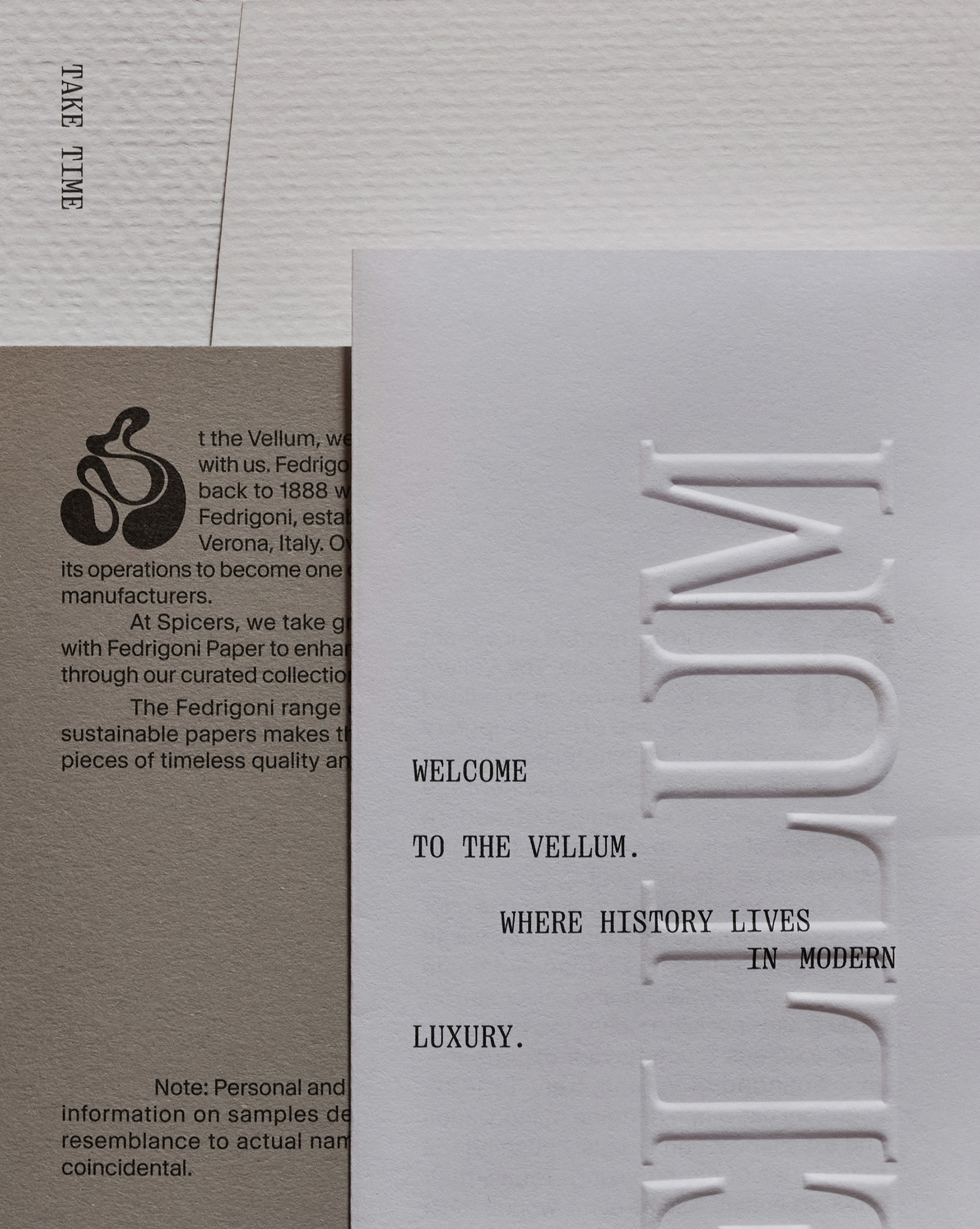
Seesaw’s response was The Vellum, a fully imagined luxury hotel brand designed as a narrative-rich platform to showcase the tactile power of paper. Drawing on the historic meaning of vellum as a symbol of craftsmanship, each brand touchpoint was carefully considered. From menus and room keys to signage and in-room stationery, the campaign fused high-end finishes, storytelling, and intentional design to create a layered sensory experience.
The brand identity reimagines tradition through contemporary typography, colour, and image-making, offering a sense of discovery in every printed piece. Much like a real hotel stay, it’s the detail that matters.
Project Commissioner
Project Creator
Team
Matthew McKenzie (Creative Director)
Larry Vila Pouca (Design Director/Photographer)
Merren Spink (Art Director/Lead Designer)
Emmett Ryan (Lead Designer)
Nikki Johnstone (Account Director)
Letterform (Copywriting)
Printing (Gunn & Taylor / Press Print)
Project Brief
Spicers, a leading supplier to the printing, signage, visual display, and graphic industries, engaged Seesaw to develop a standout creative campaign for its Fedrigoni Specialties paper range. With a robust national presence and a deep commitment to innovation, Spicers sought to reinforce its position as a go-to source for premium paper solutions, while re-engaging its core audience in a meaningful and memorable way.
The brief was to create a design-led promotional campaign that would capture the imagination of designers, print managers, specifiers, and brand owners. The campaign needed to go beyond technical demonstration and bring to life the tangible beauty, versatility, and creative potential of Fedrigoni papers in a context that felt relevant, elevated, and experiential.
To do this, Seesaw was tasked with developing the concept and art direction for a fictitious luxury hotel brand. By creating hotel-related printed materials housed in a single folder, the campaign would showcase how Fedrigoni stocks could be used across diverse real-world applications such as menus, stationery, in-room collateral and door signage.
Ultimately, the campaign needed to inspire and inform, positioning Spicers Fedrigoni as not just a paper supplier, but a creative partner invested in the future of premium print and purposeful design.
Project Innovation/Need
In a competitive and increasingly digital design landscape, Spicers needed a way to reassert the relevance, beauty, and versatility of its Fedrigoni Specialties range, particularly to designers, specifiers, and print professionals seeking premium and purposeful materials. The innovation wasn’t just in the product; it was in storytelling.
The brief called for a creative campaign to showcase the diverse applications of Fedrigoni papers across a range of real-world touchpoints. The concept of a fictitious luxury hotel, The Vellum, became the perfect storytelling platform. Named after the historic, high-quality parchment known for its refinement and artistry, The Vellum served as both a metaphor and a functional brand, embodying craftsmanship, tradition, and innovation.
Unlike other upper promotions, which focus on a single paper or paper family, Seesaw showcased six completely different paper products.
This imaginative device allowed Spicers to move beyond the traditional sample book format. Through tactile, print-based hotel collateral—menus, door signage, stationery, and in-room ephemera—each piece demonstrated the technical qualities of the paper stocks and their ability to elevate storytelling, brand expression, and design detail.
By fusing narrative, luxury, and print craftsmanship, the Fedrigoni campaign redefined how paper promotions can connect emotionally, inspire creatively, and position materials as integral to design thinking.
Design Challenge
Unlike other paper promotions, which focus on a single paper or paper family, Seesaw showcased six different premium paper products within the single promotional device.
The design challenge lay in crafting a suite of materials that not only looked beautiful but functioned as a compelling showcase of six distinct Fedrigoni paper stocks, each with its own character, weight, and finish. Every element needed to champion the material it was printed on, using the highest-quality techniques to highlight texture, tactility, and tone.
Print finishes were employed with purpose and restraint, foiling to add a touch of luxe, blind embossing to create quiet depth, PMS inks to achieve perfect brand tones, and spot varnish to elevate contrast and tactility. Each embellishment was carefully selected to complement the stock, never overwhelm it.
Structural packaging elements were designed with the same level of care. Clever die-lines eliminated the need for gluing, allowing each piece to be assembled with precision while maintaining a clean, premium finish. The result was elegant and production-efficient, a critical balance for a paper promotion aimed at industry professionals.
Above all, the piece had to resonate with creatives. It had to feel original and impeccably crafted, a reference and source of inspiration that designers would want to keep. It had to be something that told a story and invited others to tell their own.
Effectiveness
“From the beginning, our goal was to create something that not only showcased the luxury and sophistication of our Fedrigoni Specialty Papers range but also reminded the creative community of the enduring power of paper in storytelling.
Collaborating with Seesaw was an absolute pleasure. They understood the brief intuitively, and their ability to translate our vision into a design piece that is not only elegant but also deeply considered was nothing short of exceptional. From concept to execution, their attention to detail, understanding of materiality, and passion for craft shone through. They perfectly captured what we set out to achieve: that paper is not just a substrate, but vital to the creative process.
Since its release, we have seen a marked increase in interest and specifications of Spicers' Fedrigoni Specialty Papers. Enquiries for samples and mockups have risen, our print and design customers are more engaged, and brand awareness for Fedrigoni has grown significantly. It is a testament to the impact of this beautifully executed piece and the credibility it has earned within the design and print community.
This promotion is a highly admired piece, praised for its exceptional design, thoughtful storytelling and innovative use of specialty paper. It's a celebration of what is possible when great design meets beautiful materials - proof that in a digital age, print still has the power to connect, inspire and elevate.”
—
Cyndi Setia
Spicers
Graphic Design - Publication
This award celebrates creative and innovative design in the traditional or digital visual representation of ideas and messages. Consideration given to clarity of communication and the matching of information style to audience.
More Details