
Project Overview
Rooted in the essence of traditional Chinese culture, the cigarette packaging design artfully blends symbolic colors, architectural forms, ancient bronzeware, and classical motifs into a cohesive design. The result is a distinctive visual identity that radiates both historical depth and refined elegance. Inspired by Chang’an—the legendary ancient capital—the design captures its cultural spirit with subtle reverence, while modern precision in craftsmanship brings every detail to life. This harmonious fusion of heritage and innovation creates a tangible connection between the past and the present, inviting consumers to experience the legacy through a contemporary lens upon the first interaction.
Project Commissioner
China Tobacco Shaanxi Industrial Co., Ltd.
Project Creator
ZHEJIANG YIXING PACKAGING TECHNOLOGY CO., LTD.
Team
ZHEJIANG YIXING PACKAGING TECHNOLOGY CO., LTD.
Fang Yang, Jiahao Gong, Haiying Wang of China Tobacco Shaanxi Industrial Co., Ltd.
Project Brief
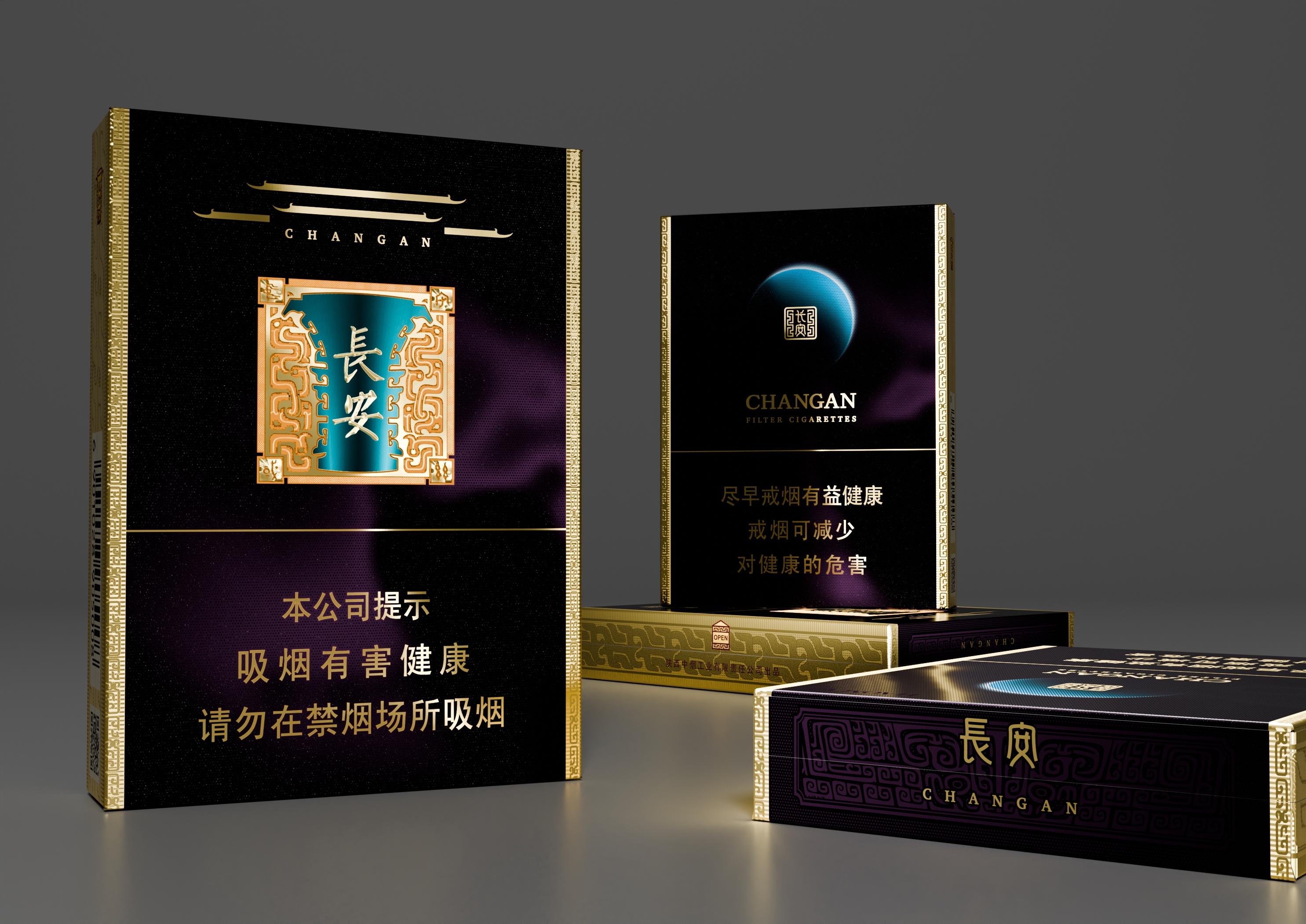
Inspired by the Book of Han: Table of Nobility Ranks and Government Offices, which references “golden seals and purple ribbons” as symbols of imperial rank, and the auspicious saying “purple cloud comes from the east”—long seen as a sign of good fortune—the design embraces dark purple and gold as its core palette. In ancient China, these colors were synonymous with power, nobility, and divine blessing. Here, they do more than honour tradition—they evoke a quiet sense of dignity, prosperity, and timeless grace. During the Tang Dynasty, Chang’an was more than a capital—it was the pinnacle of Chinese civilisation. Its legacy provides rich visual inspiration, including the grandeur of the Daming Palace, the craftsmanship of the He Zun ritual bronze vessel, and the intricacy of traditional decorative motifs. By thoughtfully integrating them into a contemporary cigarette packaging design, the brand strengthens consumers’ cultural connection, reinforces its own heritage-driven identity, and creates a distinctive presence in a crowded marketplace.
Project Innovation/Need
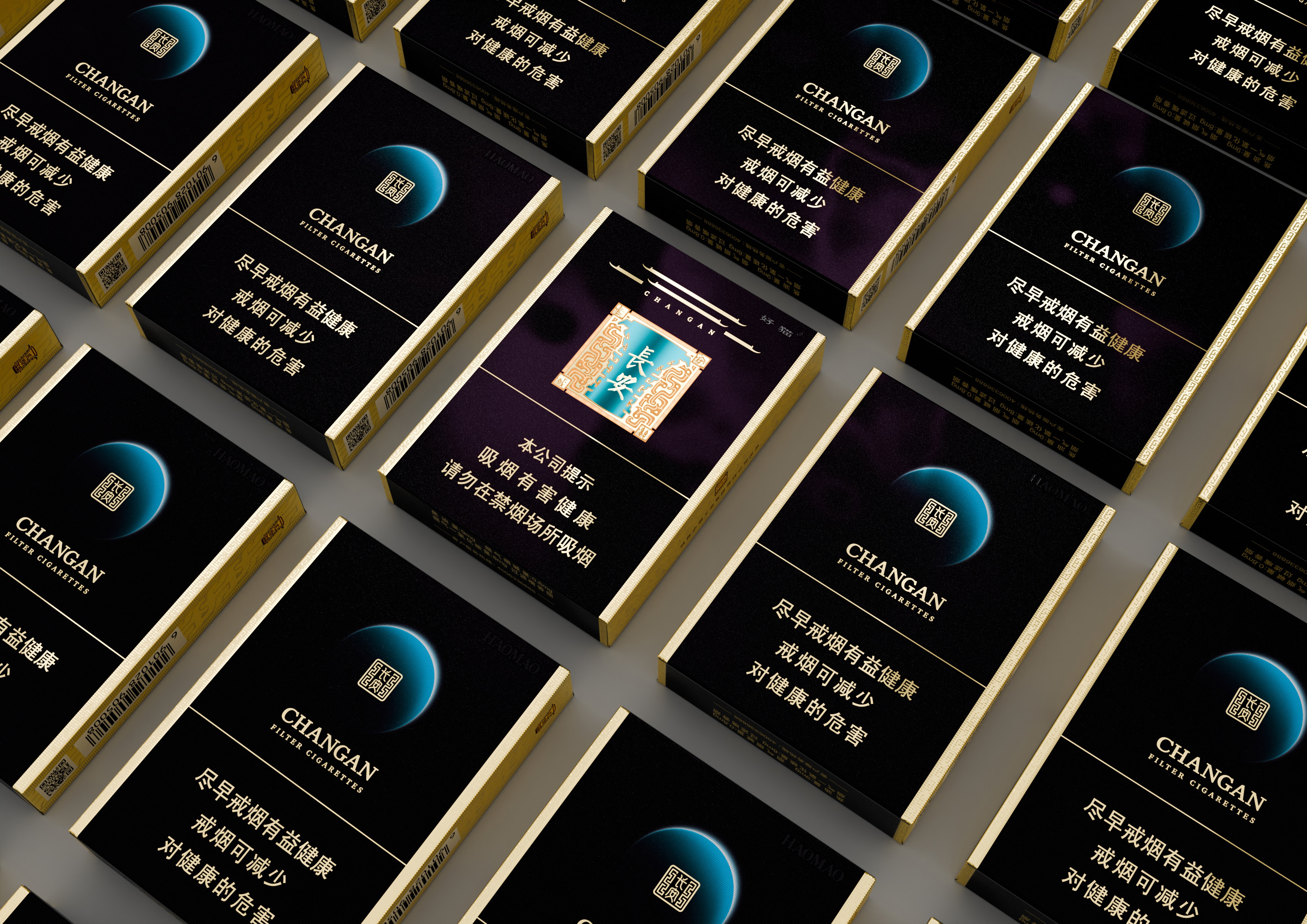
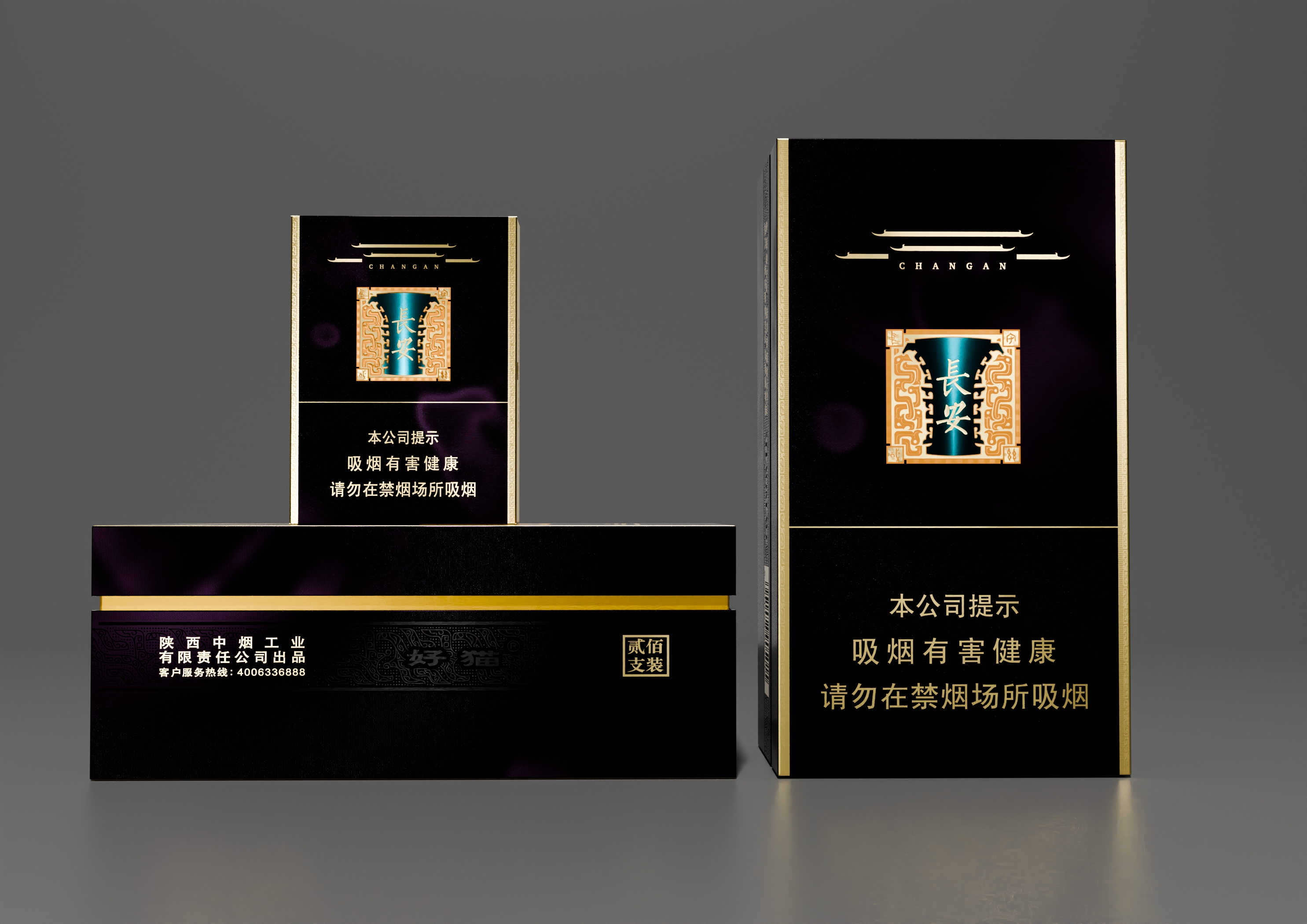
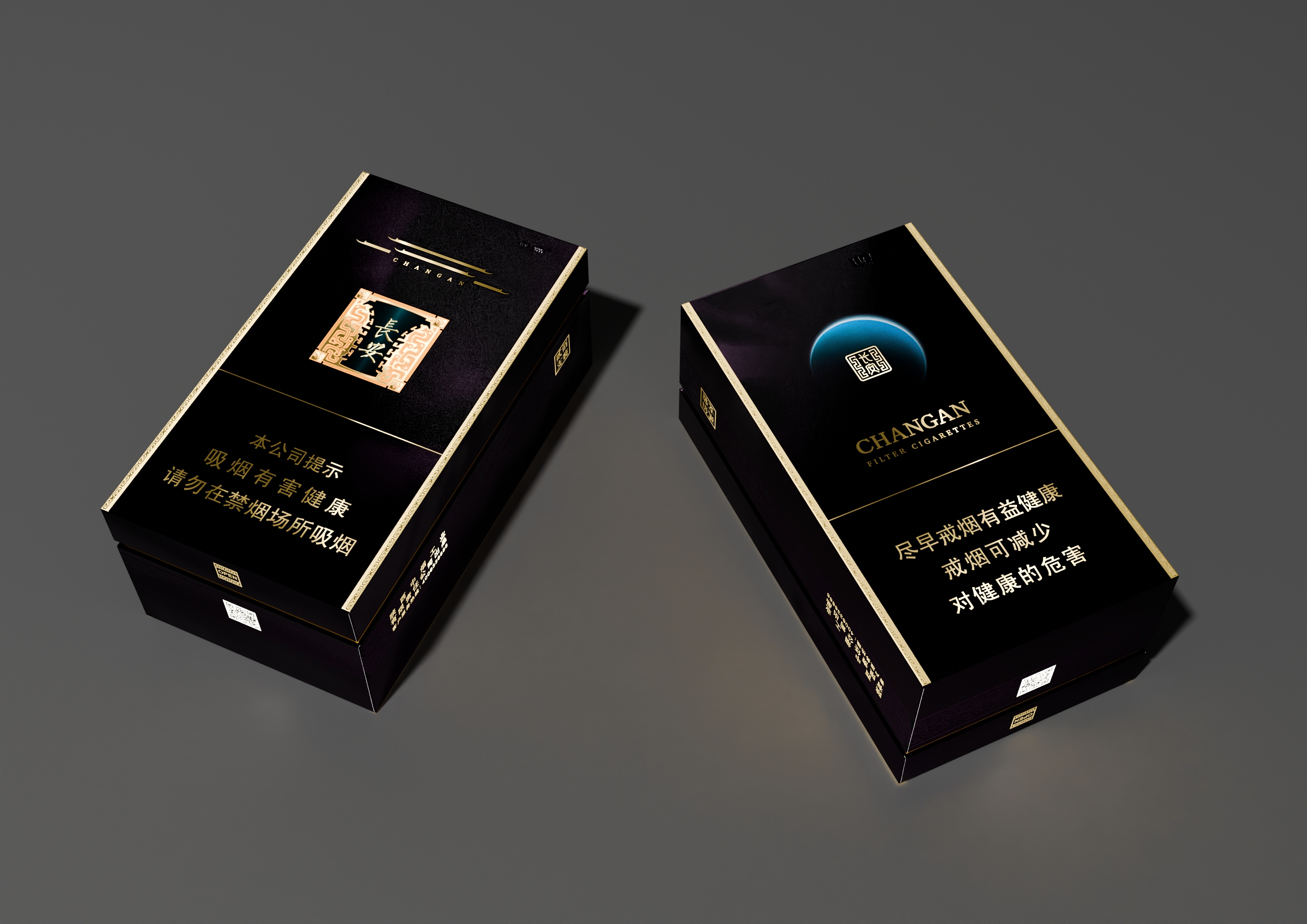
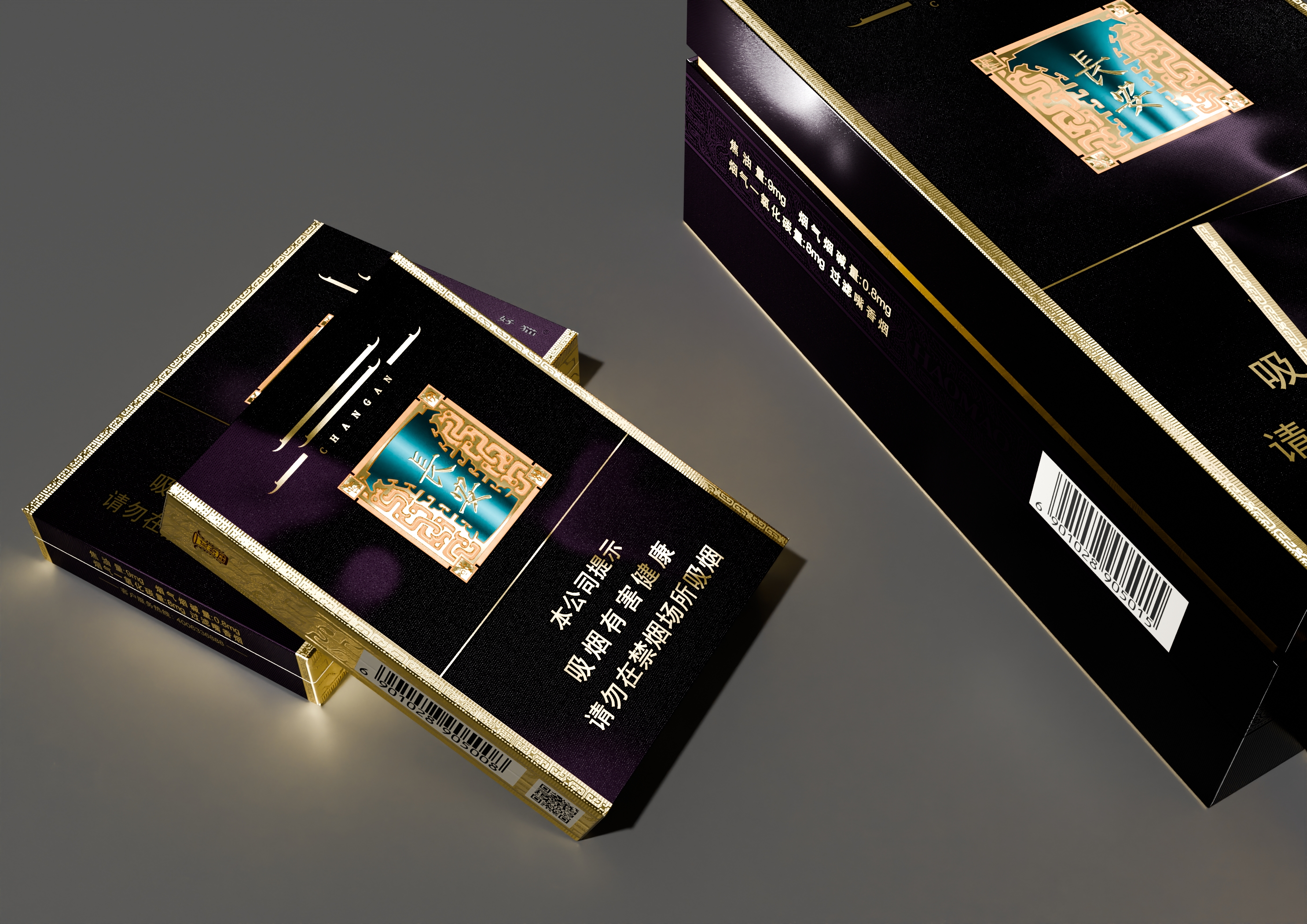
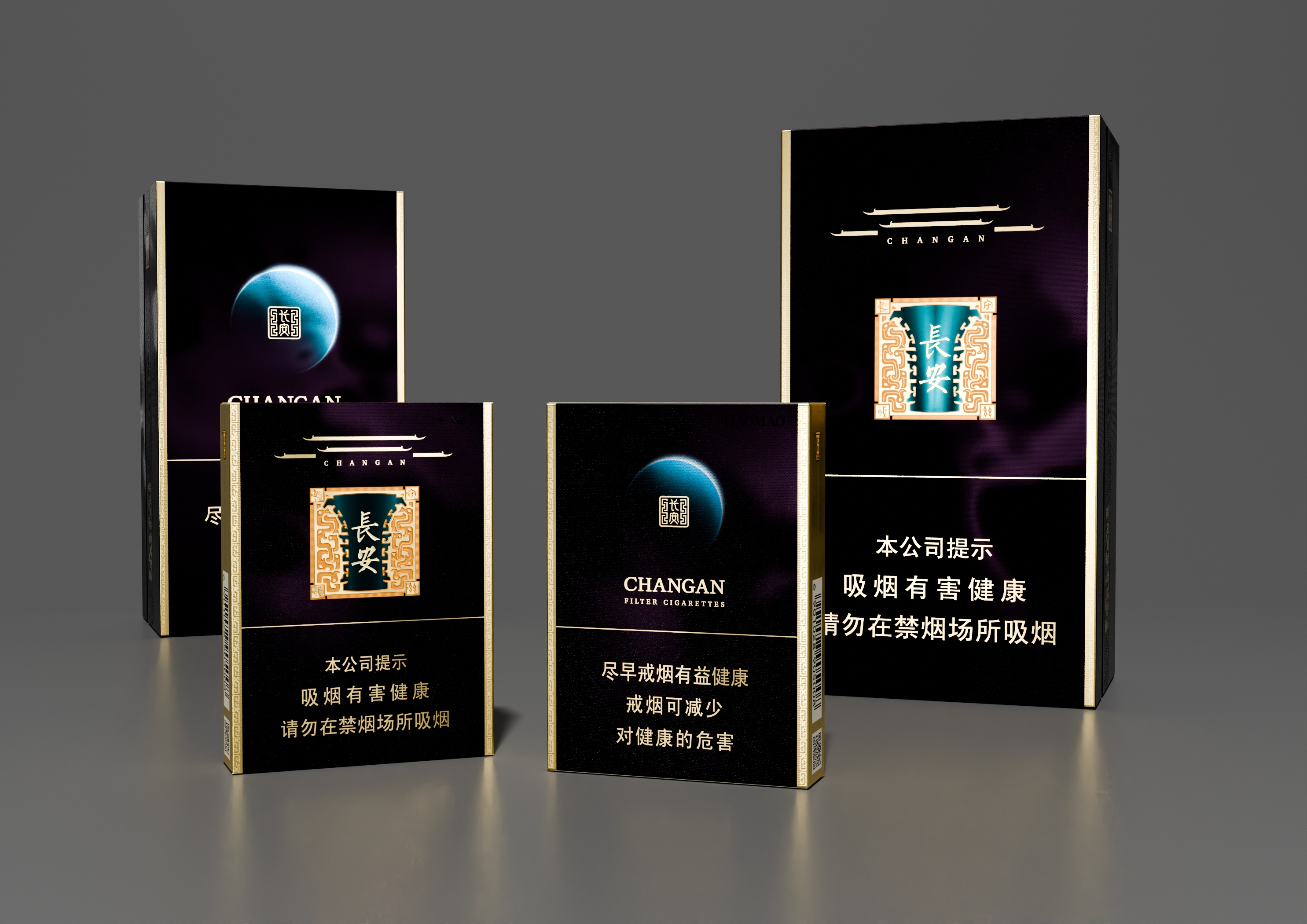
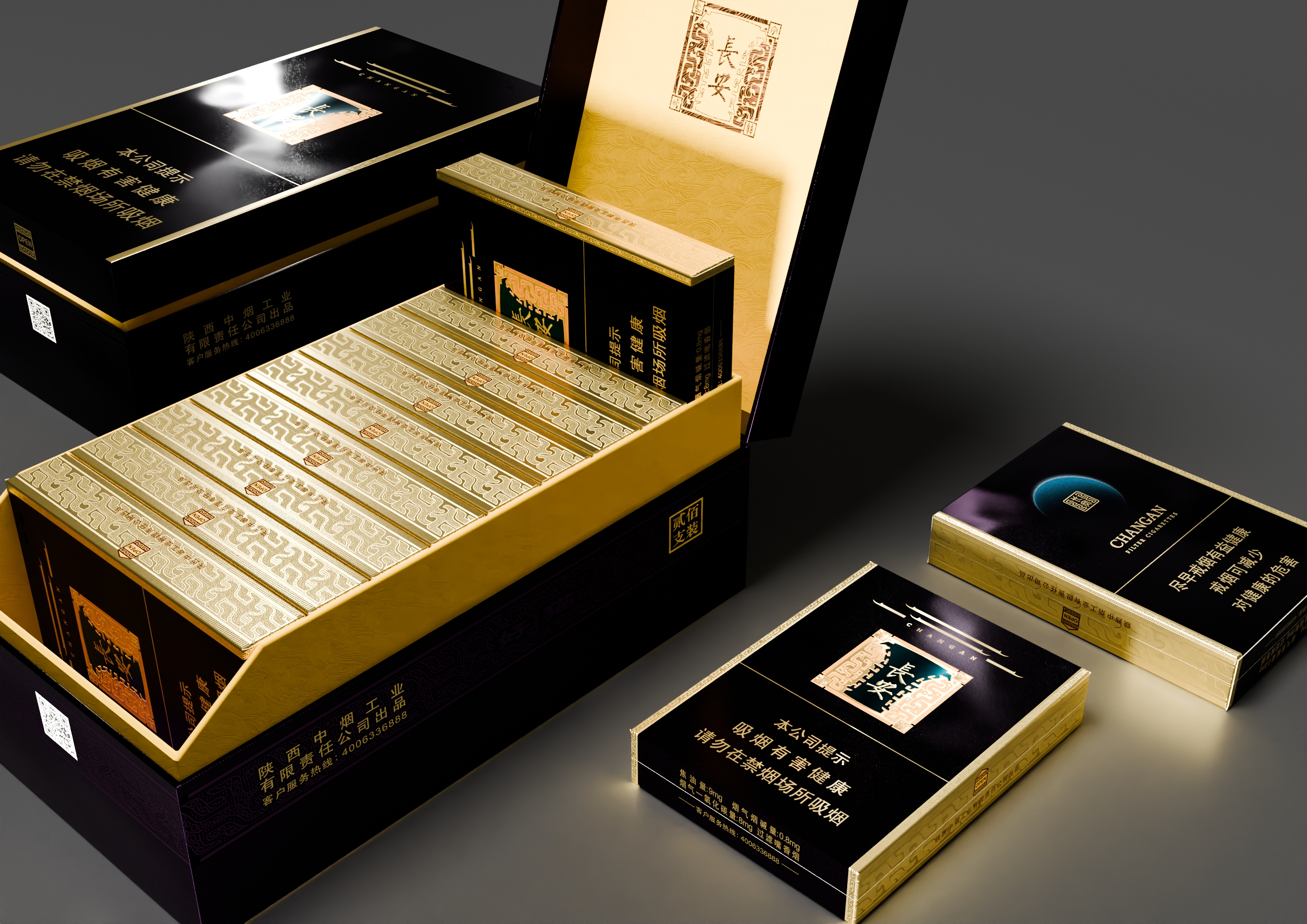
The front design draws inspiration from the Daming Palace of the Tang Dynasty, reinterpreting the distinctive roof ridges characteristic of Tang Dynasty buildings into a bold, square silhouette that evokes the outline of an ancient city. The He Zun ritual bronze vessel, a legendary national treasure, appears in the centre of the design, flanked by the pattern of Kuilong (a traditional Chinese mythical creature). In four corners, the inscription of “Zhai Zi Zhong Guo (long-term settlement in the central region)” lends the design more cultural connotations while expressing respect and admiration for Chinese civilization. The brand name “Chang’an” is prominently displayed in the centre, implying the meaning of “living in China with long-lasting peace and stability.” This conveys the profound history of the ancient capital city and the far-reaching symbolism of the brand name.
On the reverse, the design shifts to a cosmic scale: a breathtaking view of Earth’s limb glowing with sunlight against the vastness of space, evoking a sense of vastness and grandeur. Seamlessly integrated into this celestial backdrop is a stylised “Chang’an” word pattern, harmonizing natural wonder with cultural legacy and enriching the overall narrative. The top lid features the subtle motifs of Tao Tie (a mythical ferocious animal associated with gluttony) and golden cloud-and-thunder patterns, paying homage to traditional Chinese ornamentation and showcasing meticulous craftsmanship. Completing the visual story, the continuation of the He Zun-shaped 20-icon motif makes the entire packaging more exquisite and unique.
Design Challenge
- Tang Dynasty architecture and ancient bronzeware are rich in intricate detail, making it challenging to adapt their essence into a simplified, recognizable, and print-ready graphic language. To bridge tradition and modernity, the design team conducted in-depth research into Tang Dynasty aesthetics and cultural symbolism, identifying core visual elements and reimagining them through abstraction and minimalism. Through multiple rounds of sketching, prototyping, and refinement, the team ensured the final design remained both authentic and elegant—clear and intuitive in form, yet deeply rooted in tradition.
- Another challenge lay in harmonising a diverse range of design elements—architectural forms, ritual objects, decorative patterns, and symbolic colors—into a unified visual language. Achieving balance without sacrificing richness required careful attention to composition and visual hierarchy. The team began by establishing strong central motifs and a primary colour palette, then meticulously calibrated the scale and positioning of supporting elements. Through thoughtful use of colour contrast, directional lines, and subtle visual connections, each element resonates with the others, resulting in a design that feels both dynamic and harmoniously integrated.
Effectiveness
- The packaging utilizes eco-friendly inks, recyclable paper substrates, and energy-efficient printing techniques, significantly reducing its environmental footprint. Compared to conventional processes, its production lowers energy consumption by approximately 20% and cuts VOC emissions by over 30%—a powerful and meaningful step toward green manufacturing.
- High-precision printing and intricate patterns elevate the packaging’s artistic and collectable value. Market feedback indicates that around 40% of consumers choose to preserve the packaging as a keepsake. In a world of disposable things, this small act makes a difference, reducing single-use waste and supporting a circular way of using resources.
- By reinterpreting traditional motifs in a modern, commercially relevant way, the design plays an active role in keeping Chinese cultural heritage alive. Since its launch, online discussions about the packaging’s cultural themes have increased by 50%, with particularly strong engagement among younger audiences. It’s more than a trend—it’s a quiet revival, helping to pass down traditional culture in ways that resonate today.
Graphic Design - Three Dimensional
This award celebrates creative and innovative design in traditional or digital visual representation of ideas and messages used in packaging. Consideration given to: clarity of communication and the matching information style to audience; the approach, including marketing and branding concerns, the dynamics of the retail environment, environmental considerations, and legal requirements; the component parts of packaging graphics such as colour rationalisation, information layout, feel and tone of illustration and photography, and finishes, and how they are used in isolation and in relation to each other; and the relationship to the anatomy of the structural design.
More Details