

Project Overview
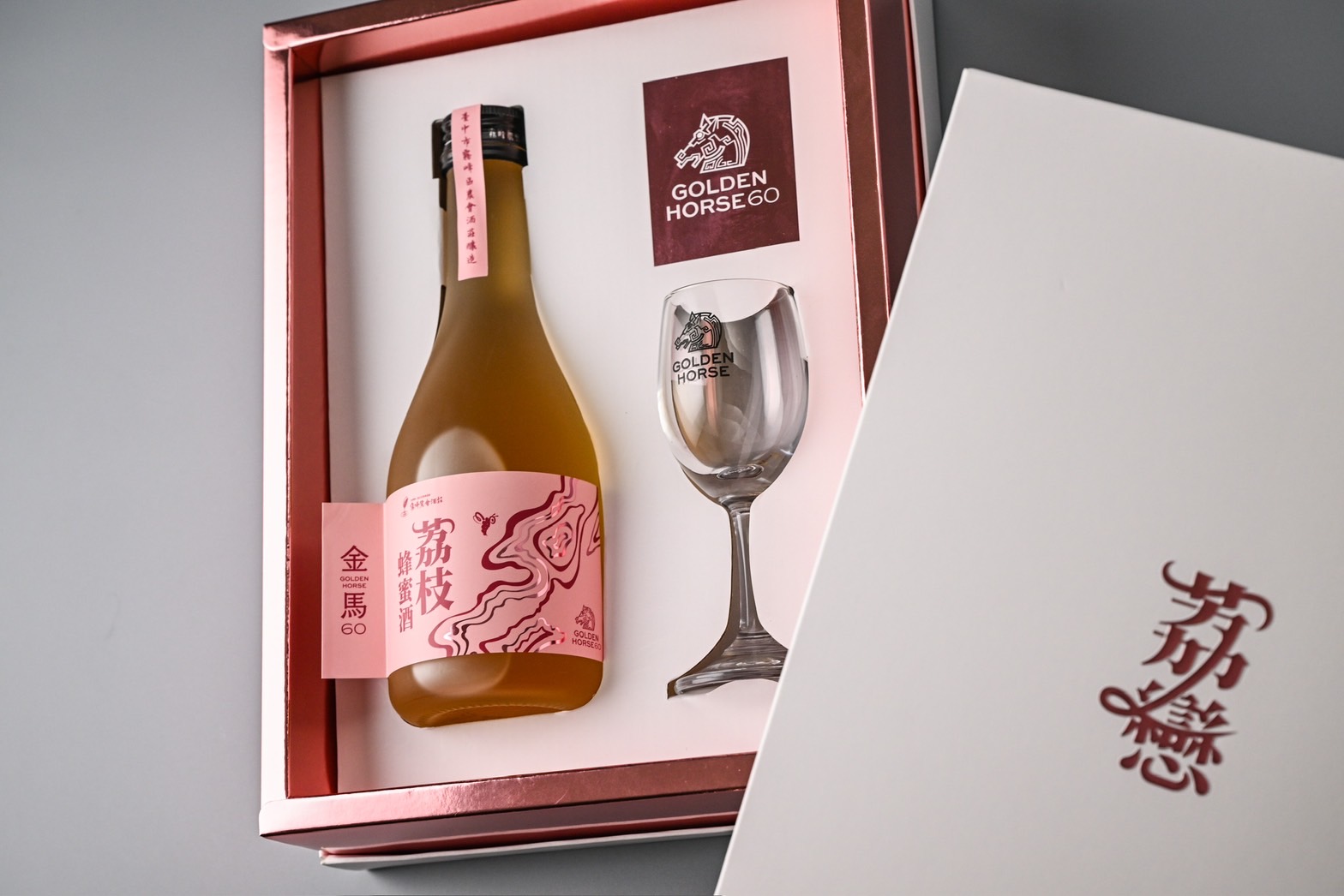
This product is a fruit wine crafted from a blend of lychee and honey, embodying the dual qualities of softness and resilience that symbolise femininity while carrying layered meanings of personal growth. The name "Lychee Romance" plays on the homophone for "experience," revealing the continual transformation necessary to overcome setbacks and embrace success.
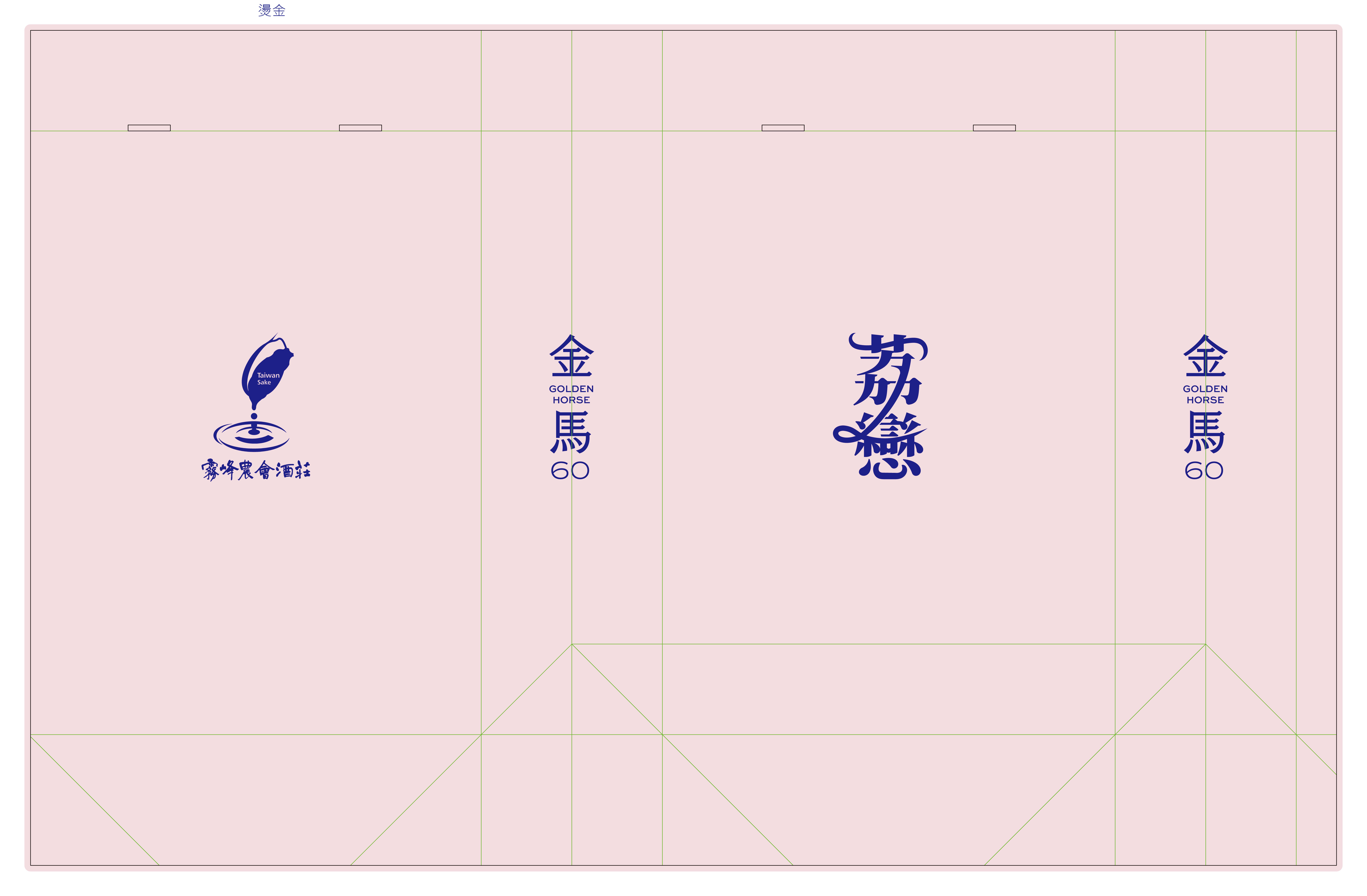
In terms of typography, the team placed particular emphasis on harmonising the text with the brand’s tone. After evaluating various handwritten and elegant serif fonts, they ultimately selected one with delicate strokes and gentle curves to echo the core spirit of feminine grace and strength. The typeface conveys a subtle handcrafted warmth, highlighting the wine’s origins in the land and its rich cultural narrative. Moreover, it complements the packaging’s cut-out imagery of mountains and mist, achieving a visual balance between softness and solidity and between the ethereal and the tangible.
The overall colour palette centres on shades of pink, striking a balance between youthful sweetness and mature inner strength. This choice resonates across generations, while metallic accents in the details symbolise an underlying resilience and stability.
Organisation
Agriculture Bureau of Taichung City Government
Team
CHING-CHANG CHANG, SHI-WEI LIAO, WEN-YI LIAO, BO-RU CHEN, CHING-CHIEN HUANG, CHUN-JUNG CHANG, CHIH-CHUNG KAO, PEI-LAN CHU
Project Brief
"Life is like a slow fermentation—bit by bit, it ultimately culminates in a uniquely rich flavour." This adage encapsulates the core spirit of the team's creation of "Lychee Romance."
In the very moment the cap is removed, the intermingling aromas of lychee and honey, reminiscent of a gentle breeze, evoke the pure anticipation of new beginnings. As the wine caresses the tongue with its warm, layered complexity, its subtle sweetness reminds us that even when fog still shrouds the future, the bittersweet memories will eventually be refined into an enchanting taste.
The cut-out lines on the packaging symbolise "mountains and mist," representing the inevitable challenges and rugged paths encountered on life's journey. Only by opening the box, fully immersing oneself in the experience, and continuously embracing trial and error can one truly savour the breathtaking vistas that lie beyond the obstacles.
When the mist finally clears and one looks back upon the journey, what is cherished is not merely the ultimate sweetness of the harvest but also the growth and profound emotions nurtured through every experience along the way.
Project Innovation/Need
Lychee Romance = Experience & Feminine Resilience
The naming of this product embodies the spirit of "experience," subtly echoing the resilience and responsibility women exhibit at various stages of life. The sweet fragrance of lychee and honey represents the warm strength that sustains us during our growth, while the term "romance" symbolises an unwavering commitment to ideals and beliefs. Additionally, the team’s packaging design highlights the theme of female empowerment by featuring graceful lines and intricate engravings that showcase feminine qualities and underscore inner strength and determination. The product was also expedited prior to the Golden Horse 60th Film Festival, allowing the work to be shared with a broader audience.
Mountains and Mist
The layered, cut-out lines on the packaging evoke images of "mountains" and "swirling mist," serving as a metaphor for the various challenges that must be overcome in life—just as bees must navigate rugged terrain to collect nectar. These overlapping lines and semi-transparent effects not only add visual dynamism but also symbolise the perseverance and effort required to achieve success. Ultimately, the breathtaking view revealed after emerging from the mist reminds us that only through enduring life’s trials can one cultivate the strength needed to produce truly remarkable outcomes.
Design Challenge
The project involved a collaboration among the farmer’s association, the design team, and four high school students, requiring a balance between the students’ creative ideas and the practical demands of mass production.
Achieving finely detailed engraving while maintaining production efficiency on a limited budget proved to be the most daunting challenge. The tight deadline ahead of the Golden Horse 60th event compounded the pressure, forcing the team to reconcile time constraints with high-quality output. They continuously refined the design and adjusted the production processes, with each iteration serving as a testament to their growth. Through this race against time, both the professionals and the students learned the invaluable lessons of persistence and adaptable problem-solving.
Effectiveness
Once the visual design was launched, both the farmers’ association and the school offered enthusiastic praise. The association commended the design for breaking free from traditional constraints by showcasing a blend of gentle strength from a female perspective, and they recognised its significant potential for broader market expansion. Connoisseurs also lauded the product for its delicate, refreshing taste—a perfect echo of the design’s intended message.
For the four high school students involved, the process of bringing the project from concept to reality provided invaluable insights into harmonising creativity with practical demands. They deeply appreciated the balance between professional standards and cost management. Finally, the feedback and cumulative experience injected new energy into local agriculture, endowing the product with profound cultural and humanistic value.
Graphic Design - Identity and Branding - International
This award celebrates creative and innovative design in the traditional or digital visual representation of ideas and messages. Consideration given to clarity of communication and the matching information style to audience.
More Details

