Key Dates

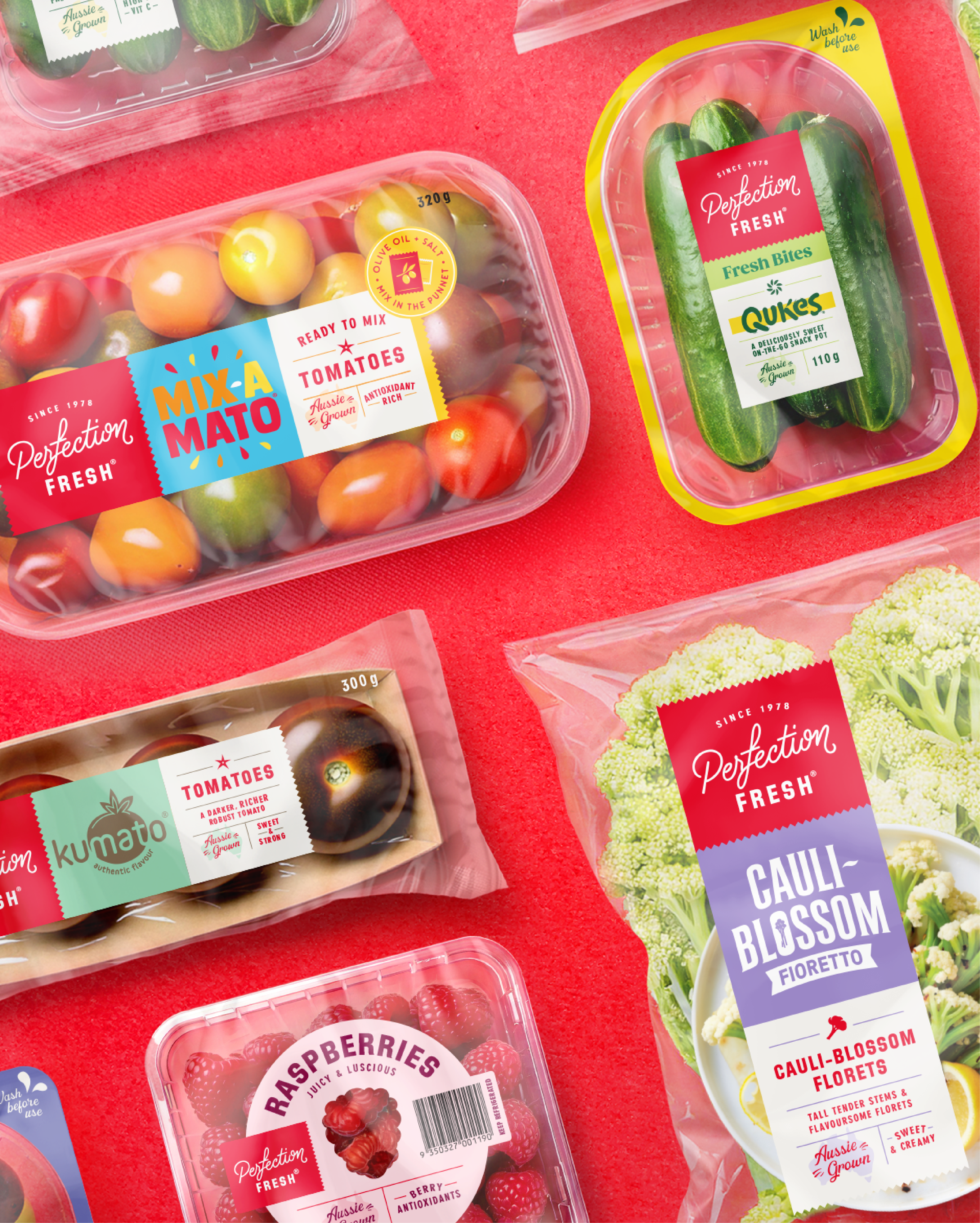


Image Credit :

Project Commissioner
Project Creator
Project Overview
Perfection Fresh is one of Australia’s most loved and innovative produce brands. But with a vast and varied portfolio across sub brands like BroccoliniTM and QukesTM as well as products like snacking cucumbers, specialty tomatoes, berries and more, the brand lacked a consistent visual identity.
Our task was to unify the range under a strong masterbrand while keeping the uniqueness of each product. The solution was a flexible design system built around a distinctive ‘Fresh Tape’ device, inspired by the charm of hand-packed produce.
This system balances clarity and creativity, with vibrant food photography, transparent packs, a smart typographic system and adaptable architecture. The refreshed logo combines a handwritten script with bold sans serif typography, creating the perfect balance of warmth and authority.
Everything works together to build brand memory, simplify shopper decisions and create standout in the fresh aisle. The design works across every format, from berry punnets to salad trays, and across retail, wholesale and digital platforms.
The new identity doesn’t just improve consistency. It elevates the brand, enhances navigation, and brings joy to the produce category. This is branding that celebrates abundance and rewards the everyday.
Team
Greg Boulting - Creative Director Tim Meredith - Design Director Lily Ash - Project Director Taby Taylor-Ziane - Strategic Director Olivia Walton - Senior Designer Shahida Hillerstrom - Finished Artist Jasmine Woodburn - Designer Jordan Lee - Designer
Project Brief
With more than four decades of legacy and innovation, Perfection Fresh needed a packaging system that could evolve with their expanding portfolio, while reinforcing what made them special. They wanted to elevate their masterbrand across all tiers, products and touchpoints.
The brief called for a visual identity that was clear, consistent, compelling and competitive. It needed to boost brand recognition on the shelf, while offering flexibility across everything from loose produce to prepared snacks and premium ranges. The design also needed to reflect the brand’s passion for freshness, quality and innovation.
We developed the idea of ‘Mix-a-Match’ as the creative foundation. This was expressed through the “Fresh Tape” – a modular brand panel that ties the portfolio together and makes space to tell product-specific stories. It’s consistent, but never boring.
The refreshed logo brings a personal yet modern tone, and is supported by colour, product iconography and strong hierarchy. Every element of the system is designed to be both practical and expressive.
The final outcome gives Perfection Fresh the ability to scale, flex and connect with their customers through a system that is structured, joyful and confidently branded.
Project Innovation/Need
Branding in the produce aisle is often an afterthought, but Perfection Fresh approached it as a key strategic opportunity. They wanted to lead the shift from generic packaging to brand-led experience.
Our solution was the “Fresh Tape” – a modular visual element that acts as both a signature and storytelling device. It creates cohesion across a huge and varied portfolio, while giving room to highlight each product’s flavour, use, or origin.
This structure is more than just flexible. It is uniquely suited to fresh food, where transparency and adaptability are essential. It works across everything from 60g snack punnets to large salad trays, without compromising brand clarity or shelf impact.
Typography, photography and colour coding are all built into the system, creating a recognisable and consistent look that is full of appetite appeal. The redesigned logo, with its script and sans serif pairing, adds authority while preserving a sense of personal charm.
This identity doesn’t just unify packaging. It enhances brand recognition, speeds up shopper decision-making and allows the business to grow with clarity and control. In a category where very few are doing brands well, Perfection Fresh now has a system that stands out for all the right reasons.
Design Challenge
Designing for fresh produce brings a unique set of constraints. Pack sizes vary dramatically. Transparency is non-negotiable. Branding space is limited. And the category moves fast, with SKUs continually evolving.
But one of the biggest complexities was architectural. Perfection Fresh already had strong consumer recognition across several proprietary sub-brands like Qukes™ and Broccolini™. These equities needed to be retained, respected and seamlessly integrated into the new masterbrand-led system.
We couldn’t dilute what was working. Instead, we needed a structure that could hero the Masterbrand, while flexing to accommodate sub-brand identities, prepared food ranges, and premium tiers.
The solution was the Fresh Tape - a modular design system that provided structure, consistency and standout, while allowing the necessary space for sub-brand expression and storytelling. We defined clear visual hierarchies, lockups and flexible tile formats to handle everything from single-ingredient produce to complex convenience formats.
Typography, layout and iconography were carefully built to flex across every format and retailer channel. And comprehensive packaging guidelines ensured the system could scale, while empowering the Perfection Fresh team to apply it with confidence.
We also created a premium Signature Range identity for Perfection Fresh, using a refined black design system, elegant typography and premium finishes to hero their finest produce and signal exceptional quality at a glance.
It’s a system designed not just to look beautiful, but to work beautifully too - uniting a diverse portfolio under one confident, recognisable brand.
Effectiveness
Although rollout to shelves is still underway, early signs show the impact is already being felt. Perfection Fresh’s latest brand health tracking reveals positive movement in key areas: the brand is now seen as more appealing, more modern, and more innovative. Perceptions of freshness and premium quality have also increased - crucial for a business built on trust in produce.
Our system was designed to work as hard as the product it holds. It balances consistency with creativity, allowing the Masterbrand to lead while flexing to accommodate everything from Broccolini to Mix-a-Mato. Importantly, it makes shopping easier: strong branding, vibrant colours and clear architecture guide shoppers across a complex portfolio without sacrificing shelf impact.
Internally, the design has become a rallying point - building pride and recognition among staff and stakeholders. Externally, it's setting a new standard for branded fresh produce.
As Luke Gibson, Chief Marketing & Innovation Officer, put it:
“From the outset we knew we had found the right design partner. They quickly understood and embraced the complexity of the challenge… delivering a breakthrough design for the category, which is already delivering results for us.”
It’s a design system that doesn’t just look good. It delivers on every front - from shelf to brand sentiment to business momentum.
Graphic Design - Identity and Branding
This award celebrates creative and innovative design in the traditional or digital visual representation of ideas and messages. Consideration given to clarity of communication and the matching information style to audience.
More Details