Key Dates
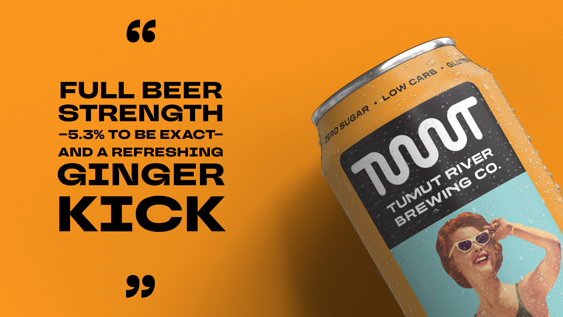
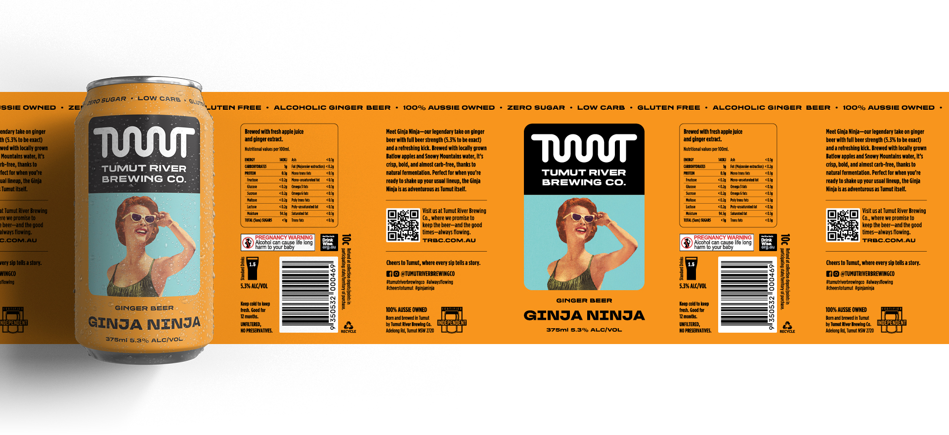
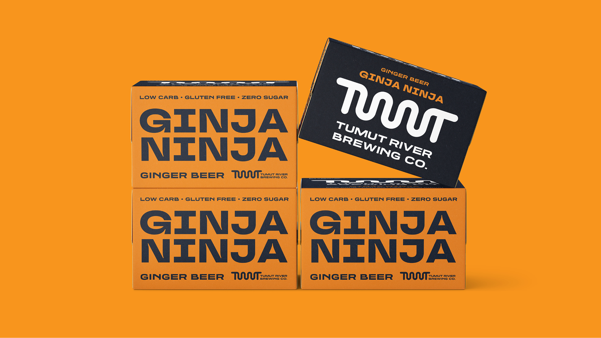


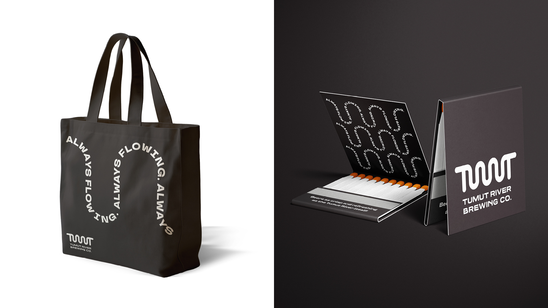
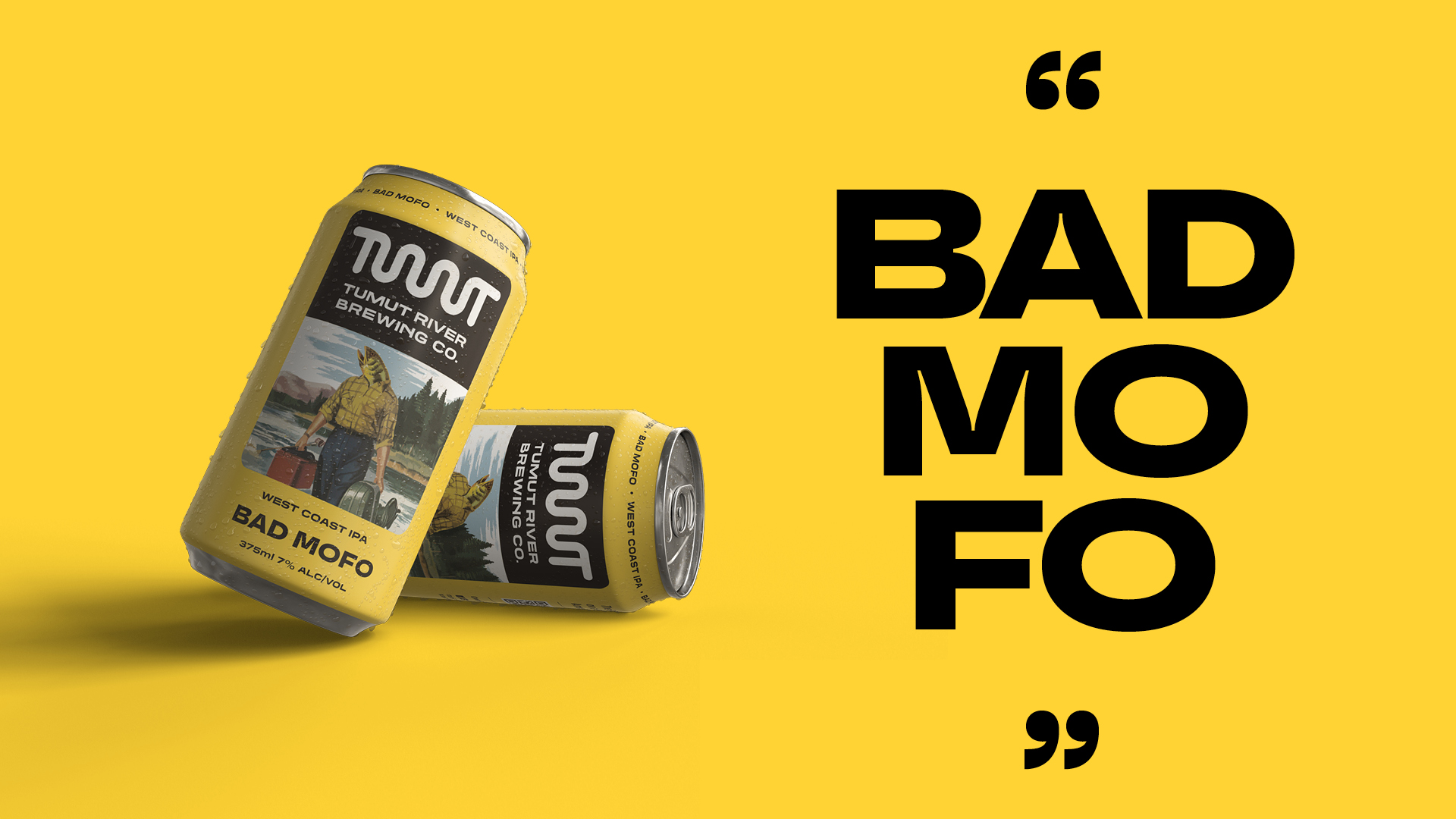
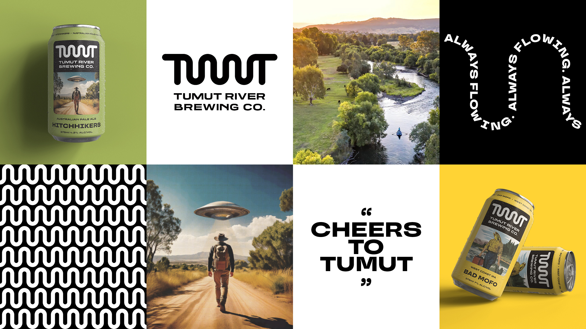
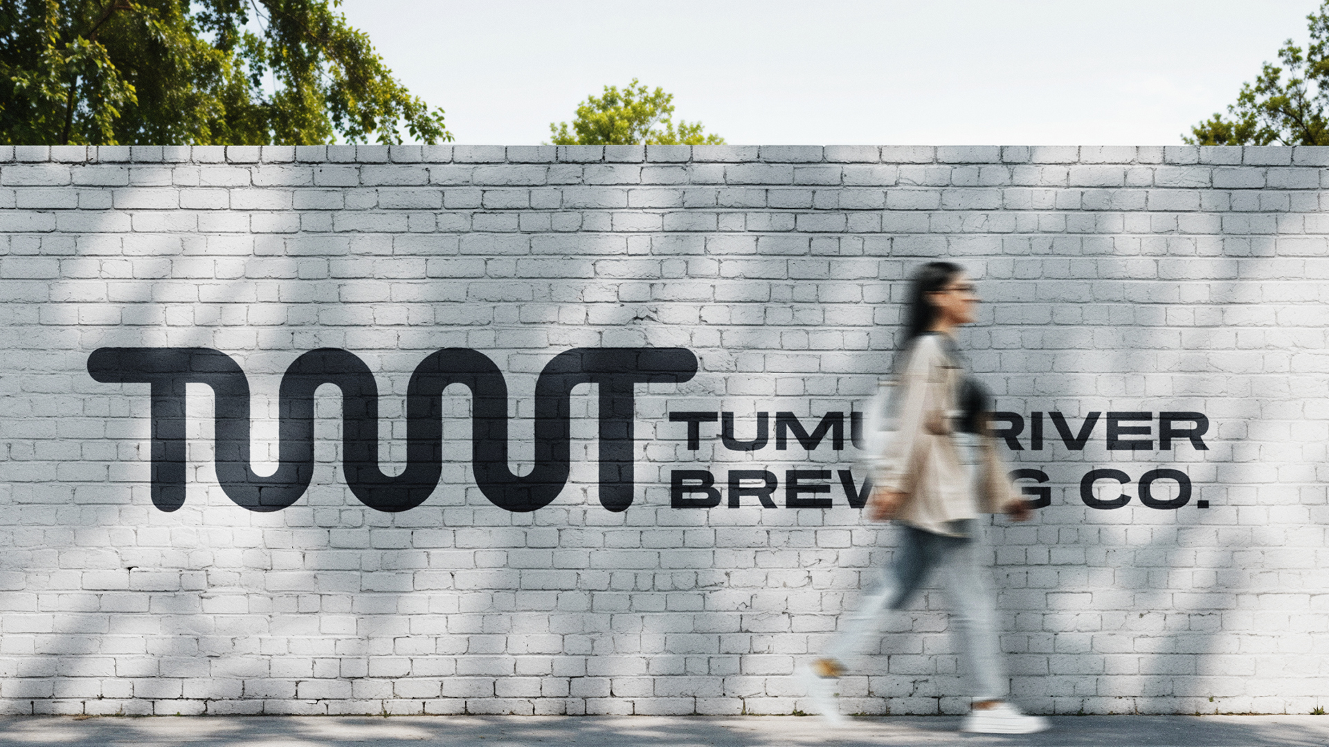
Image Credit :
Project Commissioner
Project Creator
Project Overview
Tumut River Brewing Co. is a fiercely independent regional brewery with big character, bold beers, and a down-to-earth community spirit. Creatik was engaged to deliver a complete brand overhaul, one that would bring cohesion to their range, better reflect their story, and help them punch well above their weight in a competitive craft beer market. We designed a striking visual identity and a packaging system built to scale, enabling the brewery to grow its footprint across bottleshops, bars, and festivals, while staying unmistakably Tumut. The new can designs are unapologetically bold, unapologetically local, and proudly Aussie.
Team
Executive Creative Director, Kylie Gould Creative Director, Dan Clark Brand Story, Louise Thomas Design Director, Adelle Chang Senior Designer, Kasia Froncek Digital Designer, Monet Maher Designer, Jess Harris Motion Design, Lauren Lamotta
Project Brief
TRBC had a loyal following, a growing reputation, and a shed full of beers that customers loved. What they didn’t have was a visual identity that matched their quality, character, or ambition. The team approached Creatik to help define and express who they were and where they were headed, with packaging that would do the talking on shelves and in fridges across the country. The brief was to create a unified identity across the core range and limited releases, with each beer carrying its own personality while still feeling part of a single, recognisable family. The brand had to reflect Tumut's story and soul, and confidently hold its own in the fast-paced craft beer landscape.
Project Innovation/Need
We created a dynamic packaging system that celebrates individuality within consistency. Instead of applying a rigid template, we crafted a framework that allowed the spirit of each beer to shine through, from a fruity pale ale to a full-bodied stout, while reinforcing the TRBC masterbrand. Each can is designed to be collectible, shareable and memorable, using strong colour contrasts, dynamic imagery, and bold typography that catch the eye in crowded fridges. The result is packaging that not only reflects the diversity of the beers inside, but actively drives interest and discovery, from the bar to the bottleshop to social feeds.
Design Challenge
TRBC’s packaging needed to perform in one of the most competitive and visually noisy categories out there. Craft beer is a battlefield of brands, and as a regional brewery without the marketing budgets of bigger players, the design had to work harder. The challenge was to capture the heart of Tumut, authentic, cheeky, and real, while still feeling polished and professional. We also needed to accommodate practical production constraints, using digital print runs and variable SKU management while preserving quality and shelf appeal. The result? A flexible packaging system that is as creative and characterful as the beers themselves, without compromising on production efficiency.
Effectiveness
The rebrand has been transformative. TRBC has seen a significant uplift in retail engagement and on-premise recognition. Customers are not only reaching for the beers, they’re posting about them, talking about them, and coming back for more. The brewery’s presence has expanded well beyond its local roots, supported by a packaging system that travels well and tells a consistent, compelling story. The identity now reflects the business’s confidence, ambition, and spirit, and the cans have become as much a conversation starter as the beer inside. As the TRBC team puts it: “We could not be happier. Creatik has delivered above and beyond. The result is a brand we’re proud to put our name behind.”
Graphic Design - Three Dimensional
This award celebrates creative and innovative design in traditional or digital visual representation of ideas and messages used in packaging. Consideration given to: clarity of communication and the matching information style to audience; the approach, including marketing and branding concerns, the dynamics of the retail environment, environmental considerations, and legal requirements; the component parts of packaging graphics such as colour rationalisation, information layout, feel and tone of illustration and photography, and finishes, and how they are used in isolation and in relation to each other; and the relationship to the anatomy of the structural design.
More Details