Key Dates
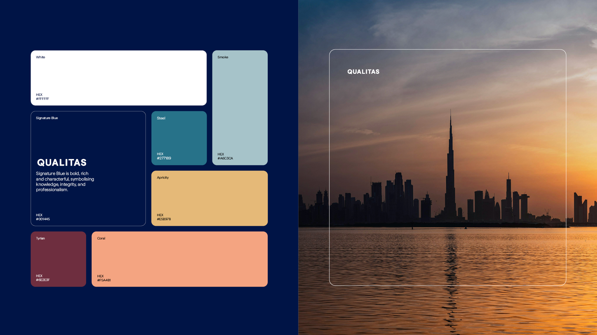
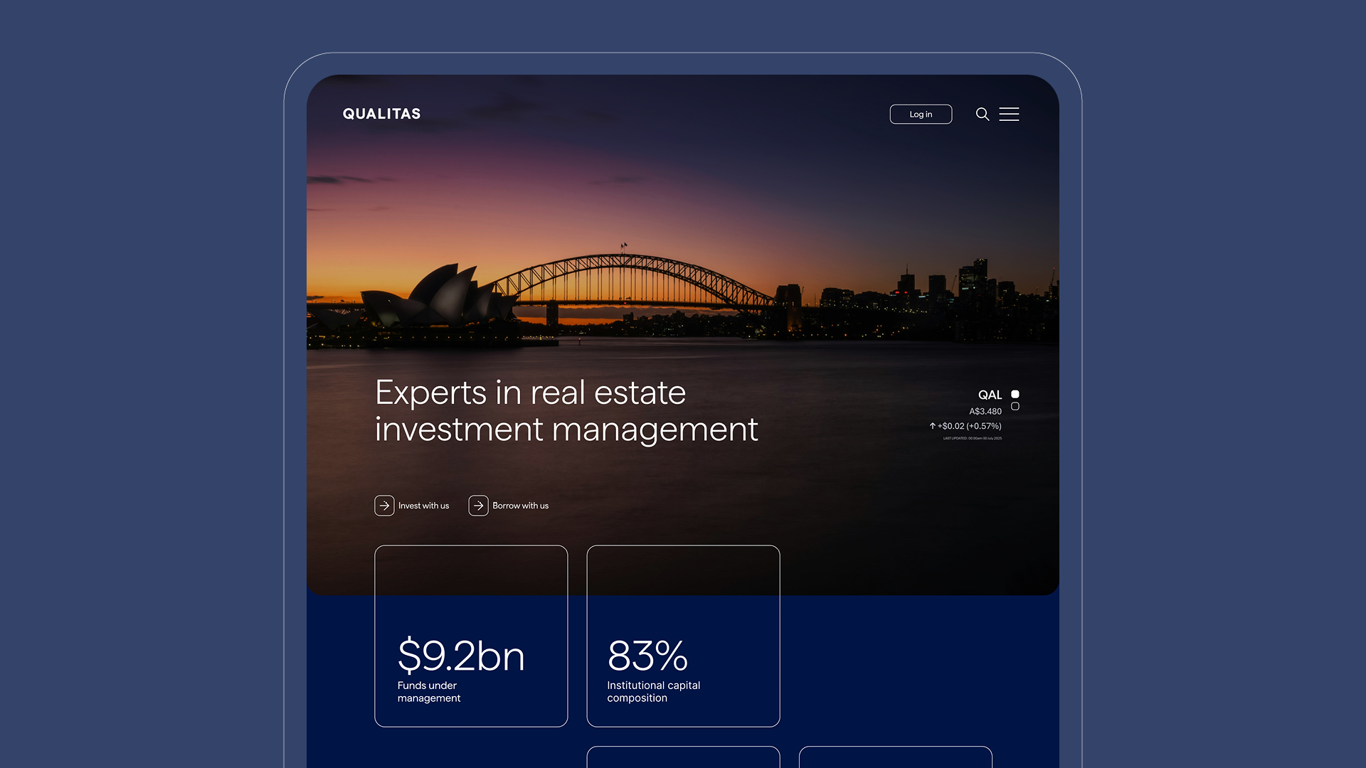
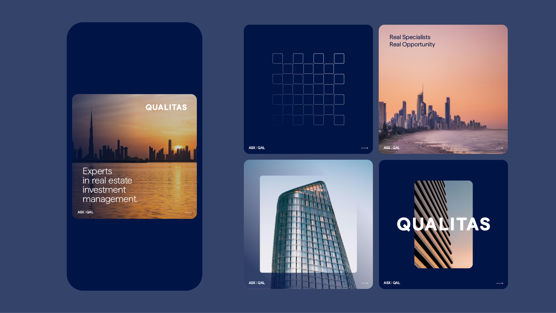
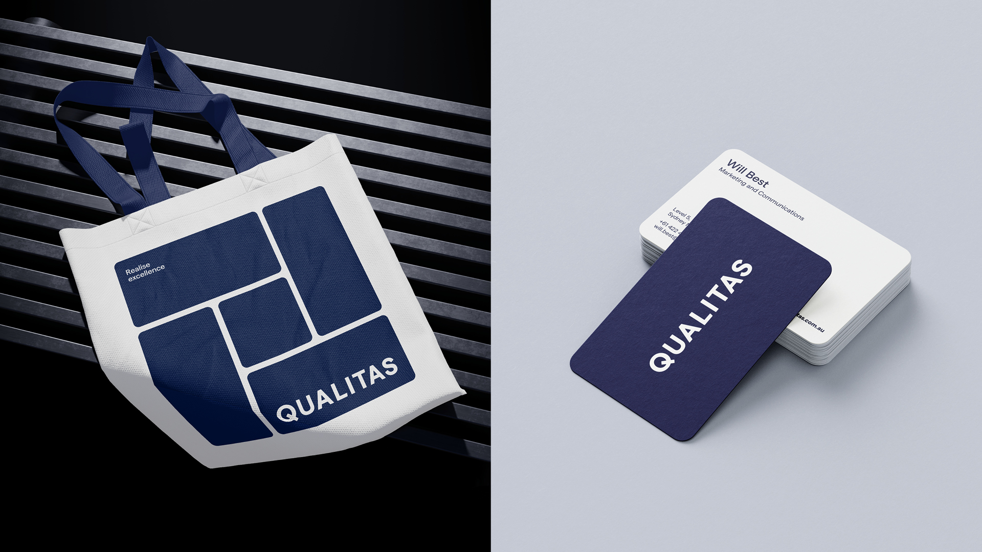
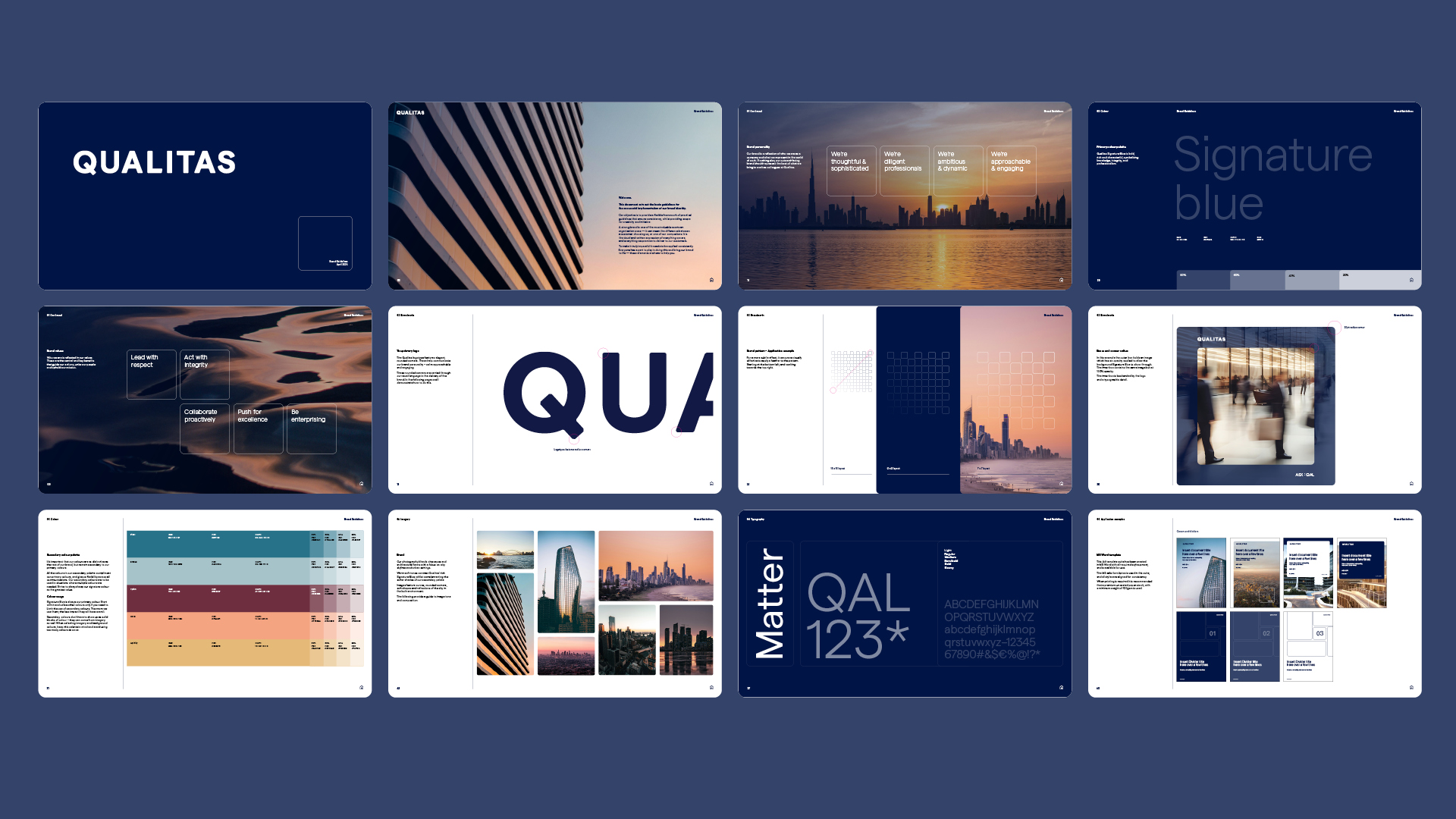
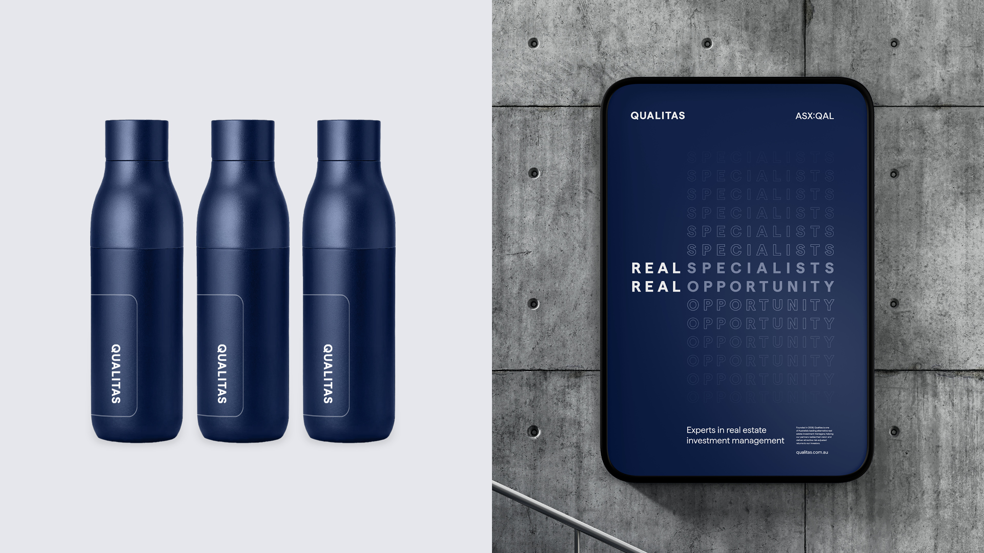

Image Credit :
Project Commissioner
Project Creator
Project Overview
When a leading ASX-listed Australian investment manager decides it's time to ditch the corporate beige and embrace some personality, you know something good is about to happen. The Qualitas Brand Refresh wasn't just about making things look prettier. It was about translating genuine ambition into a brand that could compete globally while staying true to its Australian roots. We took a respected but reserved brand and gave it the confidence to speak up in a crowded room. The result? A complete strategic and visual transformation that positions Qualitas as the smart choice in the alternative real estate investment space, one that's both rigorous and refreshingly human.
Team
Creative Director, Dan Clark Business & Design Director, Adelle Chang Brand Strategy, Louise Thomas Senior Account Manager, Amy Wilson Senior Designer, Kasia Froncek Senior Designer, Alexis Bowman Designer, Jess Harris Designer, Lauren Lamotta
Project Brief
The finance world has a personality problem: everyone sounds identical. In commercial real estate, brands hide behind jargon, same-same messaging, verbose leadership claims and generic imagery, hoping credibility alone will carry them through. Qualitas came to us with a different challenge. They wanted to break free from the pack while maintaining hard-earned trust. Growing fast and thinking globally, their brand was stuck in 2015. The brief was clear: refresh the Qualitas brand, retire the existing Q icon and make it approachable to a broader audience. They wanted to inject personality that reflected the firm's growth trajectory, both now and into the future, while honouring their roots in Australian commercial real estate. They were open to exploring new colours but keen to retain a touch of gold as a nod to their brand heritage. The imagery direction needed to shift from abstract to the built environment, particularly Australian architecture. We needed to create a brand that could command attention in any room, from local Australian deals to international investor meetings.
Project Innovation/Need
Defining Qualitas's brand strategy was the game-changer. Through a short, sharp strategic process, we helped them find the sweet spot between ambition and authenticity, unearthing their brand essence "Realise Excellence." Their essence does double duty. It expresses what Qualitas does (help realise successful investments) and how they do it (with excellence, precision and rigour). It struck the right tone: intelligent without arrogance, ambitious without overreach, becoming the springboard for everything that followed. From this foundation, we shaped a brand personality built on clarity, sophistication and calm confidence. The tone of voice was deliberately stripped of jargon and overstatement, replaced with plain-spoken intelligence. Strategy and design worked hand in hand. The visual system translates their refined brand strategy through geometric foundations. We wanted a distinctive typeface with genuine character. Matter, a grotesque typeface, offered the qualities we needed: subtle warmth through lively forms and diagonal terminals that add unexpected character to geometric structures. These typographic nuances, often overlooked, fundamentally shift how a brand feels and presents. For the wordmark, we crafted a bespoke version of Matter with softened corners to balance authority with approachability. This typographic treatment became the organising design principle for the entire brand system, shaped with rounded squares and rectangles that echo the font’s geometry throughout the identity. These shapes function as flexible layout components, framing imagery, organising content and reinforcing consistency. Every design decision flowed from the strategic foundation, giving Qualitas permission to be genuinely itself: thoughtful and sophisticated, diligent yet dynamic, ambitious but approachable.
Design Challenge
Evolution, not revolution. Qualitas had built genuine equity in the Australian market, so we couldn't tear everything down and start fresh. We needed to honour their heritage while preparing for their next chapter. The existing brand lacked personality and sophistication, but wasn't broken, just playing it too safe. The brief was clear: evolve the brand to reflect its maturity and ambition without losing the trust and reputation built over the last 16 years. Objectives included: • Retire the outdated ‘Q’ icon and refresh the visual identity • Bring personality and confidence into the brand • Align the identity with the firm’s global growth strategy • Create a system that works hard across platforms, especially digital • Shift perception from conservative to considered, from beige to bold Our challenge was to inject character and contemporary thinking without losing hard-earned trust and recognition. We also had to create a system working across vastly different contexts, from intimate client presentations to large-scale international pitches, while maintaining consistency and impact. The visual system needed to feel both established and forward-thinking, credible yet approachable. Most crucially, every element had to work seamlessly across digital platforms, particularly LinkedIn, where Qualitas increasingly engages with global audiences. The rounded geometric forms we developed became the perfect solution: distinctive enough to own, flexible enough to adapt, and sophisticated enough to elevate every touchpoint.
Effectiveness
The new brand delivers exactly what Qualitas needed. It strikes a balance between strength and sophistication. It better reflects the firm’s ambition, sharpens its voice in the market, and equips the business with the tools to communicate confidently across audiences and platforms. The flexible visual system has streamlined its communications, making everything from pitch decks to LinkedIn posts feel cohesive and distinctly Qualitas. Internal feedback has been overwhelmingly positive. The marketing, investment, capital and senior leadership teams feel the brand finally reflects who they are and where they're going. They're no longer blending into the background in competitive markets. The brand isn't just working; it's enabling Qualitas to show up as the thoughtful, sophisticated, and ambitious firm it's always been. The system's flexibility means it can grow with them as they continue to expand their reach and influence in the global commercial real estate market.
Graphic Design - Identity and Branding - Finance
This award celebrates creative and innovative design in the traditional or digital visual representation of ideas and messages. Consideration given to clarity of communication and the matching information style to audience.
More Details