

Project Overview
Vinidex, a leading provider of piping systems, partnered with Focus Creative to revitalise its brand identity and re-establish its position as an industry leader. The brief was to modernise the brand while retaining the trust and loyalty of long-standing customers, a delicate balance between evolution and reinvention.
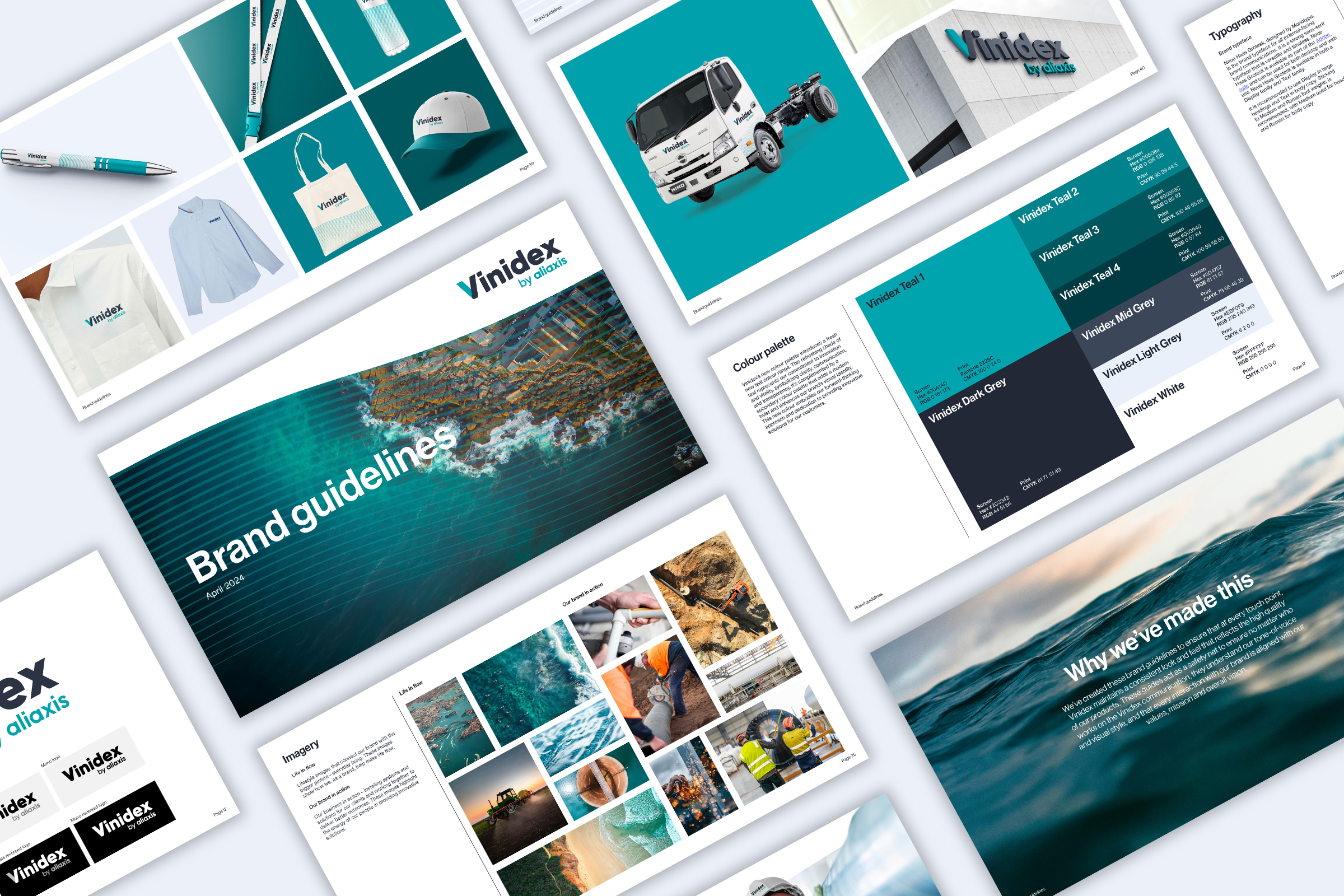
The result is a bold, dynamic identity built on a distinctive wave motif that visually connects brand communications across digital, print and environmental touchpoints. Focus Creative delivered a full brand rollout, including logo, typography, photography, iconography, motion assets, templates and livery, underpinned by robust brand guidelines.
Crucially, the rebrand process was inclusive and consultative, engaging stakeholders at every step to ensure alignment. The final identity presents Vinidex as a future-focused business with strength, clarity and energy, all while honouring its legacy.
Project Commissioner
Project Creator
Team
Creative Director: Carlos Jonmundsson
Strategy: Ellie Moss
Creative Lead: Alex Ferguson-Kang
Client Strategist: Ellee Richardson
Project Brief
Vinidex needed a brand identity that could do two things at once: retain the confidence of existing clients and spark interest among new business-to-business audiences. The challenge was to position the company as a leader in an industry often viewed through a cost-first lens.
Focus Creative was tasked with developing a modern identity that reflected Vinidex’s quality, innovation and ambition. However, the rebrand couldn’t alienate long-standing customers or internal teams.
The brief was not only to design a visual identity, but to carefully guide the organisation through a transformative journey. Success depended on building trust across multiple stakeholder groups, through a structured process, thoughtful concepts and consistent consultation.
The result was a brand system that confidently signals a new era for Vinidex while maintaining continuity with the brand’s heritage and values.
Project Innovation/Need
At the heart of the new brand identity is a unique wave device: a dynamic visual element that unifies communications across all touchpoints. This distinctive graphic builds instant recognition while evoking movement, strength and flow; a perfect metaphor for the brand’s core offering.
To manage the delicate task of transformation, Focus Creative began with deep consultation, engaging internal stakeholders to understand their appetite for change. This included a brand discovery phase, where we ran collaborative workshops and conducted interviews with the sales team to uncover key insights. These sessions directly informed the messaging framework, which played a critical role in shaping the new brand positioning.
Research into competitor positioning helped identify a space where Vinidex could differentiate itself visually and strategically. A phased concept process moved from subtle brand refreshes to bold reinventions, helping the client gain confidence in a full redesign. This journey not only brought key decision-makers on board but also helped shift internal perceptions of what the brand could become.
The final system captures the trust of the past and the energy of the future, resulting in an innovative yet respectful reimagining of an industry brand.
Design Challenge
This project required sensitive handling of legacy perceptions and strong stakeholder relationships. While the business was ready to evolve, many clients and staff felt emotionally invested in the existing brand.
The challenge lay in crafting a visual identity that moved the brand forward without alienating its loyal base.
Focus Creative began by exploring a range of concepts, from evolutionary to revolutionary and used these to open conversations across stakeholder groups. As trust built, the appetite for change increased.
Simultaneously, we addressed industry-specific challenges: creating standout in a largely functional, cost-driven sector, and building a visual language that reflected not just what Vinidex does, but what it stands for.
Time was invested upfront to ensure the design process would run smoothly, from clear templates and design logic to collaboration infrastructure. The result was a rebrand that felt fresh, strategic and embraced by the full organisation.
Effectiveness
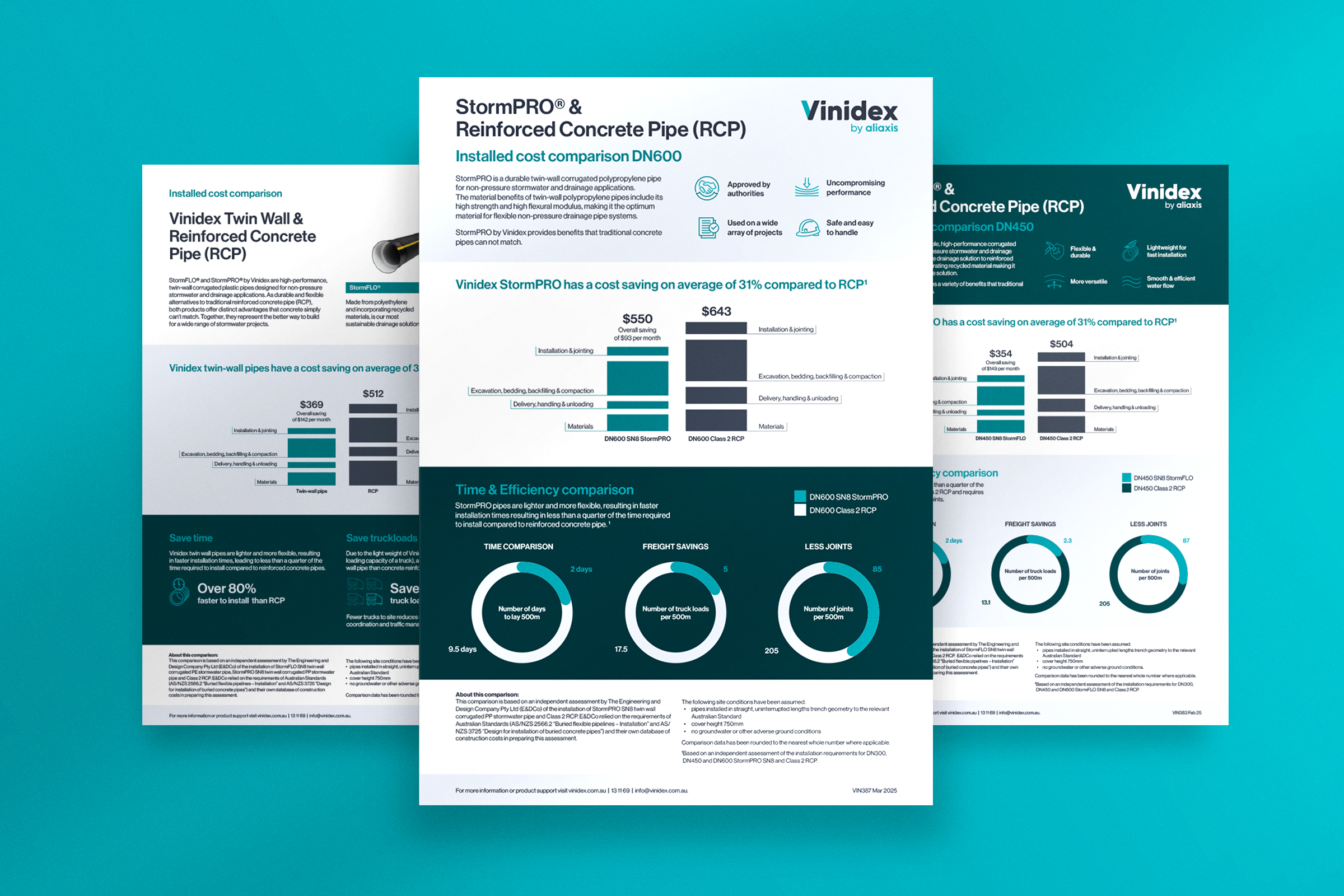
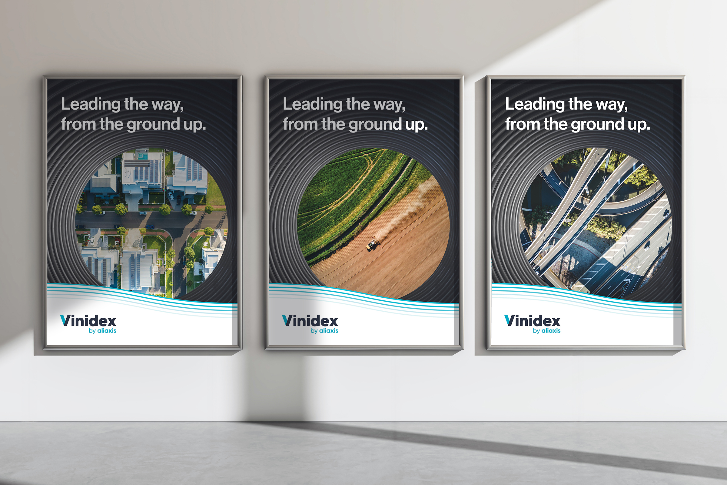
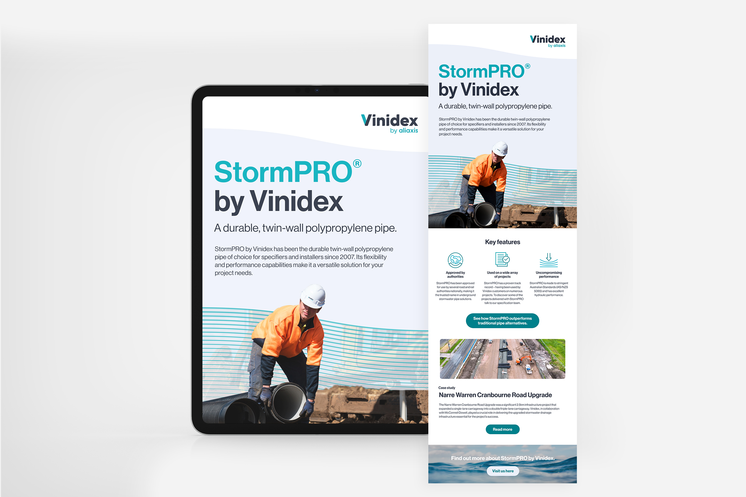
The final brand was implemented across every major channel, including digital assets, video content, corporate templates, vehicle livery and signage, all supported by a robust brand guidelines book.
Consistency was ensured through a centralised visual language and the appointment of a brand custodian, who worked alongside designers to manage one-off applications without compromising core identity elements.
The internal response was enthusiastic, with stakeholders feeling ownership of the result. The new brand identity has energised teams and brought clarity to communications, while supporting ongoing marketing, tendering and internal alignment.
Client feedback was resoundingly positive:
“Focus Creative understood the sensitivities of evolving our brand and made sure that the process was inclusive and contained key stakeholder check-ins to ensure all parties were included in the decision-making process. The end result was a well-crafted and considered new brand identity that captures the energy and ambition of our business.” – Melissa Waters.
Graphic Design - Identity and Branding
This award celebrates creative and innovative design in the traditional or digital visual representation of ideas and messages. Consideration given to clarity of communication and the matching information style to audience.
More Details

