


Project Overview
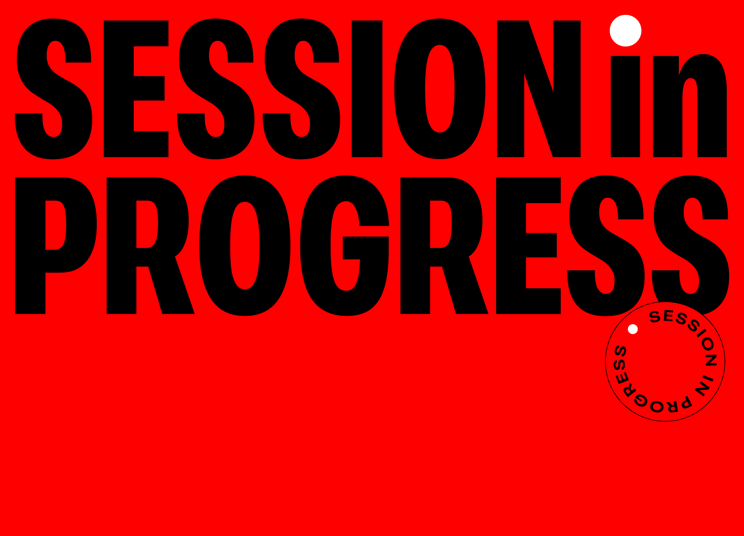
Session In Progress is a video podcast production brand built around the universal recording symbol — always recording, always evolving. The brand identity centres on a single, instantly recognisable graphic element: the red recording circle. This simple device becomes a dynamic system that expands, contracts and interacts with type to reflect conversation in motion. Accessibility was a key consideration, with bold colour contrast, clear form and adaptable type creating a system that performs across digital platforms and screen sizes. Paired with a refined palette and variable typography, the brand captures the rhythm of dialogue — from bold, emphatic moments to quiet pauses — delivering an identity that feels dynamic, clear and highly flexible.
Project Commissioner
Project Creator
Team
Studio White Noise:
Andreas Pranoto Creative Director
Lauren Messina Design Director
Ross Karabelas Director
SESSION in PROGRESS:
Angus O'Loughlin Director & Founder
Amelia Stamos Executive Producer
Project Brief
The brief was to create a distinctive, flexible identity for a new video podcast production company — one that would immediately communicate recording, feel recognisable across platforms, and scale seamlessly across motion, social, merchandise and digital applications. Accessibility, clarity and instant recognition were core requirements, alongside a visual system that could evolve with every episode, guest and conversation.
Project Innovation/Need
In a saturated podcast and content production space, SESSION in PROGRESS required a brand that stood apart visually and functionally. Many competitor brands rely on templated or static design systems. This identity needed to feel immediate, energetic and adaptable, while ensuring that colour, scale and type worked clearly across devices, social platforms and content thumbnails — essential for podcasting and video-first audiences.
Design Challenge
The identity system is designed for movement and clarity. The red recording circle shifts, scales, and adapts like a visual echo of conversation. Variable typography mirrors natural speech patterns — some moments bold, others light — while maintaining clear readability at every size. High contrast colour, simplified form,s and deliberate scale ensure accessibility remains consistent across devices, formats and screen environments.
Effectiveness
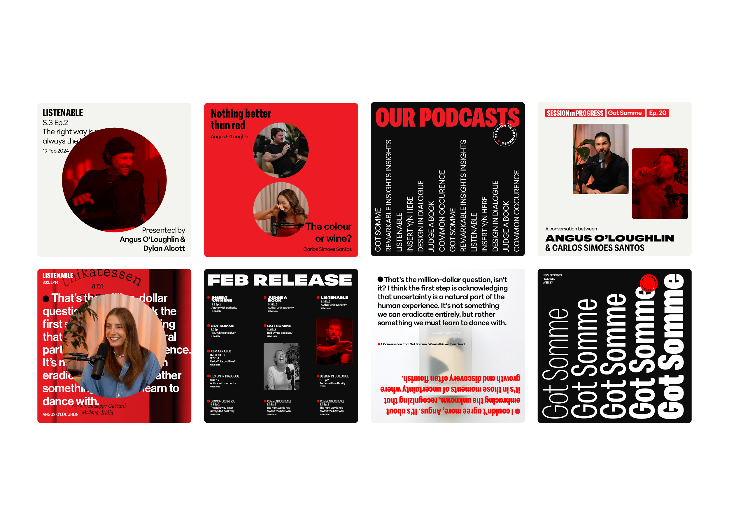
The identity seamlessly extends across digital platforms, episode graphics, thumbnails, motion graphics, merchandise and brand collateral. The recording symbol serves both as the logo and a flexible graphic device across every touchpoint, allowing for strong brand recall while maintaining constant visual interest as the system evolves.
Graphic Design - Identity and Branding
This award celebrates creative and innovative design in the traditional or digital visual representation of ideas and messages. Consideration given to clarity of communication and the matching information style to audience.
More Details