
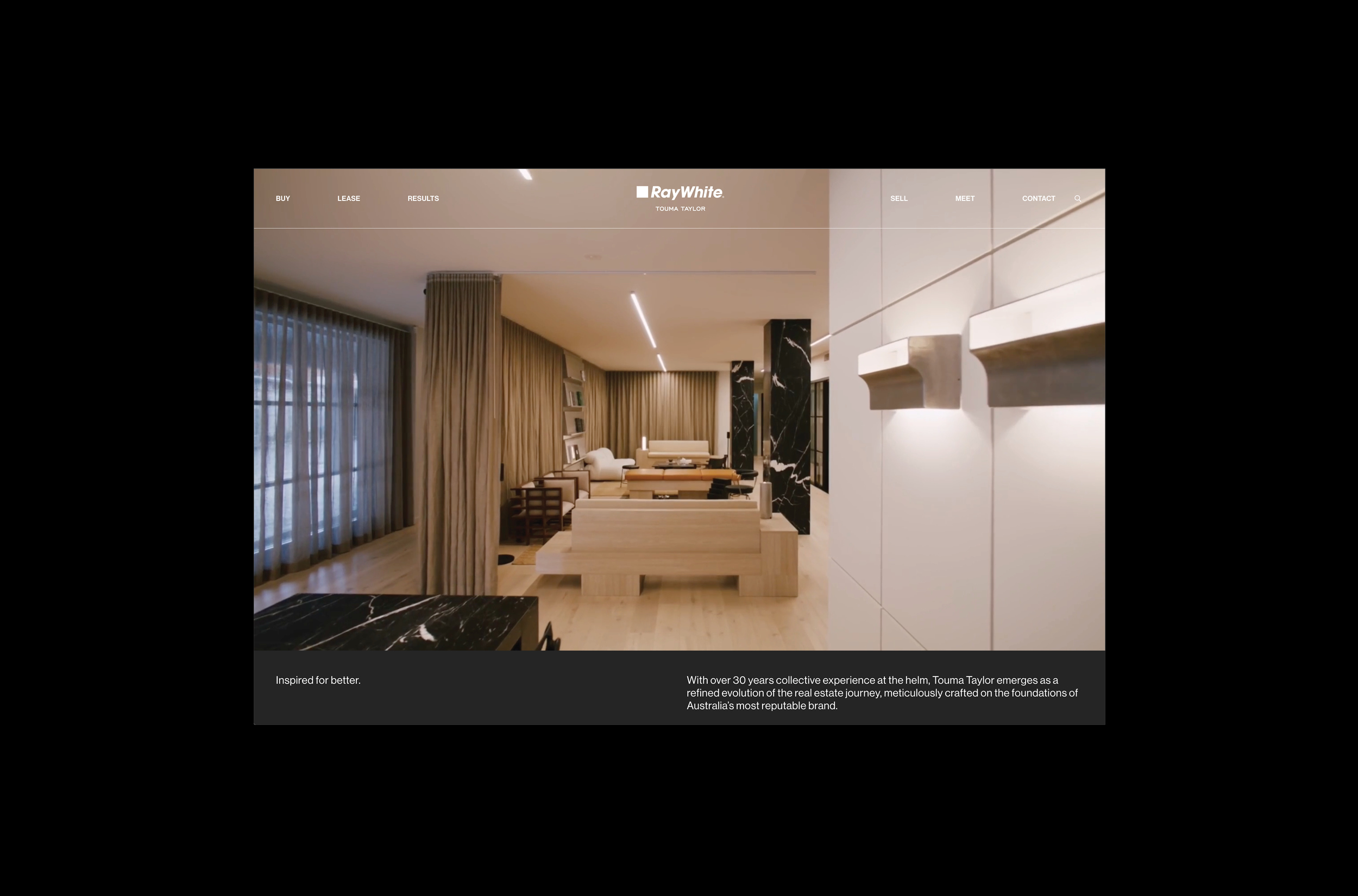
Project Overview
Touma Taylor is the next evolution of a powerhouse real estate partnership, Charles Touma and Peter Taylor, who have worked together for nearly 25 years under the Ray White banner. We were tasked with redefining their identity into a standalone brand that respects Ray White’s legacy while elevating the experience for a new generation of design-aware clients. The result is a refined, confident brand that signals both continuity and bold progression: a future-facing identity that feels as sharp and disciplined as the business itself.
Project Commissioner
Project Creator
Team
Designer Fransiska Sylvia
Creative Director Jessica Longmore
Art Director Fransiska Sylvia
Finished Artist Fransiska Sylvia
Writer Tim Longmore
Project Steering Tim Longmore
Account Manager Chiara Mckellar
Project Brief
Touma Taylor needed a new identity to signal their leadership, while still retaining the trust and recognition of the Ray White name. The brief was clear: create a brand that reflects their performance and precision, but also introduces warmth, personality, and lasting visual clarity.
Our response was an identity that is intentionally understated but deeply confident. A tone of voice that is intelligent without arrogance. A palette and type system that is elegant yet assertive. Every brand touchpoint, from signage to stationery to campaign films, was designed to uphold a premium feel, anchoring Touma Taylor as a sophisticated force in the competitive Sydney property market.
Project Innovation/Need
The brand honours Ray White’s legacy while redefining what a real estate identity can look like within the group. Where many brands pursue visibility through overstatement, Touma Taylor takes a different approach, one of quiet confidence and purposeful restraint. The innovation lies in its clarity: a system built around minimalist, modular design and sharp messaging that instils trust without noise.
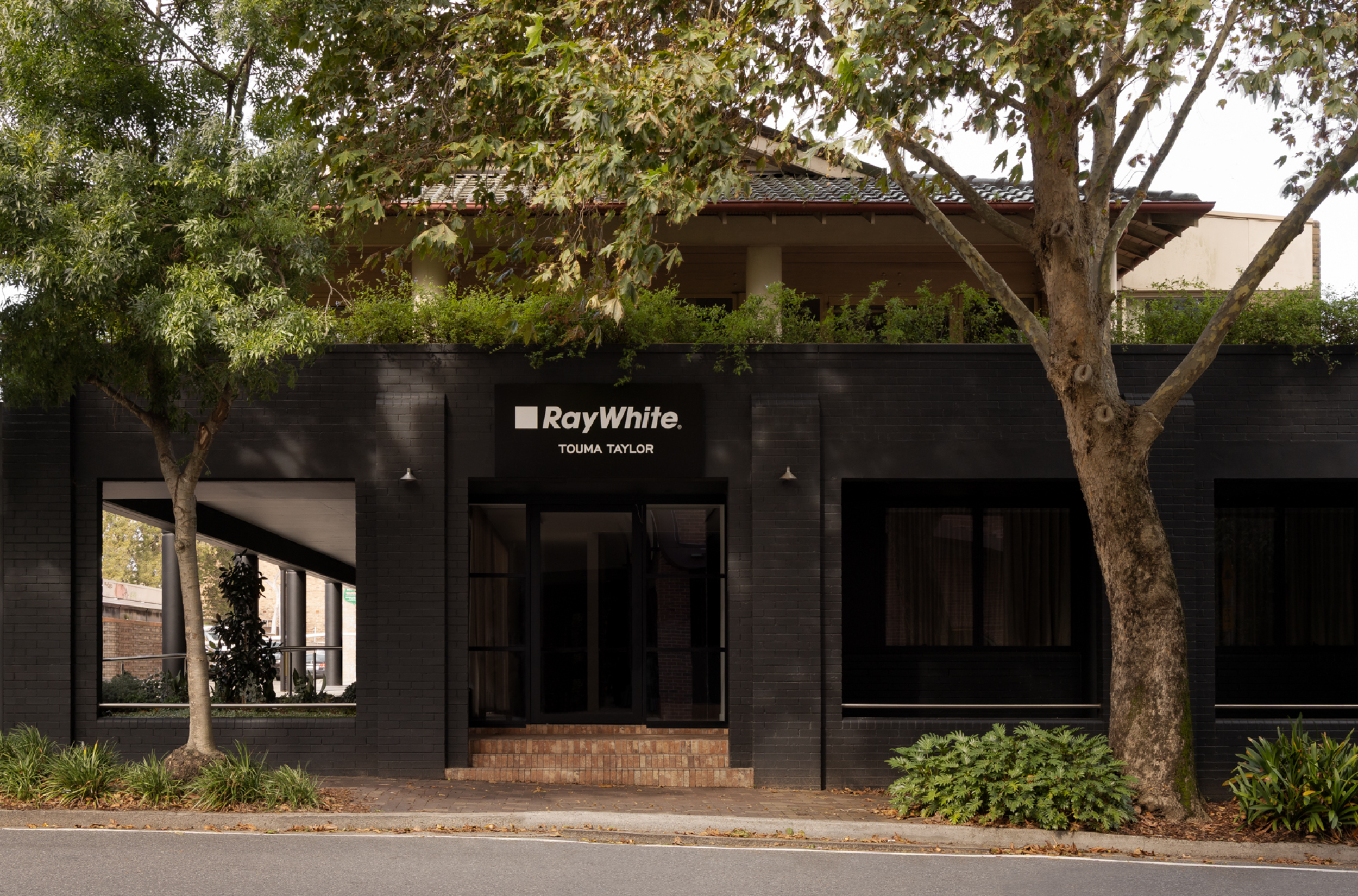
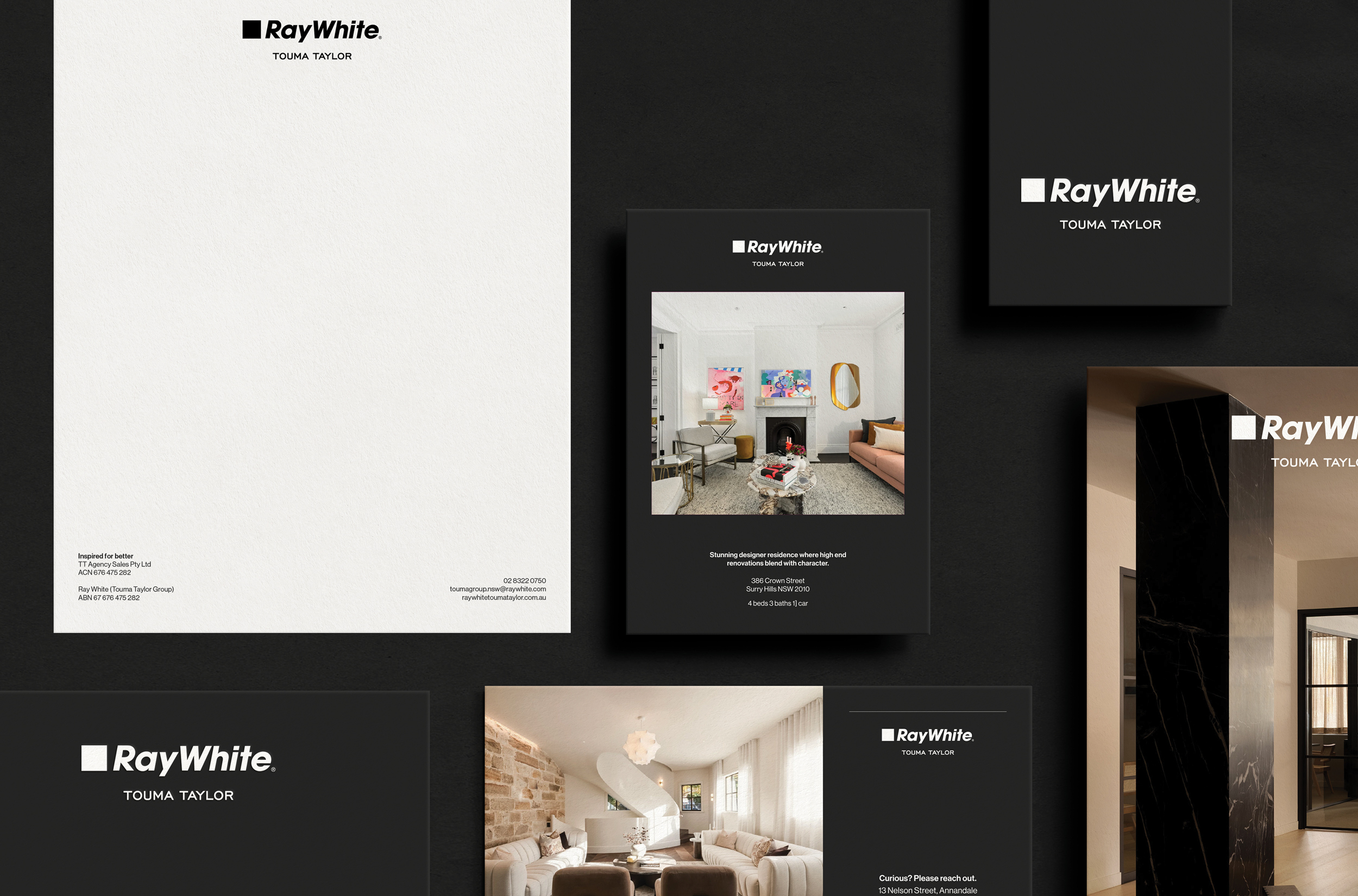
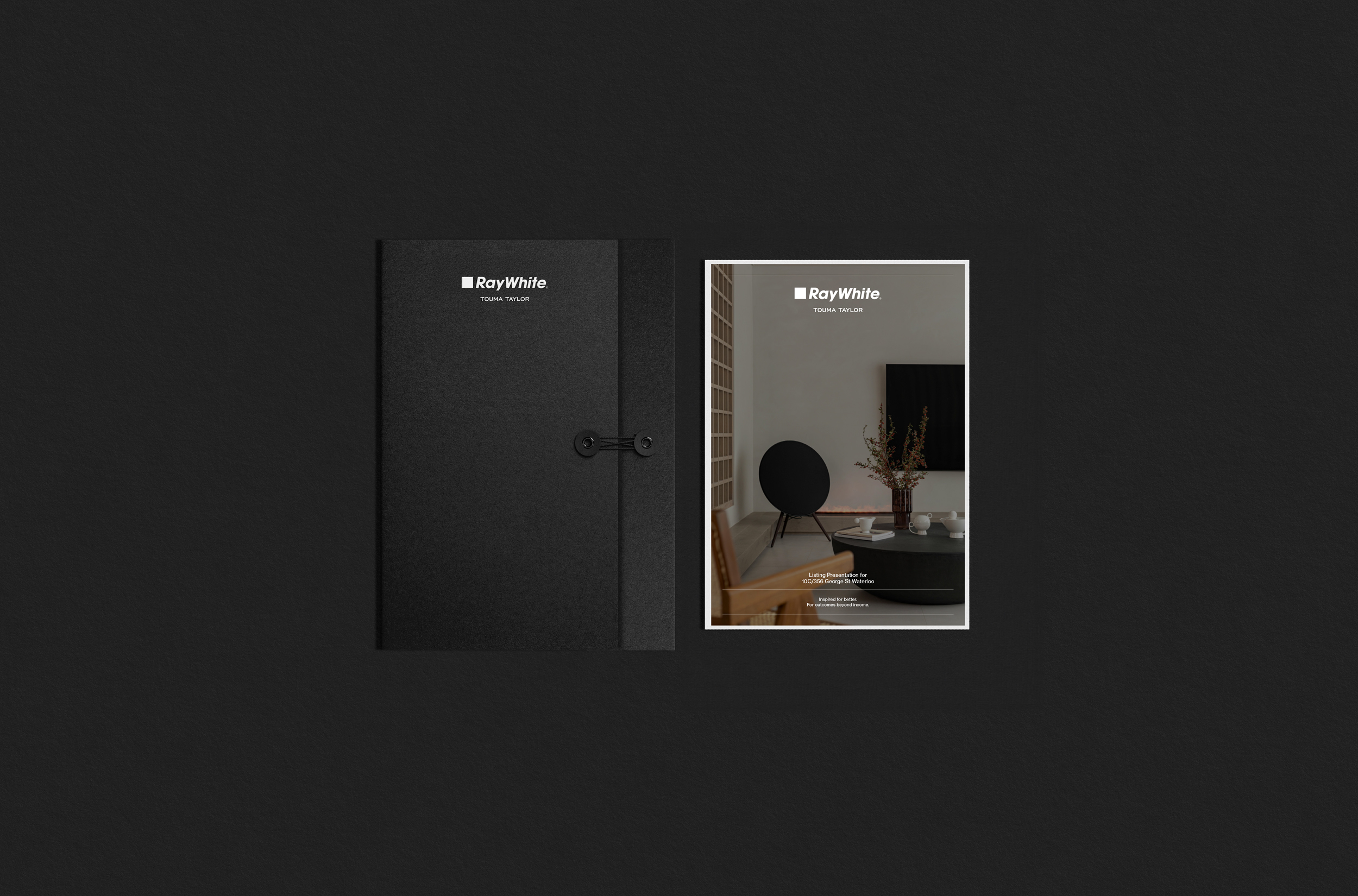
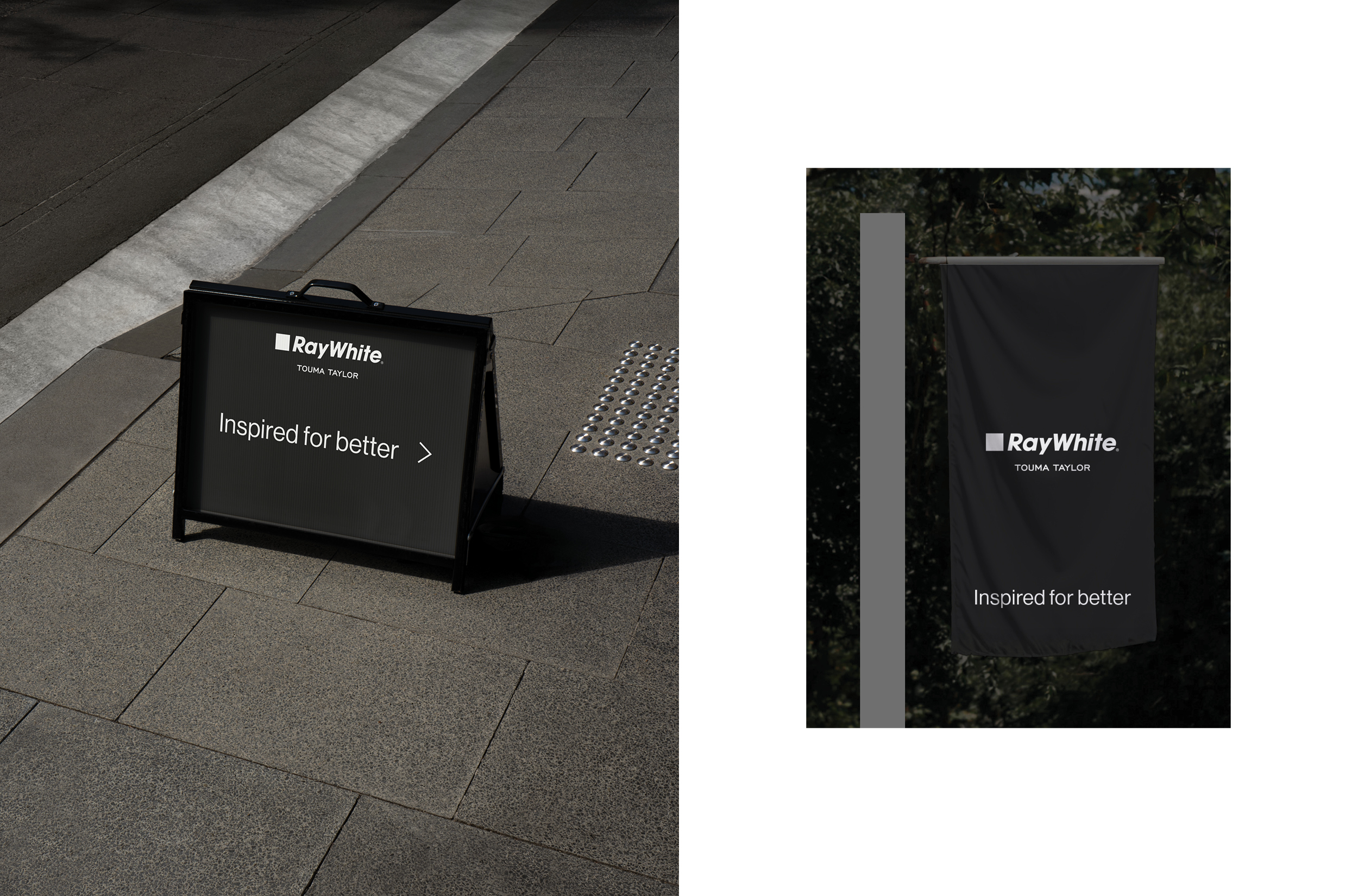
A typographic language that feels architectural and deliberate gives the brand its distinctive edge. The introduction of black as a primary brand colour, uncommon within the Ray White ecosystem, further sets Touma Taylor apart. Its use is intentional: black conveys confidence, precision, and permanence. It strips away distraction, allowing the finer details, tone, typography, and spatial hierarchy to speak with greater clarity and control. It’s bold, but never brash. Timeless, not trendy.
The system respects the Ray White structure, yet confidently carves out its own visual and tonal footprint. The brand tone, “Inspired for better,” acts as both a client promise and internal compass, reinforcing the firm’s ambition at every level.
From digital experiences to physical spaces, the identity is consistently applied with considered detail. Interiors mirror the brand’s clean lines; social content feels editorial, not transactional. In a saturated category, Touma Taylor offers something rare: calm authority and enduring appeal.
Design Challenge
The core challenge was striking the right balance between Ray White’s national recognition and Touma Taylor’s local, boutique personality. The brand needed to evolve without disconnecting from its legacy. That meant building enough visual independence to resonate with new clientele while remaining cohesive with Ray White’s system.
We also needed to express both founders’ values, precision, trust, and forward-thinking, without creating a brand that felt sterile. Through typographic nuance, refined composition, and intelligent messaging, we created an identity that bridges tradition with transformation.
Effectiveness
The Touma Taylor rebrand has delivered immediate and measurable results. Within weeks of launch, the team reported a notable increase in both high-value listings and direct inquiries, particularly from vendors seeking a premium selling experience. The refined brand presence has enabled them to attract a more design-aware clientele, better aligned to the elevated nature of their offering.
Under the new brand, Touma Taylor successfully secured a new franchise office within the Ray White group, expanding into Potts Point | Elizabeth Bay, an important milestone that has extended their footprint and elevated their presence in one of Sydney’s most desirable precincts. The expansion affirms the brand’s strengthened positioning: better presence, bigger reach. Additionally, the elevated platform has helped recruit new talent, reflecting the internal alignment and external appeal of the transformation.
Online engagement across social and digital channels has surged, with marked improvements in reach and click-through rates. The cohesive identity and campaign tools have streamlined internal workflows, allowing the team to present more compelling, consistent proposals across all touchpoints.
Internally, the rebrand has elevated team pride and reinforced a culture of precision and purpose. Externally, Touma Taylor is now perceived as a design-led market leader, prompting industry peers to take note and setting a new standard within Ray White and beyond.
The results confirm it: this is not just a new look, but a strategic transformation. A brand that reshapes perception, drives performance, and signals a bold new chapter.
Graphic Design - Identity and Branding - Property - Services
This award celebrates creative and innovative design in the traditional or digital visual representation of ideas and messages. Consideration given to clarity of communication and the matching information style to audience.
More Details