Project Overview
Welcome to the future of Baby Bunting.
With a new leadership team, an ambitious growth strategy, and a complete overhaul of its customer experience underway, it was time for the Baby Bunting identity to evolve.
Having already worked with Baby Bunting on their strategic repositioning, The General Store was engaged to create a bold new brand expression that would bring the new positioning to life. Our goal: design an identity that aligns with the brand’s revolutionary Store of the Future concept, while expanding its accessibility, modernising its image, and creating deeper emotional connection with the next generation of caregivers - all in pursuit of our vision: to create the best start for the brightest future.
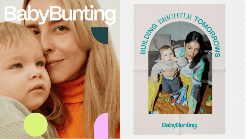
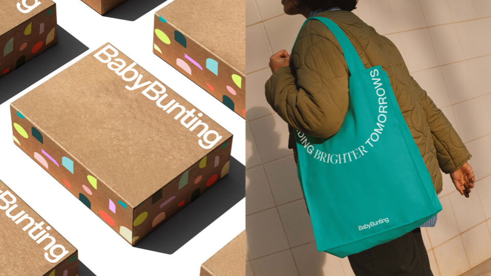
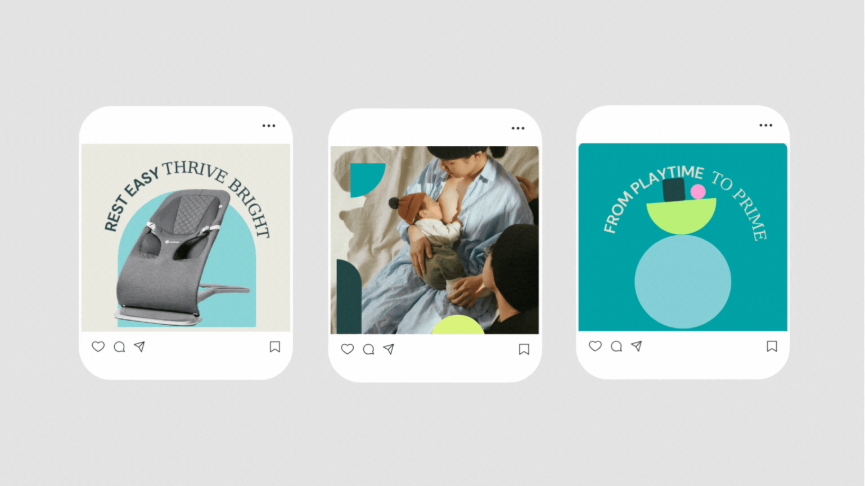
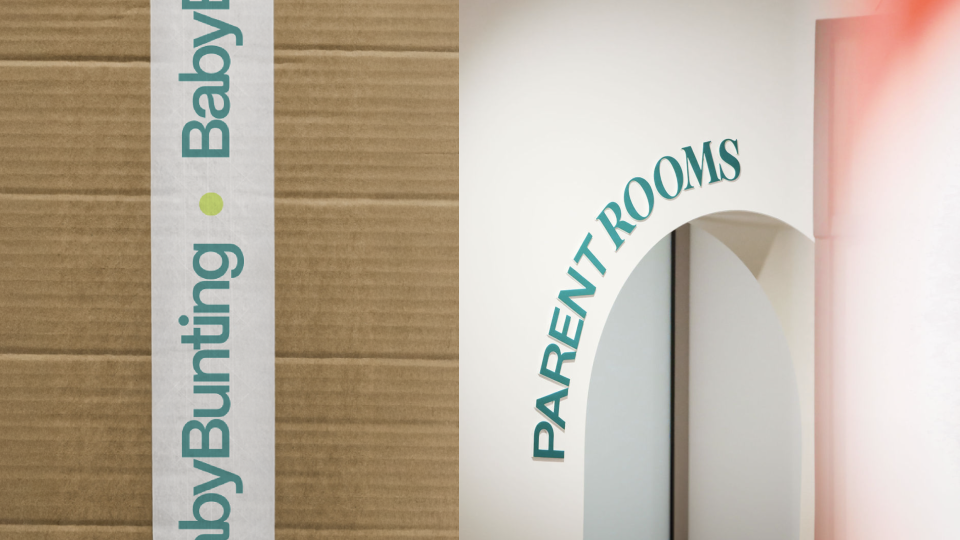
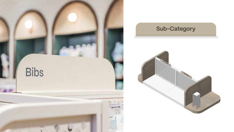
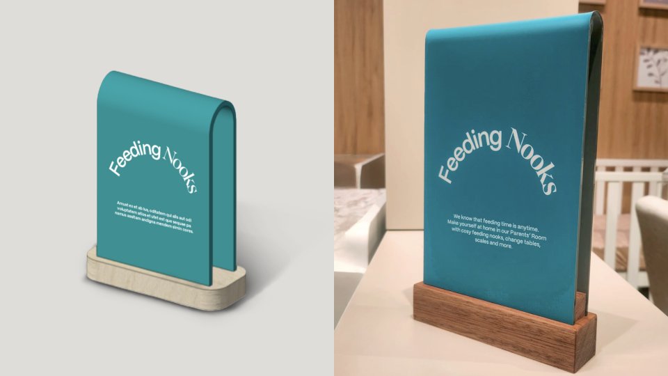
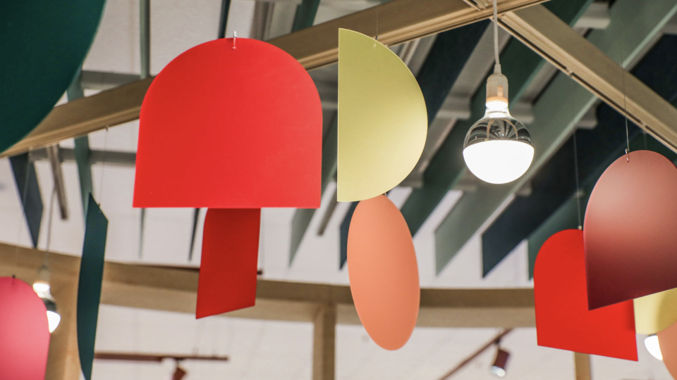
At the heart of our solution is a confident, connected wordmark: letterforms built with intention, subtly symbolising the bonds between parent and child, and between customer and brand. The supporting identity system is expressive yet minimal, optimistic but grounded. The colour palette, evolved from Baby Bunting’s equity teal, offers warmth, flexibility, and breadth. Custom shapes derived from the wordmark form the basis of a dynamic graphic system, used across digital, retail, packaging and communications.
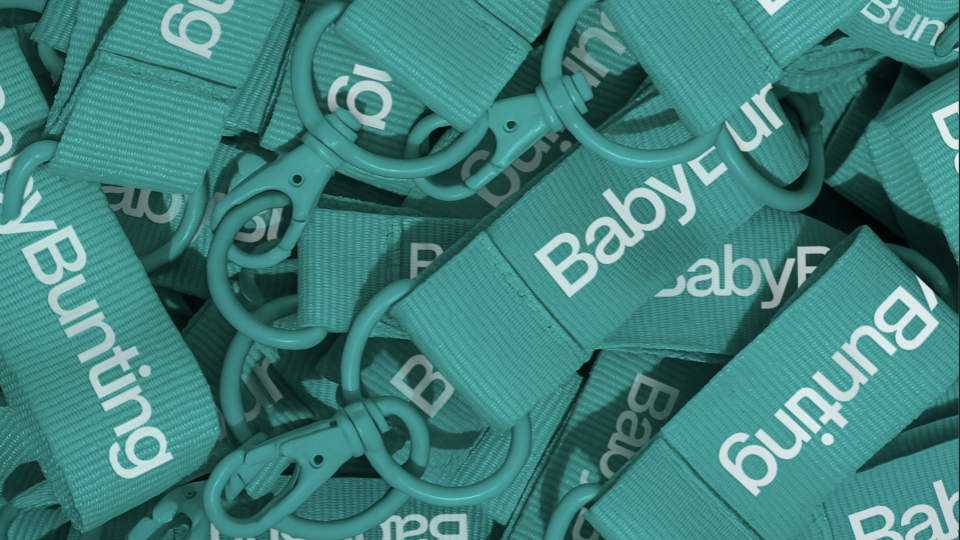
Everything was designed to work hard across every channel, from the tiniest social tile to in-store signage, uniforms, and e-comm packaging. And the results are already clear: the flagship store has significantly outperformed projections and fast-tracked Baby Bunting’s network-wide transformation.
This is a brand built for real life. Equal parts emotional, practical and future-proof.
Project Commissioner
Project Creator
Team
Madeleine Livesey
Genevieve Read
Project Brief
With a new executive team and an ambitious growth strategy in place, Baby Bunting was ready to transform. The General Store had already led the strategic repositioning and developed the Store of the Future concept. Now it was time for the brand identity to catch up.
The brief was clear: evolve a legacy brand into one that reflects a more progressive, inclusive and emotionally honest experience for today’s parents - and tomorrow’s. That meant designing a visual identity that could scale with the business, hold its own against new, design-led competitors, and connect with a broader, more diverse audience.
The old logo, with its separated double Bs symbolising two pregnant bellies, unintentionally signalled exclusivity, speaking narrowly to one experience, rather than the full spectrum of caregivers. At the same time, the identity held significant brand equity, particularly in the recognisable teal. We needed to evolve, not erase, retaining what people connected with, while reimagining the brand for a broader, more progressive future.
We also understood the emotional context. The joy of discovering a baby is on the way can quickly turn into anxiety and overwhelm, especially when navigating a complex retail environment. The new brand had to do more than look good. It needed to feel like a support system. Optimistic, relatable, and grounded in reality.
Project Innovation/Need
This identity reimagines what a parenting brand can look and feel like. Designed not for babies, but for the people raising them.
Where the category is often cluttered with cutesy, pastel-heavy aesthetics, Baby Bunting’s new identity is modern, refined and human. We designed it through the eyes of the caregiver, not the child, creating a system that balances optimism with authenticity, and maturity with emotional warmth.
At the core is a confident, connected wordmark. Each letterform is crafted with purpose, with subtle links between characters that symbolise support, connection and care. It’s a visual metaphor for the bond between parent and child, and the role Baby Bunting plays in that journey. In motion, the letters come to life with gentle, anthropomorphic gestures that add personality without being gimmicky.
We evolved the teal - a key piece of Baby Bunting’s brand equity - into a flexible, inclusive palette, supported by geometric shapes derived from the wordmark itself. These shapes form the foundation of a graphic system that works across physical, digital and social environments, giving the brand a visual language that’s instantly recognisable and endlessly adaptable.
Every element was tested for accessibility, versatility and relevance, from type to uniforms to packaging. This was not about chasing trends. It was about building a brand with lasting impact. One that reflects real life, meets real needs, and has room to grow with the next generation of parents.
Design Challenge
The biggest challenge was balance. We were designing for a new generation of parents - primarily Gen Z - while also needing to retain trust and relevance for existing customers. The identity had to feel modern and aspirational, but also warm, human and deeply accessible. Push too far in either direction, and we risk alienating key audiences.
This was especially complex in a category that spans emotional extremes, from the euphoria of expecting a child to the anxiety and overwhelm that often follows. We needed a visual system that could carry both lightness and honesty, optimism and realism. A brand that could meet people wherever they were on the parenting journey.
The other challenge was longevity. The new identity couldn’t chase trends or feel overly tied to this moment in time. It had to hold up across evolving channels, generations, and retail formats. We built the foundations around minimalist, enduring design principles: a strong wordmark, versatile shapes, and a refined, future-focused palette. Seasonal elements, campaign layers, and content could then be added flexibly, without compromising the integrity of the core system.
Designing for this kind of breadth - demographically, emotionally, and across environments - requires clarity, restraint and precision. Every choice had to earn its place.
Effectiveness
The new brand identity played a pivotal role in the successful launch of Baby Bunting’s flagship Store of the Future - a retail experience also designed by The General Store. The brand gave the store clarity, presence and emotional connection, helping it significantly outperform its business model.
The response from customers and internal teams has been overwhelmingly positive. As a result, Baby Bunting has committed to accelerating its transformation program, with plans to roll out the new identity and experience across more stores nationwide.
Graphic Design - Identity and Branding
This award celebrates creative and innovative design in the traditional or digital visual representation of ideas and messages. Consideration given to clarity of communication and the matching information style to audience.
More Details