Key Dates
11 Dec -Extended Deadline
14 Dec -Judging
17 Dec -Winners Announced
-
categories
-
Architecture
-
Interior Design
-
Interior Design - International Residential - Executive Suite
-
Space Plus
Space Design
-
Product Design
-
Communication Design
-
Advertising & Marketing
-
Service & System Design
Experience Design
-
Digital Innovation
-
Web & App Design
-
Better Future
Transformative Design
-
- quick start guide
- nominate
- past winners
- home
Mountain Dew Redesign 2025
PepsiCo | Graphic Design - Identity and Branding
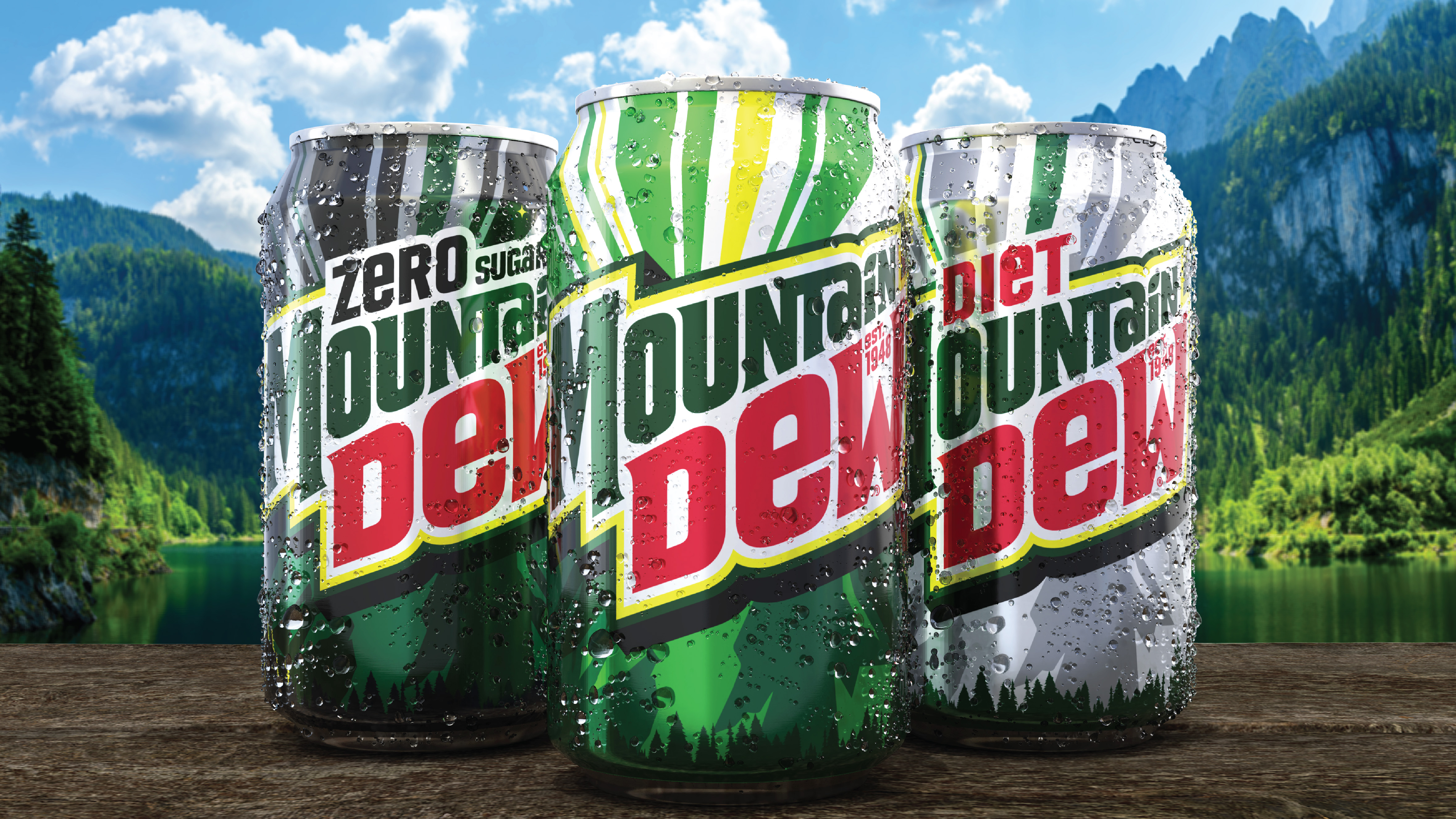
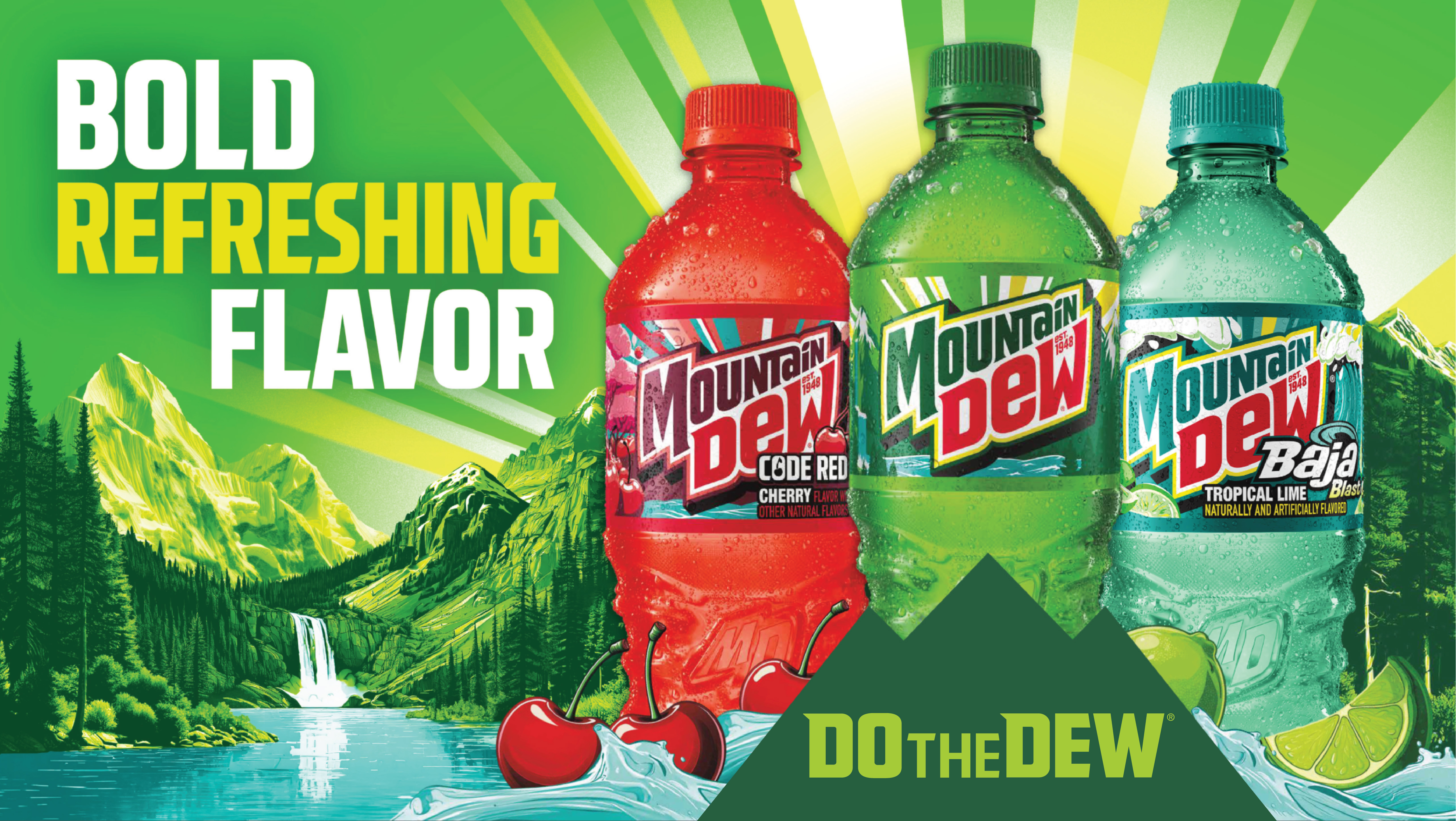
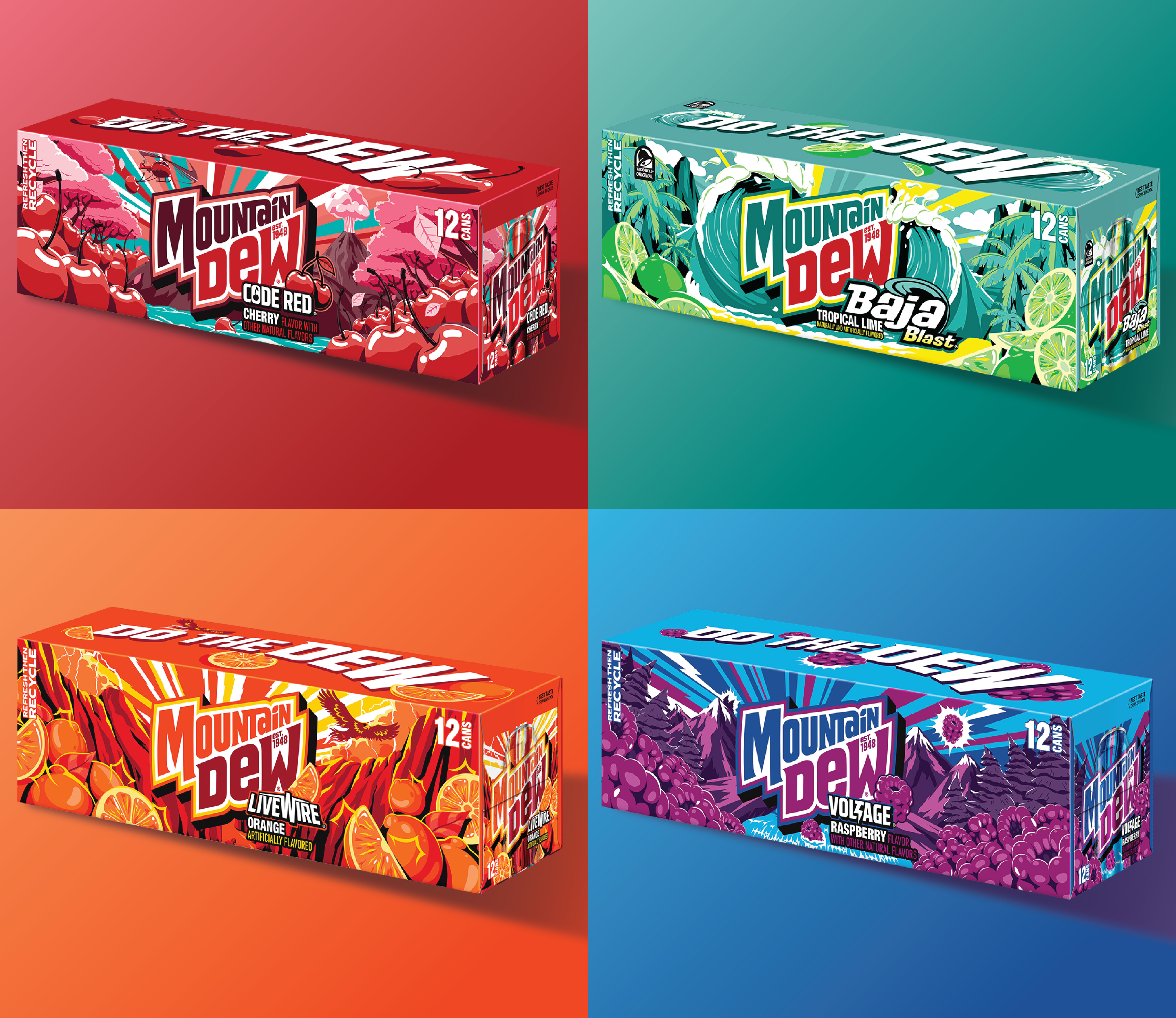
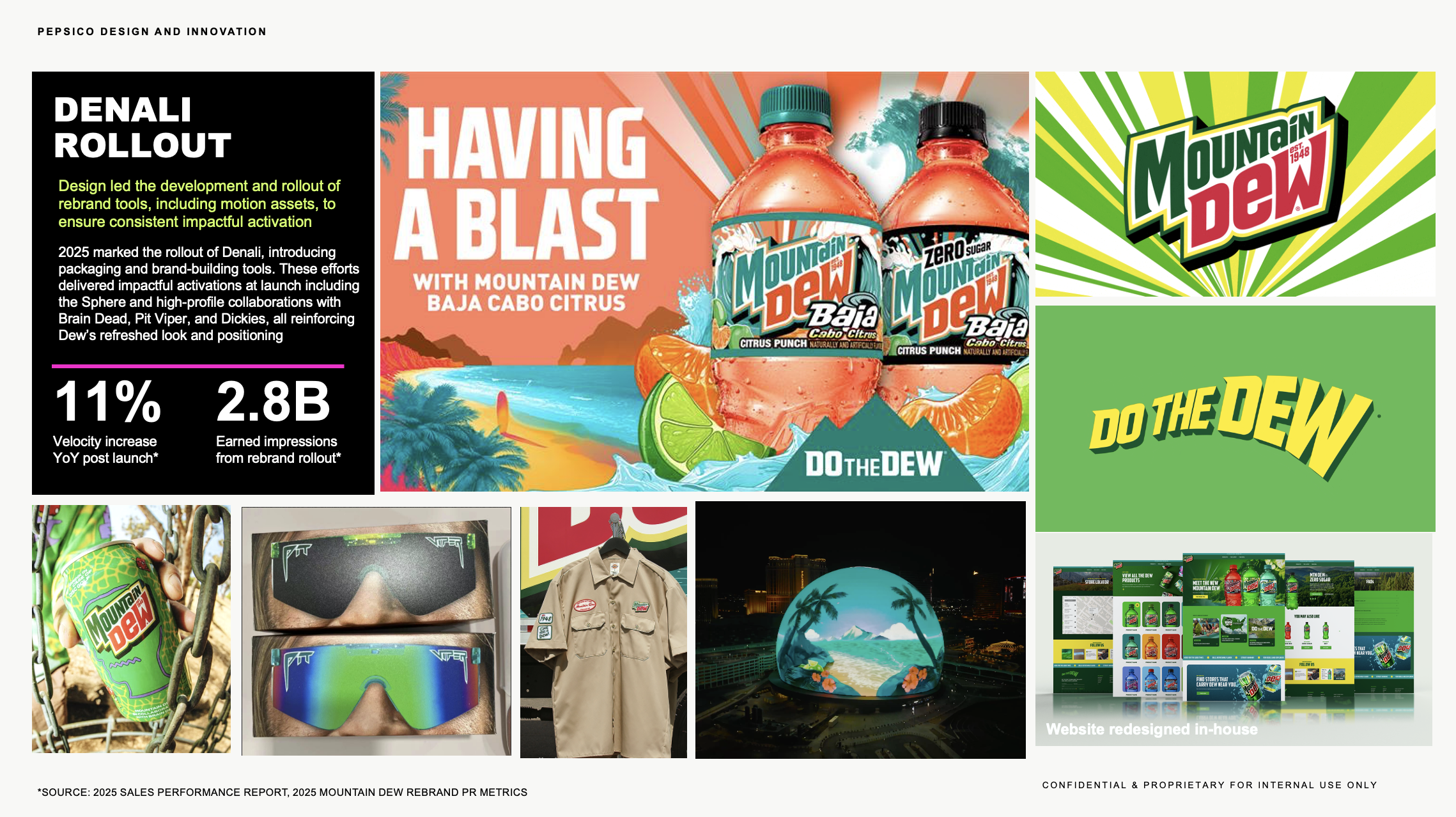
Image Credit : PepsiCo
Project Overview
After 14 years as MTN DEW, the brand is turning over a new leaf and going back to its roots as Mountain Dew. We created a new visual identity that celebrates our heritage while boldly looking ahead, with inspired landscapes, nods to our fruity flavor portfolio, softer angles, and refreshed colorways. Our team brought all the flavor, refreshment, and outdoorsy optimism of Mountain Dew to this approachable and adventurous new look.
Organisation
Team
PepsiCo
Project Brief
Mountain Dew had long been synonymous with high-energy beverages, action sports, and gaming culture. But as younger Millennials and Gen-Z audiences sought more inclusive and uplifting brands, the brand risked feeling too niche and too extreme. We saw an opportunity to reconnect through a more optimistic lens: outdoors, good times, and immersive flavor worlds. We aimed for a nostalgic, yet modern visual identity rooted in natural refreshment, turning a once-polarizing brand into one that invites everyone in and honors our legacy DEW drinkers. As a key business priority, we assembled an internal task force to deliver one of the biggest brand updates in recent history. We successfully launched the rebrand in under a year.
Project Innovation/Need
Nostalgia was our North Star throughout this redesign. The new logo shifts away from the sharp, extreme energy of the previous brand mark. We reintroduced the full Mountain Dew name, softened the wordmark’s angles, and added a citrus leaf icon over the “i” to highlight flavor. We included the brand’s founding year to reinforce heritage and build trust. Inspired by vintage WPA National Parks posters, our packaging artwork and other supporting elements embrace an outdoorsy feel with stylized landscapes and sunburst patterns that evoke refreshment and exploration. A new color system brings in sunlit yellows, energetic blues, and richer greens, while each flavor is anchored in a “V” formation, giving prominence to taste in every scene.
Design Challenge
This rebrand marks one of the most significant shifts in Mountain Dew’s history. Consumer testing showed that the updated visual identity increased purchase intent and associations with refreshment, taste, and fun. The new design successfully reframes Mountain Dew as more inviting, more flavorful, and more in tune with today’s culture, while still respecting what Dewnation (the brand’s diehard fanbase) loves most.
Effectiveness
With retro-modern design and inviting outdoor aesthetics, Mountain Dew is ready to refresh a whole new generation. PR METRICS TO-DATE: 618 pieces of coverage, garnering 2,802,488,924 potential earned impressions 94% positive to neutral sentiment
Graphic Design - Identity and Branding
This award celebrates creative and innovative design in the traditional or digital visual representation of ideas and messages. Consideration given to clarity of communication and the matching information style to audience.
More Details