Key Dates
19 Dec -Judging
05 Jan 2026 -Winners Announced
-
categories
-
Architecture
-
Interior Design
-
Space Plus
Space Design
-
Product Design
-
Communication Design
-
Graphic Design - Identity and Branding - Property - Commercial
-
Graphic Design - Identity and Branding - Property - Lifestyle
-
Graphic Design - Identity and Branding - Property - Services
-
Advertising & Marketing
-
Service & System Design
Experience Design
-
Digital Innovation
-
Web & App Design
-
Better Future
Transformative Design
-
- quick start guide
- nominate
- past winners
- home
SunRice Group
SunRice Group / Hulsbosch | Graphic Design - Identity and Branding - Corporate
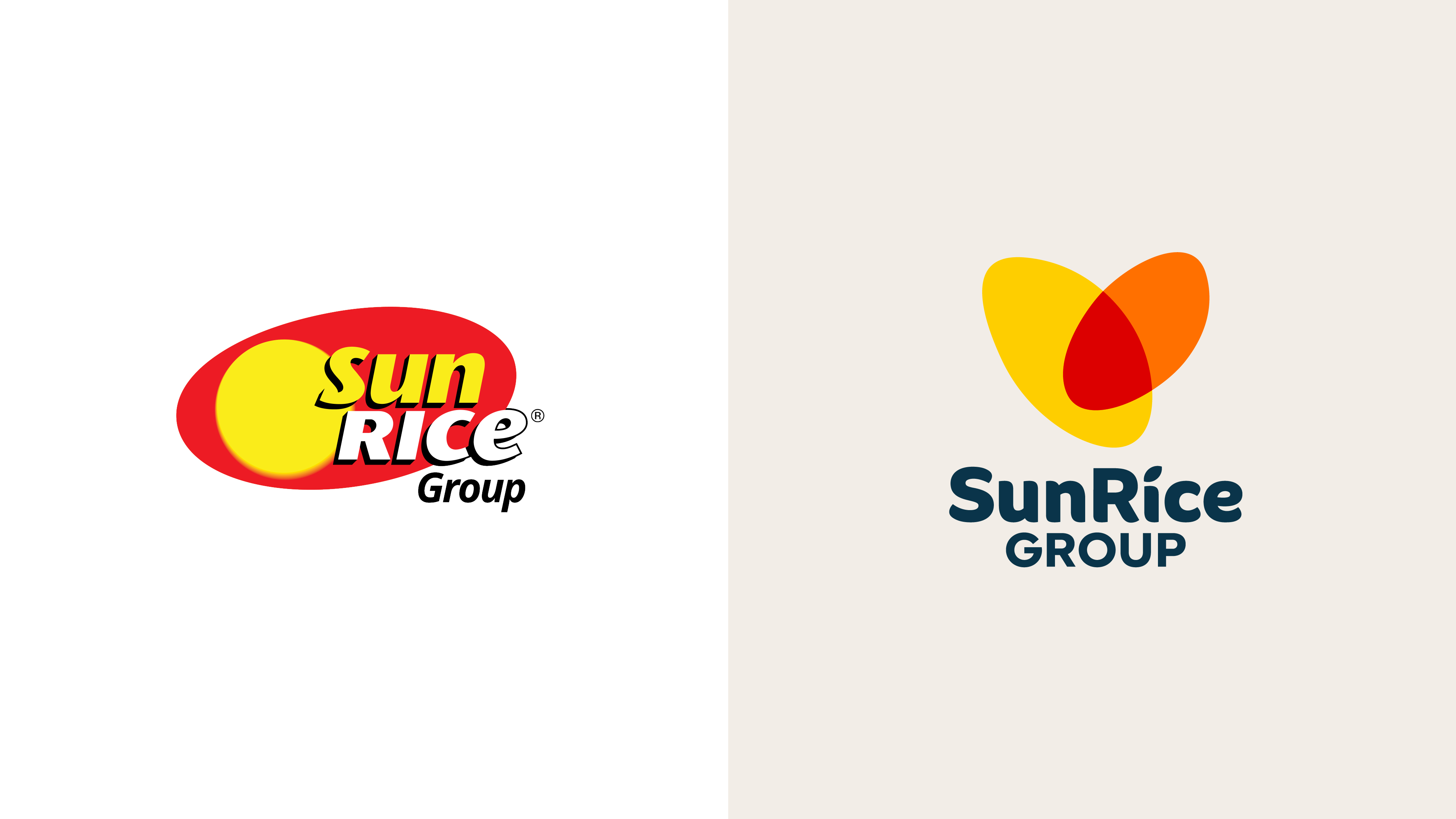

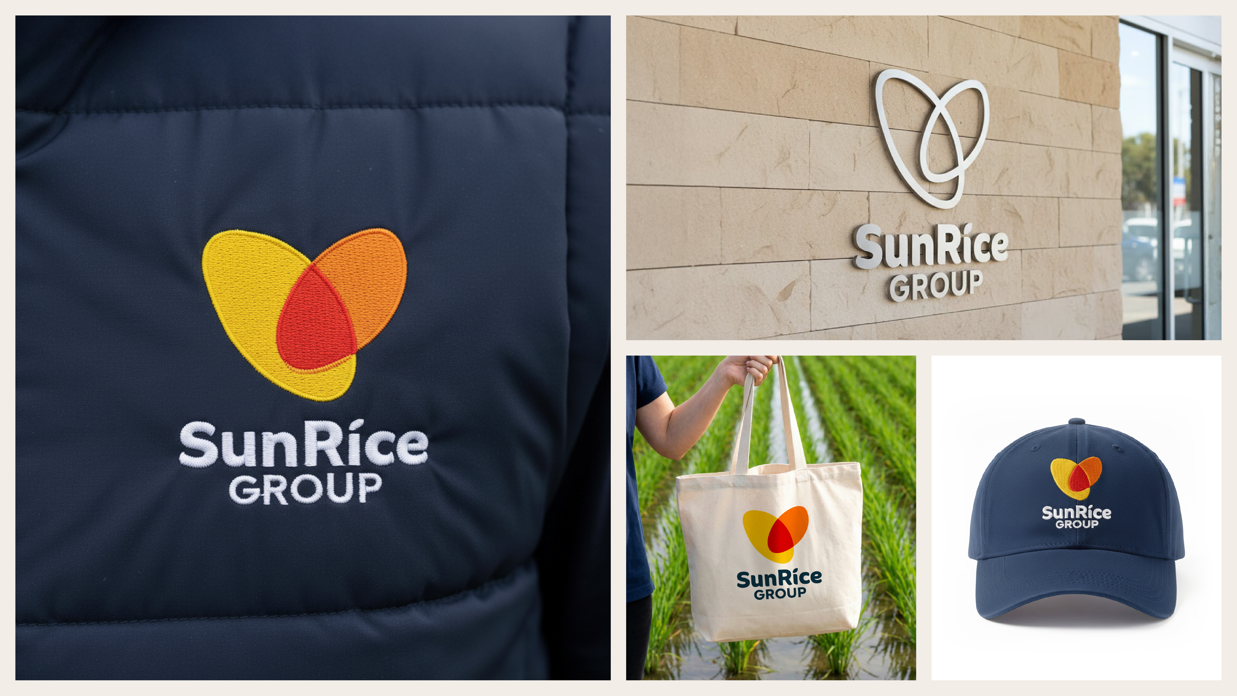
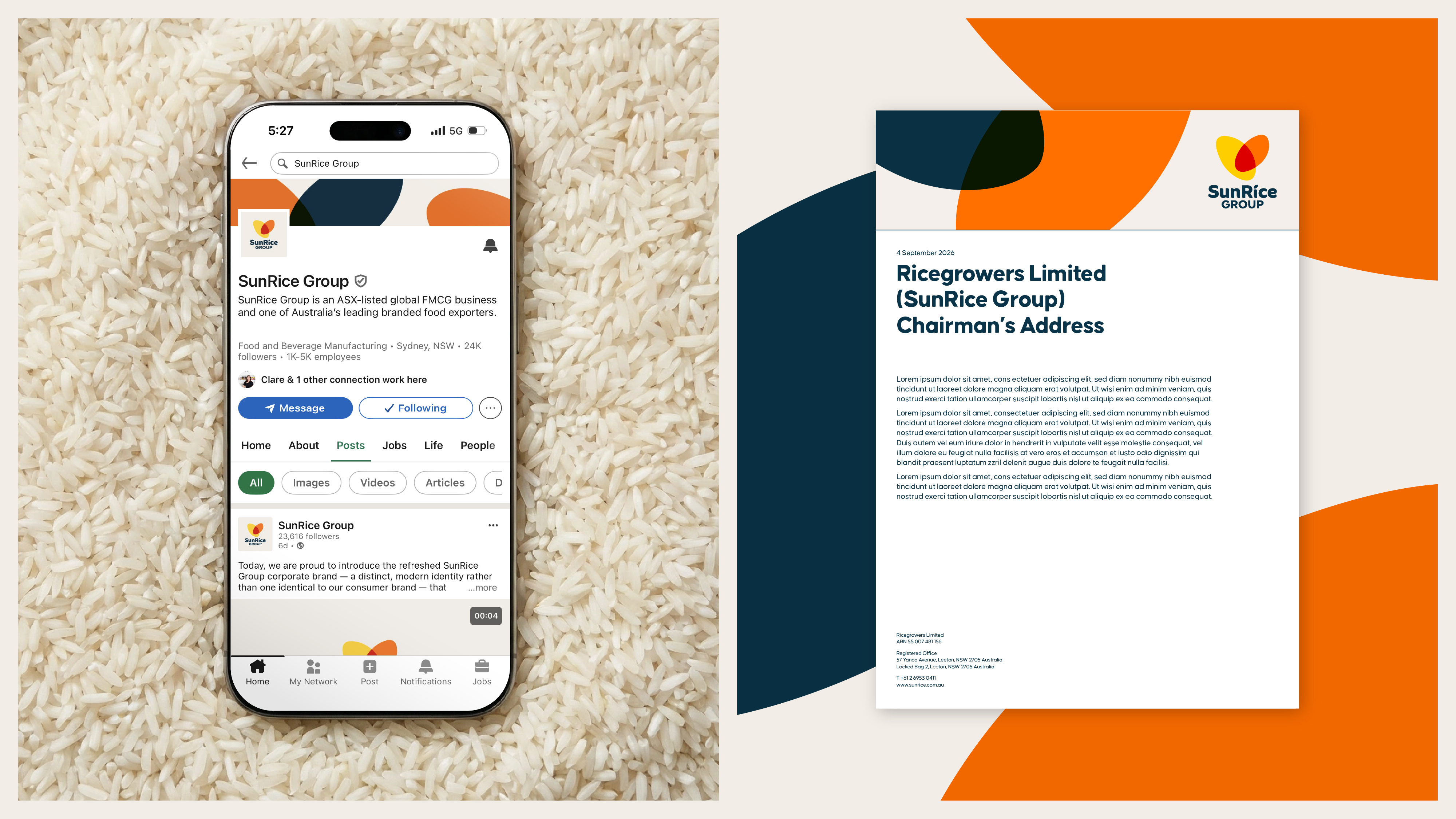

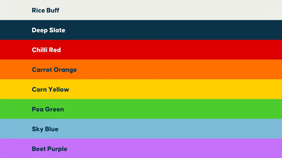
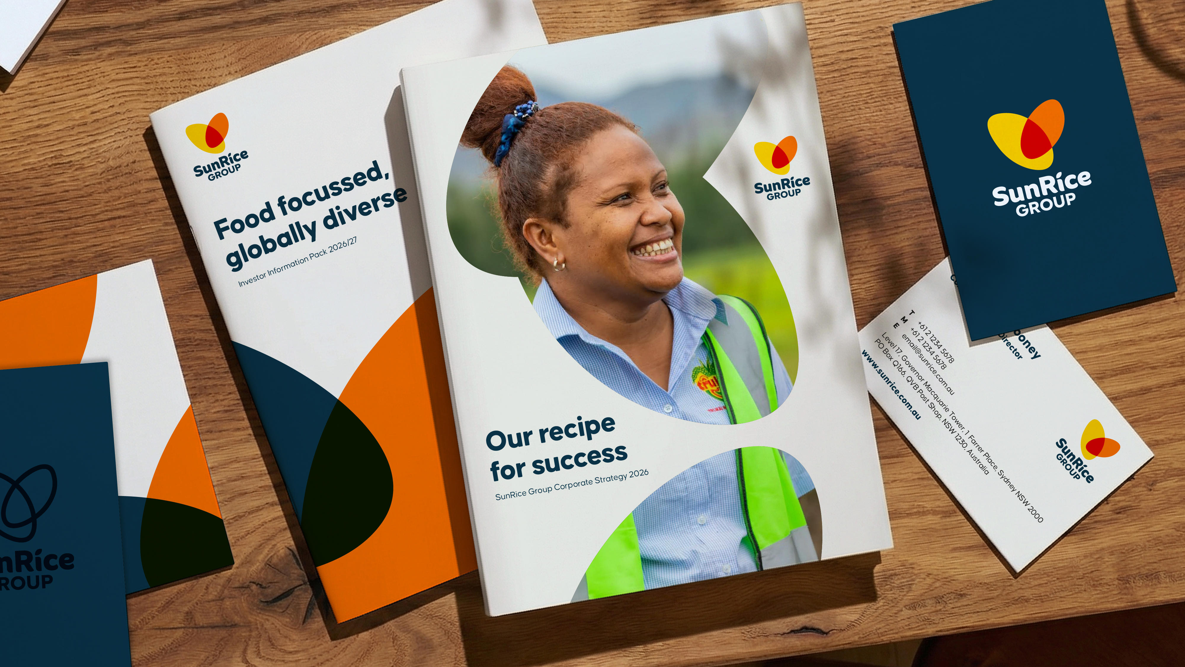
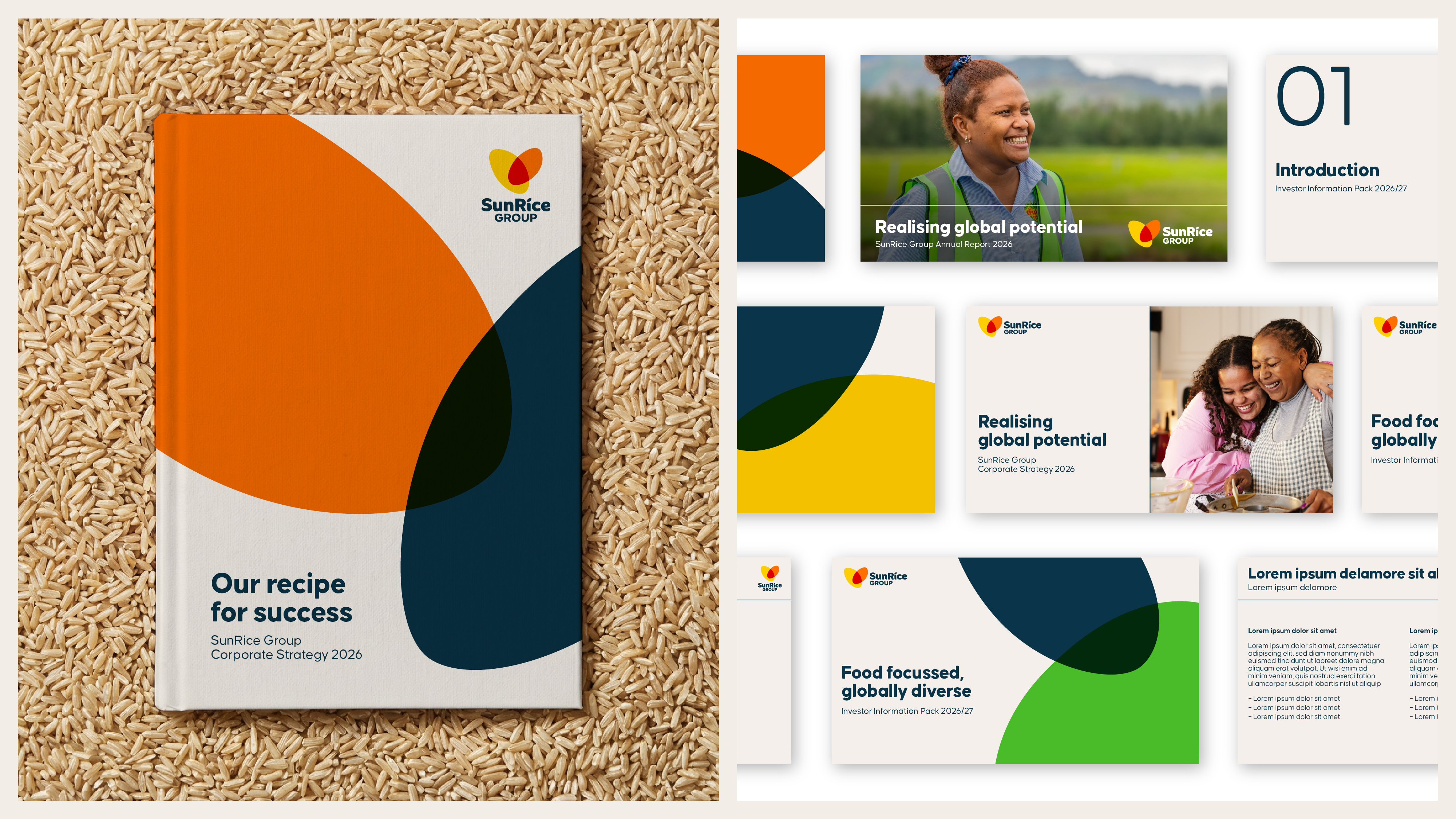
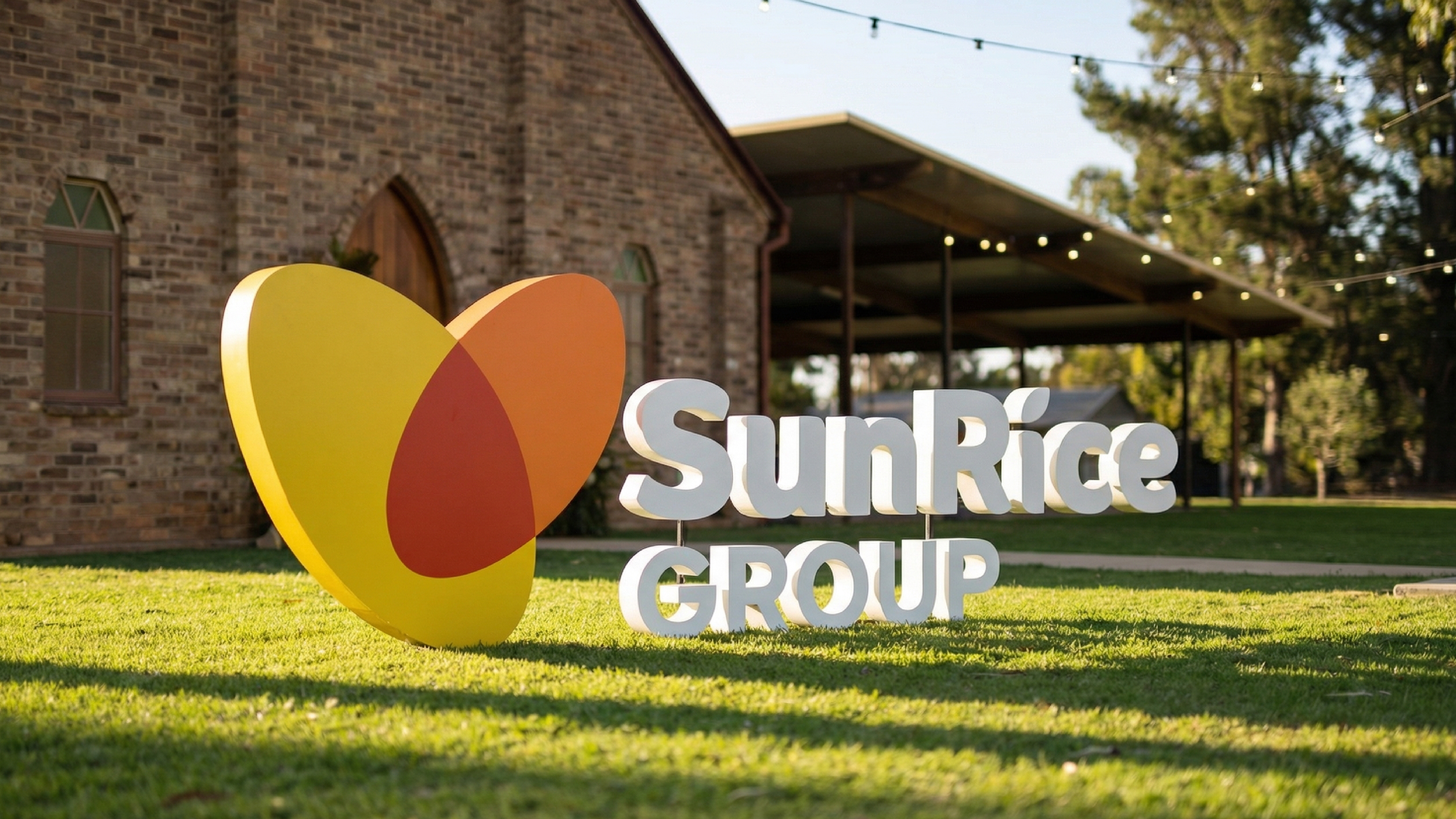
Image Credit :
Project Commissioner
Project Creator
Project Overview
As SunRice Group entered its 75th year, the organisation needed a corporate identity that reflected its evolution into a diversified, global food group. Operating across more than 50 countries, with multiple subsidiaries and specialised businesses, SunRice required a unified corporate brand that could clearly articulate who the Group is today.
Hulsbosch developed a new corporate identity centred on connection, trust and global ambition. Anchored by two abstract rice grains forming a symbol subtly shaped like a heart, the brand captures the humanity and care that have defined SunRice for generations. The new system creates cohesion across the Group, strengthens its corporate presence and sets a strong foundation for long-term growth.
Team
Hans Hulsbosch, Exec Creative Director Mikey Hart, Creative Director Marcel Wijnen, Creative Director Nick Mooney, Snr Designer Carolyn Pitt, Client Strategy Director Ally Burnell, Snr Account Manager Ian Boniface, Snr Finished Artist Jaid Hulsbosch, Director
Project Brief
The brief called for a complete repositioning of the corporate brand to better represent the Group’s diverse portfolio. While the SunRice consumer brand is iconic, the corporate identity lacked the gravitas and clarity expected of a modern global organisation.
Objectives included:
– Establish a distinct, credible and authoritative corporate brand
– Create a system that unifies the Group’s businesses while allowing for flexibility
– Maintain visual connection to the consumer heritage without relying on legacy equities
– Support global communication, governance, and stakeholder engagement
– Align the rebrand with the company’s 75-year anniversary for maximum impact
The identity needed to be instantly recognisable, globally relevant and capable of performing across executive, regulatory, agricultural and operational contexts.
Project Innovation/Need
The identity introduces a future-proof corporate brand built on an innovative modular system. The two-grain icon becomes both symbol and structural device, informing layout, navigation, colour and hierarchy.
Key innovations include:
– A bespoke logotype balancing corporate confidence with organic warmth
– A modern corporate palette merging consumer heritage tones with natural colours representing land and sky
– A universal design system that allows complex information, reporting and stakeholder communication to be expressed with clarity
– A tailored typographic ecosystem (Causten Round) that enhances legibility and accessibility across digital and environmental applications
– A unique graphic device derived from the logo, applied across collateral with consistency and recognisability
This solution addresses a genuine market need: a cohesive, sophisticated corporate identity for a global food group — one that communicates trust not through austerity but through clarity, connection and humanity.
Design Challenge
The primary design challenge was balancing legacy with leadership: how to stay true to SunRice’s origins while presenting a modern, global corporate identity. The consumer brand is deeply embedded in Australian culture, and any evolution needed to show respect for the communities and growers who built it.
SunRice’s organisational complexity required a highly flexible but tightly governed system. It had to work across investor reporting, sustainability communications, major stakeholder briefings, internal culture programs and global business units.
Another challenge was timing. Aligning the identity launch with the 75-year anniversary created both opportunity and pressure. Every visual asset needed to reinforce the milestone while signalling a future-focused narrative.
The result is a design system capable of delivering clarity and confidence across every corporate touchpoint.
Effectiveness
The new corporate identity has significantly improved communication clarity across the SunRice Group. It allows leadership to articulate strategy, purpose and ambition within a unified visual language that is instantly recognisable and globally relevant.
Key outcomes include:
– Strong alignment among executives, investors, growers and employees
– Streamlined corporate communications through a systemised design language
– Greater cohesion across subsidiaries, reducing brand fragmentation
– Improved credibility in global markets due to a more contemporary and authoritative visual identity
– A strengthened internal culture with teams understanding and championing the new brand
The identity not only celebrates SunRice’s 75-year legacy but also positions the Group confidently for future expansion, reinforcing its role as a trusted, resilient global food business.
Graphic Design - Identity and Branding - Corporate
This award celebrates creative and innovative design in the traditional or digital visual representation of ideas and messages. Consideration given to clarity of communication and the matching information style to audience.
More Details