Key Dates
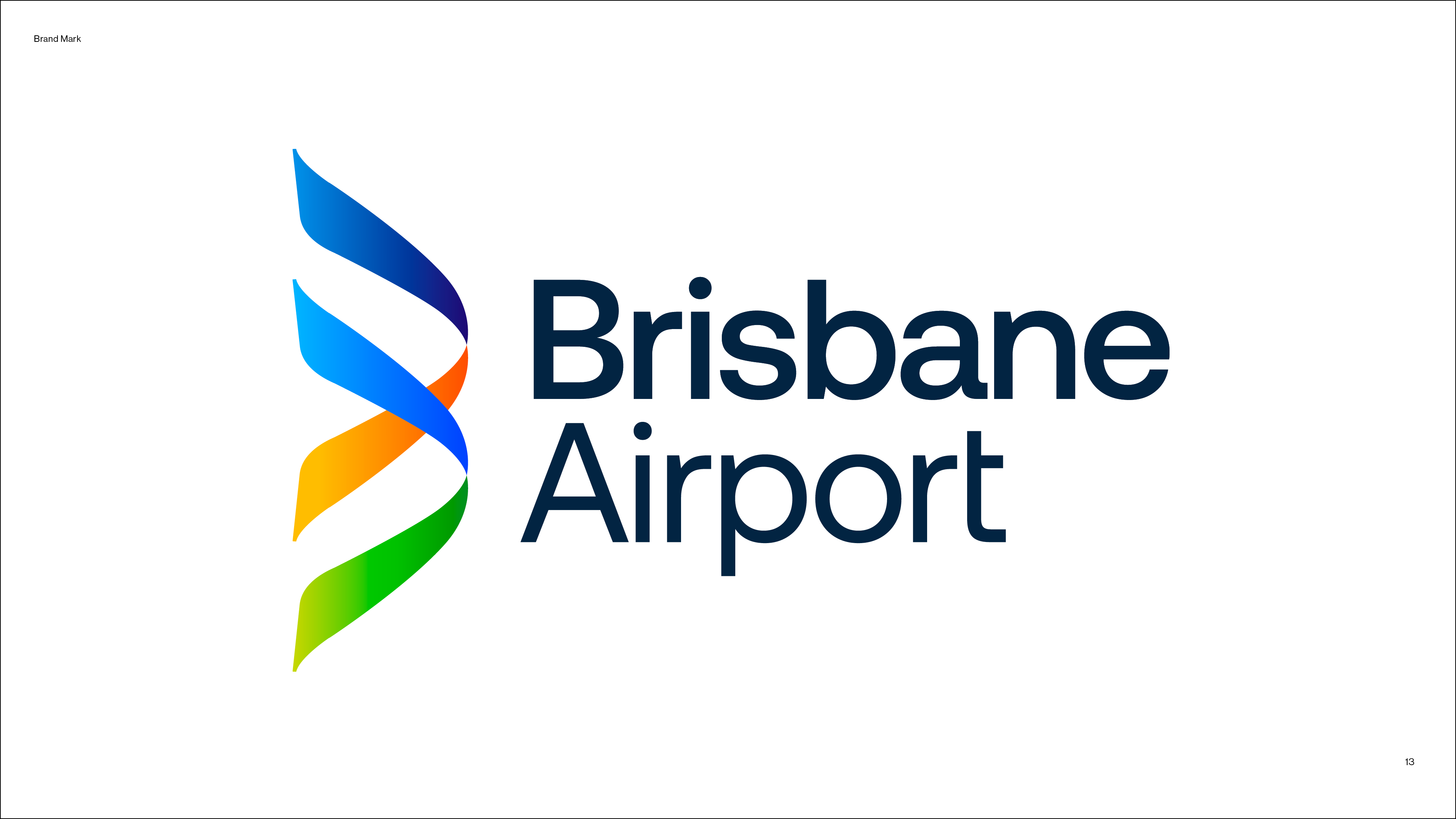

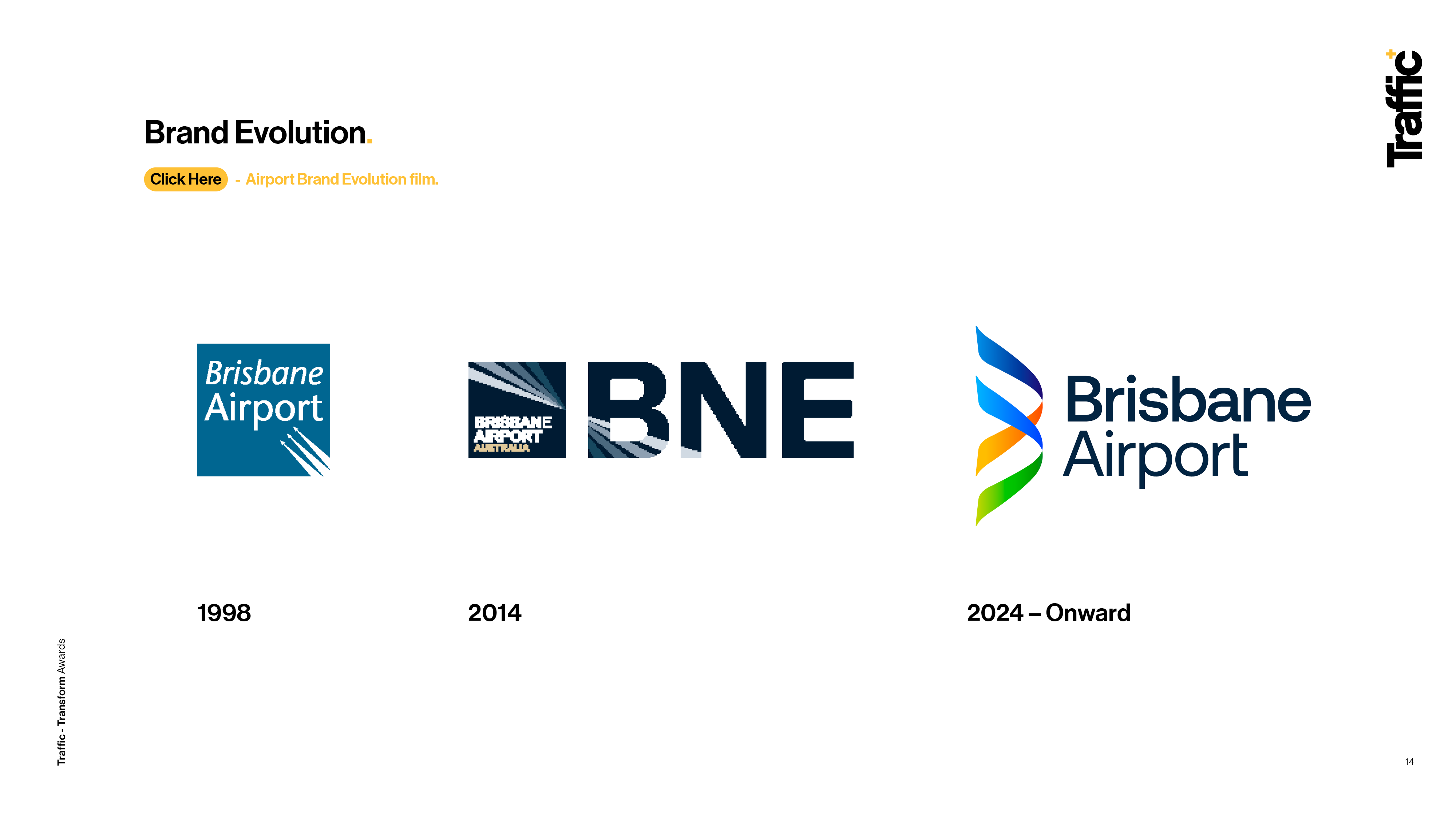
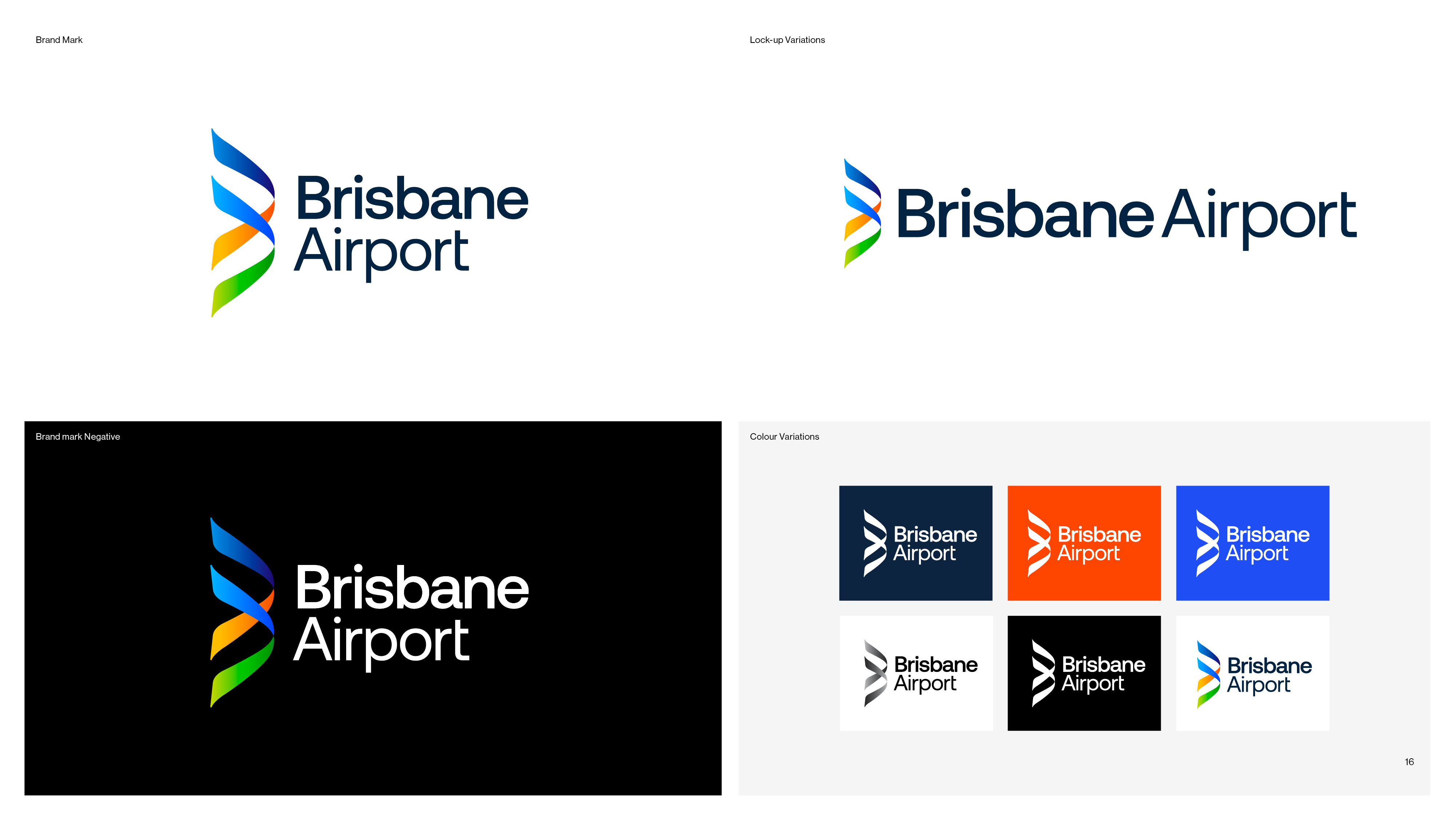
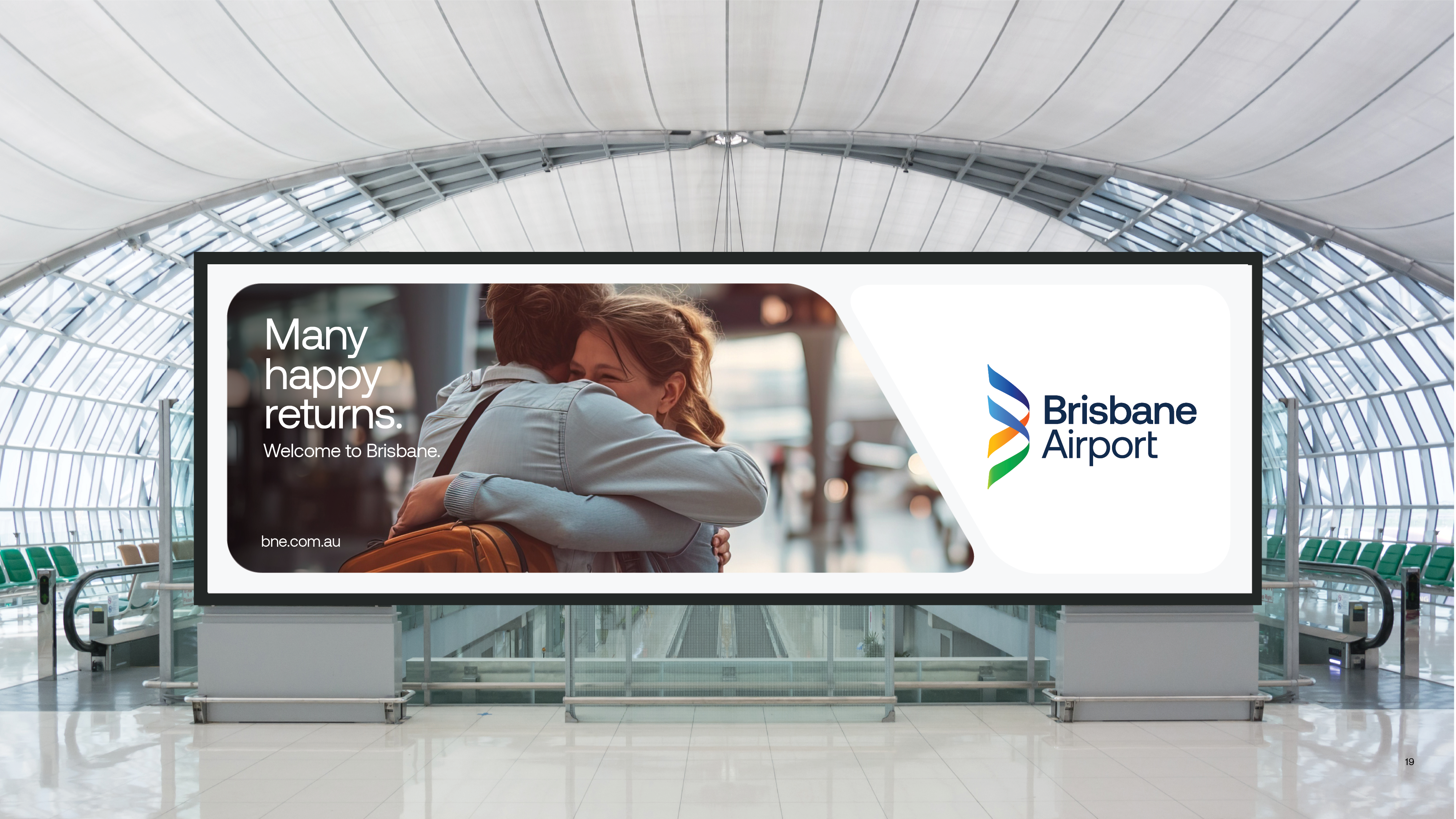
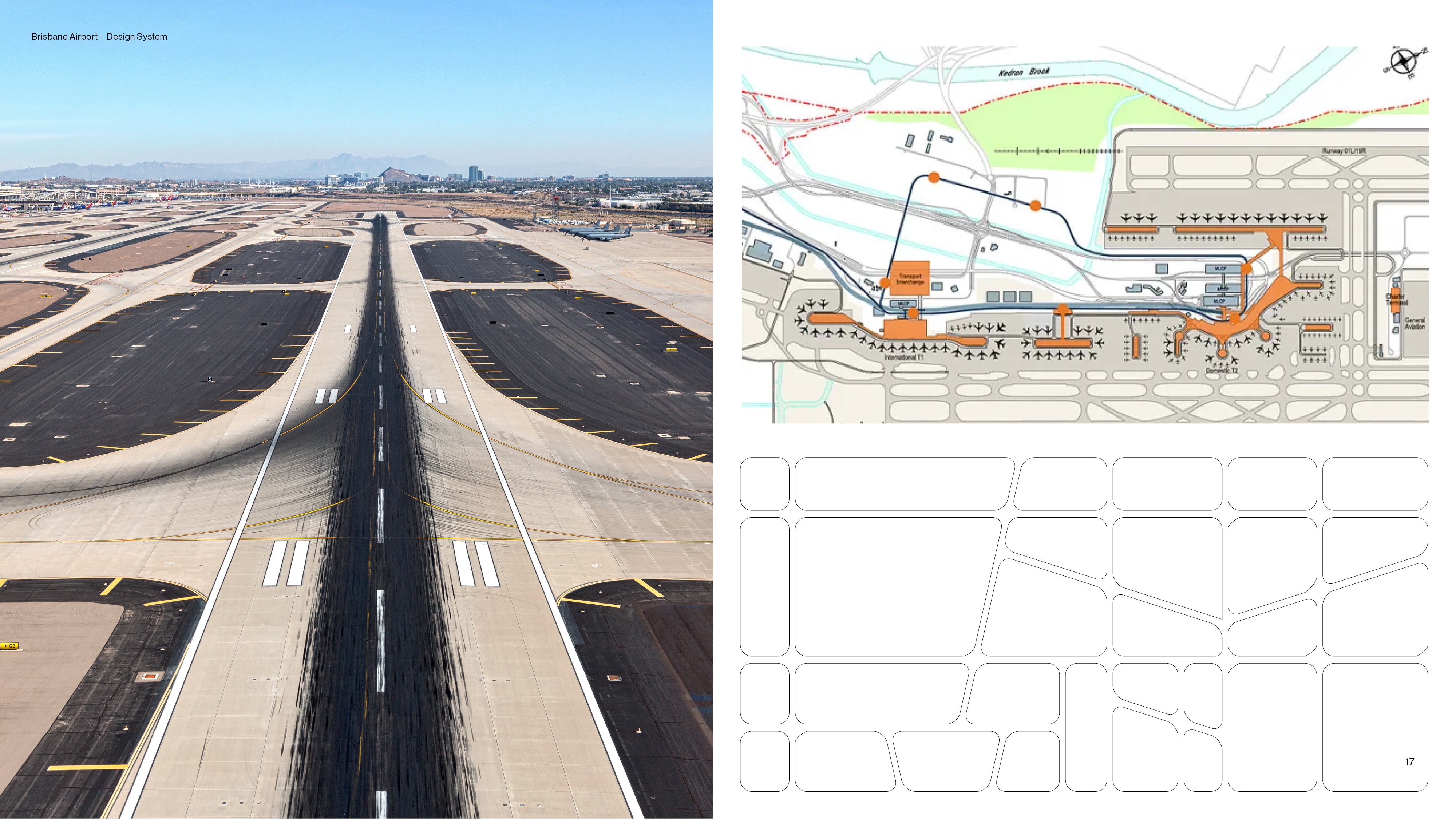
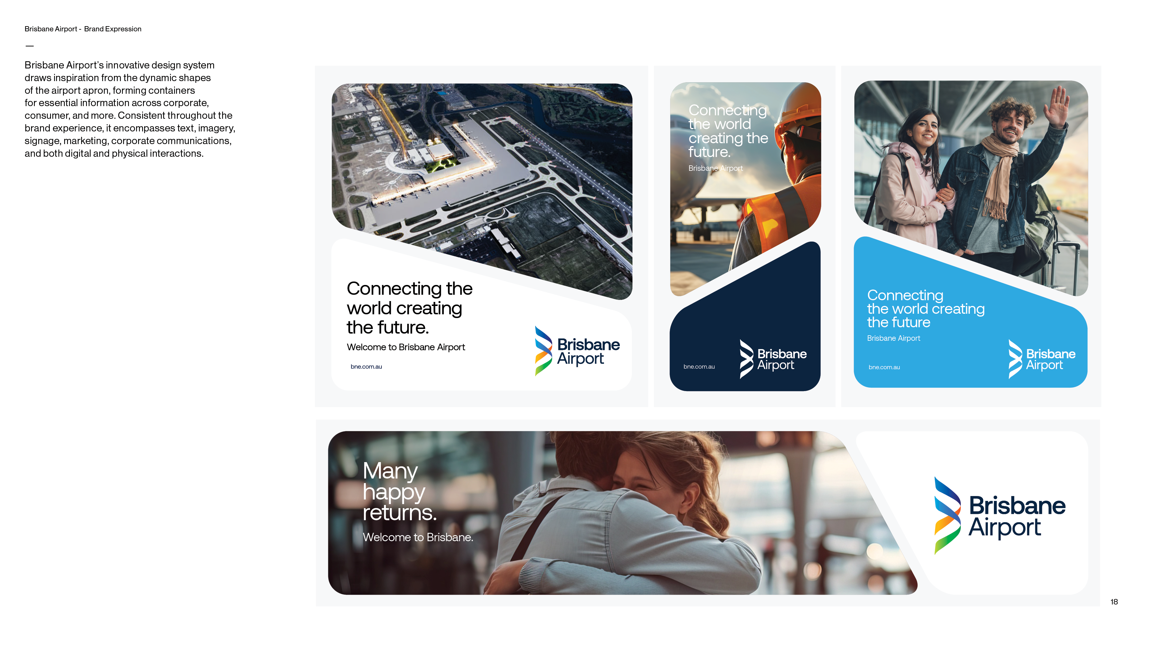
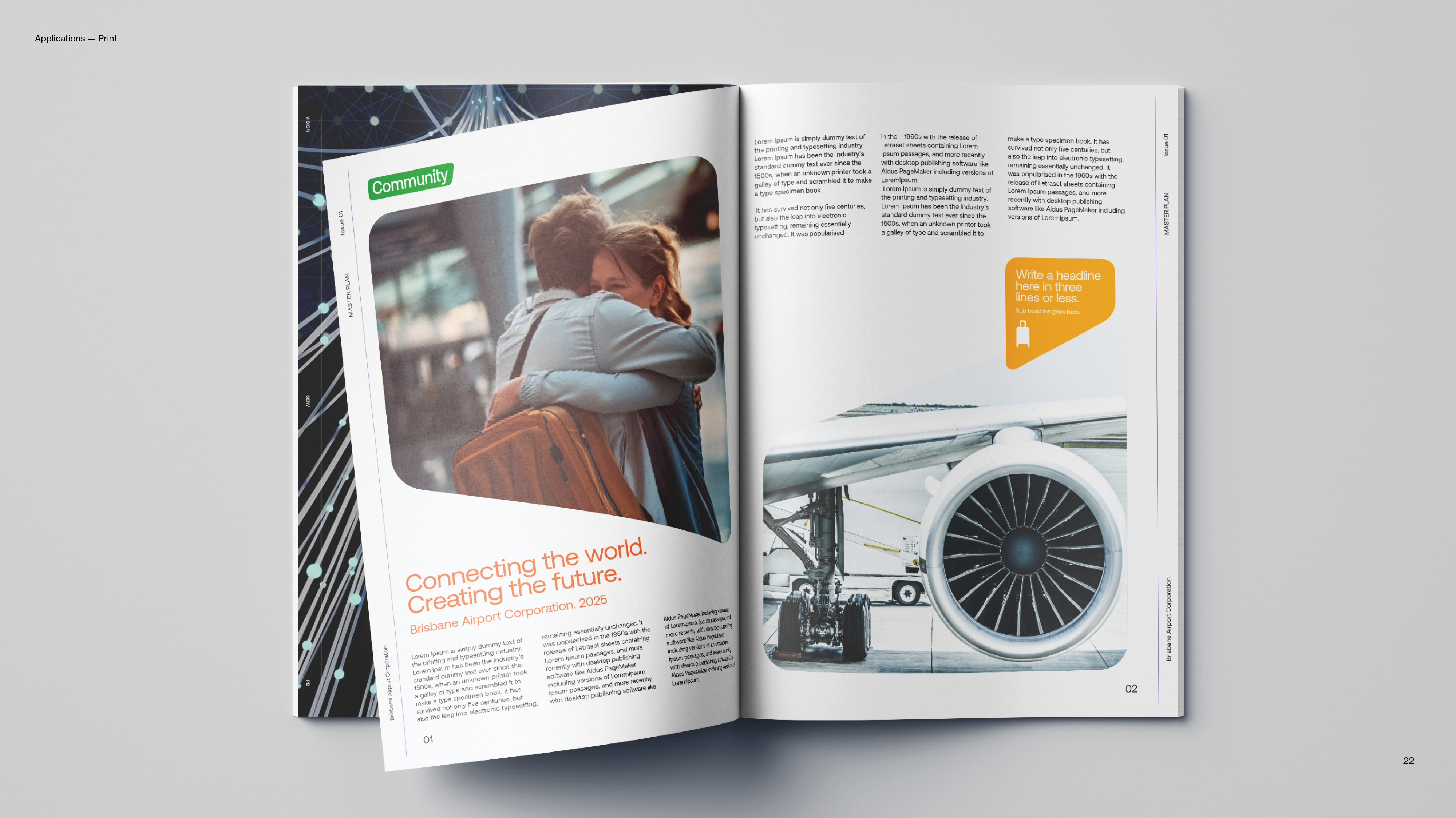
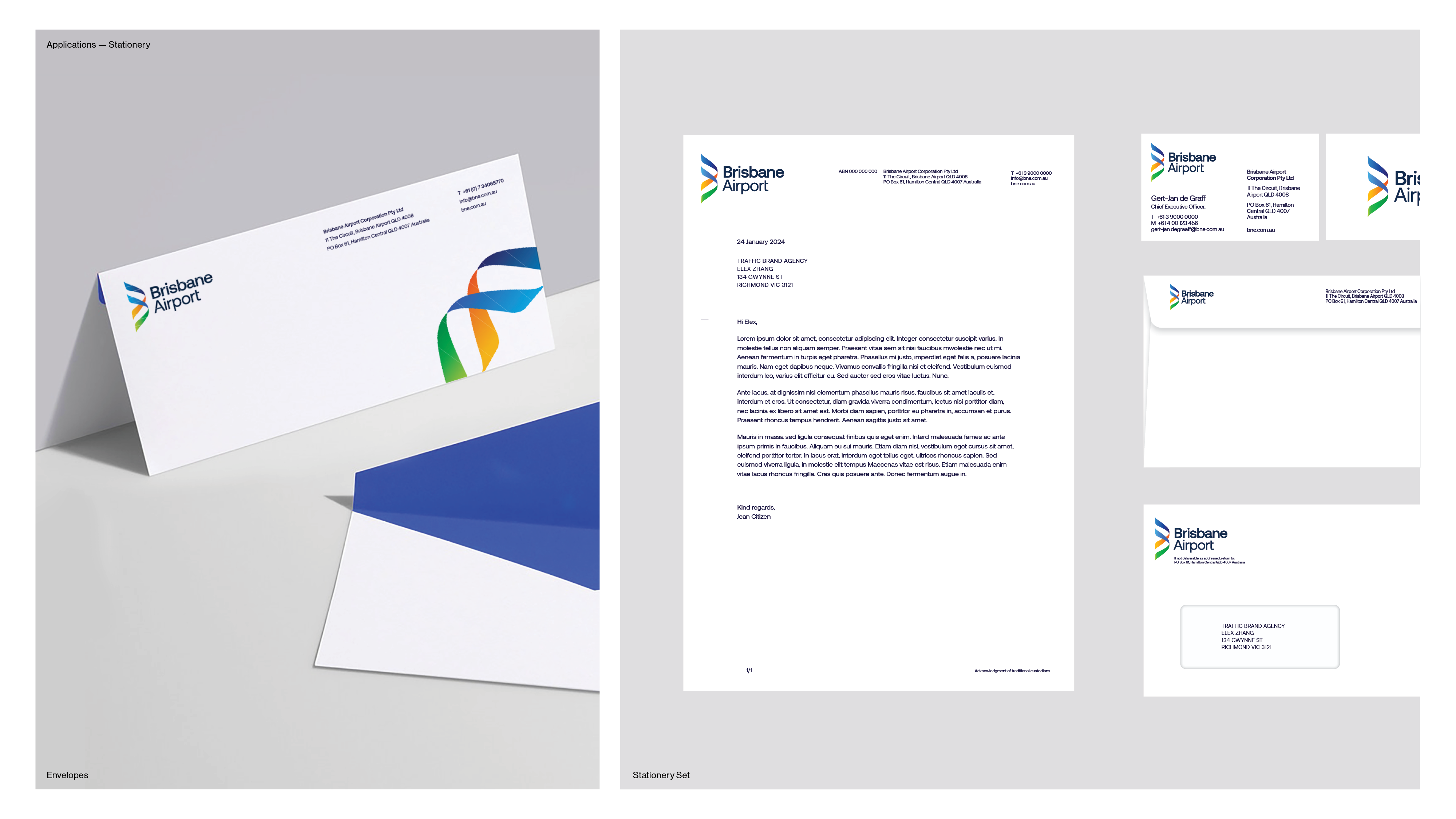
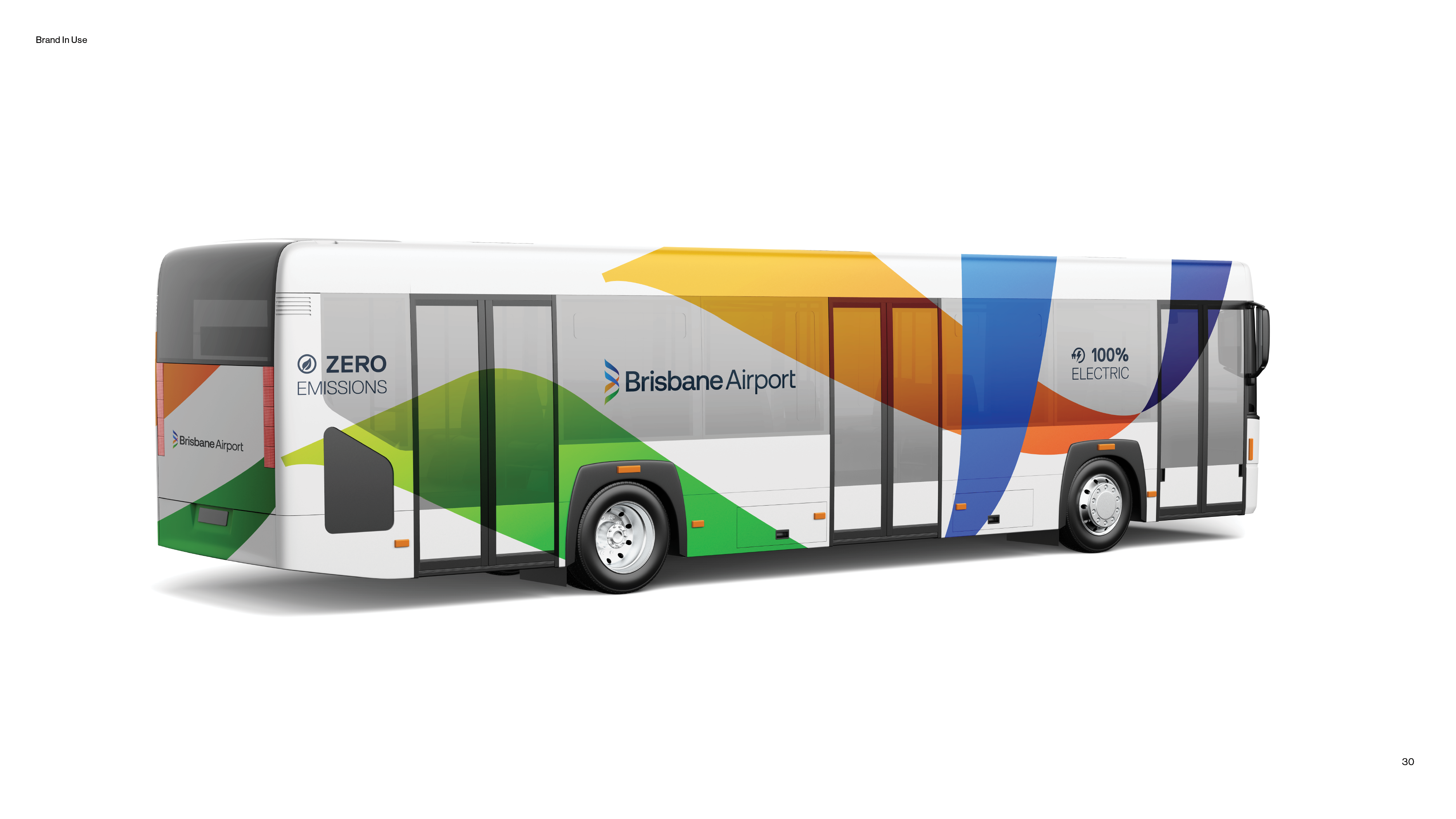
Image Credit : Traffic Brand Agency Sydney
Project Commissioner
Project Creator
Project Overview
Connect the World. Create the Future.
Brisbane Airport’s rebrand marks a bold evolution, celebrating 100 years of aviation while setting a confident course for the future. Developed in partnership with Traffic Brand Agency as part of the airport’s $5 billion transformation program, the new identity honours its legacy while aligning with a global, future-focused vision.
The traditional square logo has been replaced by a dynamic brandmark—flowing ribbons that form a stylised ‘B’, inspired by jet streams and the journey from land to sea to sky. This expressive device reflects motion, freedom, and Queensland’s natural landscapes, while offering a flexible visual system that adapts across digital, physical, and experiential applications.
A key strategic shift was replacing the IATA code BNE with the full name Brisbane Airport to create a more human, accessible, and globally recognisable identity.
Inspired by the osprey—known for vision and agility—the identity captures the airport’s role as a connector of people, places, and possibilities. It reflects Brisbane Airport’s core values: care, collaboration, communication, and courage, and expresses a personality that is inspiring, diligent, welcoming, and curious.
Four brand pillars—community-centred champions, steadfast guardians, impassioned connectors, and big picture activators—shape how the brand behaves, communicates, and evolves.
This is more than a visual update; it’s a purposeful redefinition of Brisbane Airport’s role in the world. A brand built to elevate passenger experience, attract global partners, and lead Australia’s aviation future with clarity, ambition, and connection.
Team
Andrew Begg - CEO & Creative Director Jeremy King - General Manager Laura Simpson - Strategy Sarah Jane Wilson - Project Director Andrew Begg - ECD & Design Director Chris Shurey -Design Director Rob Quick - Art Director
Project Brief
Airports are no longer just transit points—they are complex, customer-facing ecosystems competing for passenger loyalty, airline partnerships, and commercial success. In an era shaped by evolving passenger expectations, sustainability pressures, and rapid technological advancement, leading airport brands must reflect not only operational excellence but also emotional resonance.
As Brisbane Airport approached its centenary, it recognised the need to refresh its brand identity—an identity that had served the airport well but no longer fully captured the scale, ambition, or innovation of its future. With significant infrastructure investment underway, global connectivity growing, and the 2032 Olympic Games on the horizon, Brisbane Airport needed
a brand that could confidently lead it into its next chapter.
Project Innovation/Need
Visually, we broke free from the traditional, boxy lockups commonly seen in airport branding. At the centre of the identity is a re-imagined brandmark: a flowing ribbon forming a stylised ‘B’. Inspired by jet streams and flight
paths, the ribbon captures the dynamic movement of travel. It also reflects the osprey—a bird native to Queensland—known for its vision, agility, and connection to sky and sea.
The colour palette transitions from green to blue, mirroring the journey from land to sea to sky. The effect is both evocative and unmistakably Queensland, grounding the brand in place while elevating it to a global context.
Importantly, the ribbon device extends beyond the logo. It becomes a versatile brand asset—a graphic system that connects messages, imagery and people across all touch points. We drew inspiration from the unique shapes of the airport apron to create custom content containers, lending both structure and flexibility to digital and print applications.
Typography, photography, motion and iconography were all refined to support the new brand personality— professional yet human, confident yet open.
Design Challenge
The task was multifaceted. How do you honour a proud aviation legacy while embracing a bold, future-facing outlook? How do you express the complexity of an airport—its operations, tenants, and stakeholders—in
a single unifying brand? And how do you differentiate Brisbane Airport in a category dominated by conservative, functional identities?
Internally, the brand had to work across diverse business units, audiences and physical environments, from terminal signage to corporate presentations and digital interfaces.
Externally, it needed to resonate with passengers, partners, and the wider community—locally and globally. One of the key challenges was transitioning from the operational IATA code BNE to the full name Brisbane Airport. While BNE is widely recognised in aviation circles, it lacked emotional connection and accessibility for broader audiences. The shift to Brisbane Airport was essential to create a more human, welcoming, and passenger-friendly brand expression—one that clearly communicates place, purpose, and pride.
Finally, the identity had to embody Brisbane Airport’s personality and values: welcoming, diligent, inspiring, and curious. It had to feel both human and world-class.
Effectiveness
The new Brisbane Airport brand was launched internally and externally to widespread acclaim. Staff and stakeholders embraced the identity as a powerful reflection of the airport’s purpose and personality. The brand system has been adopted across internal comms, customer experience design, investor presentations, and community engagement.
It has given the organisation a cohesive, adaptable design framework—improving consistency and clarity across all channels. From physical signage to social content, the brand now presents a unified front that’s
bold, flexible, and globally resonant.
Importantly, the brand has helped reposition Brisbane Airport in the eyes of its partners and community. It reflects the scale of investment in infrastructure, technology and sustainability, reinforcing the airport’s role as a long-term contributor to Queensland’s economic and social future.
The rebrand was not just cosmetic—it realigned the airport’s identity with its vision. By connecting the world and creating the future, Brisbane Airport is now equipped with a brand as ambitious and inspiring as its next 100 years.
Graphic Design - Identity and Branding
This award celebrates creative and innovative design in the traditional or digital visual representation of ideas and messages. Consideration given to clarity of communication and the matching information style to audience.
More Details