Key Dates
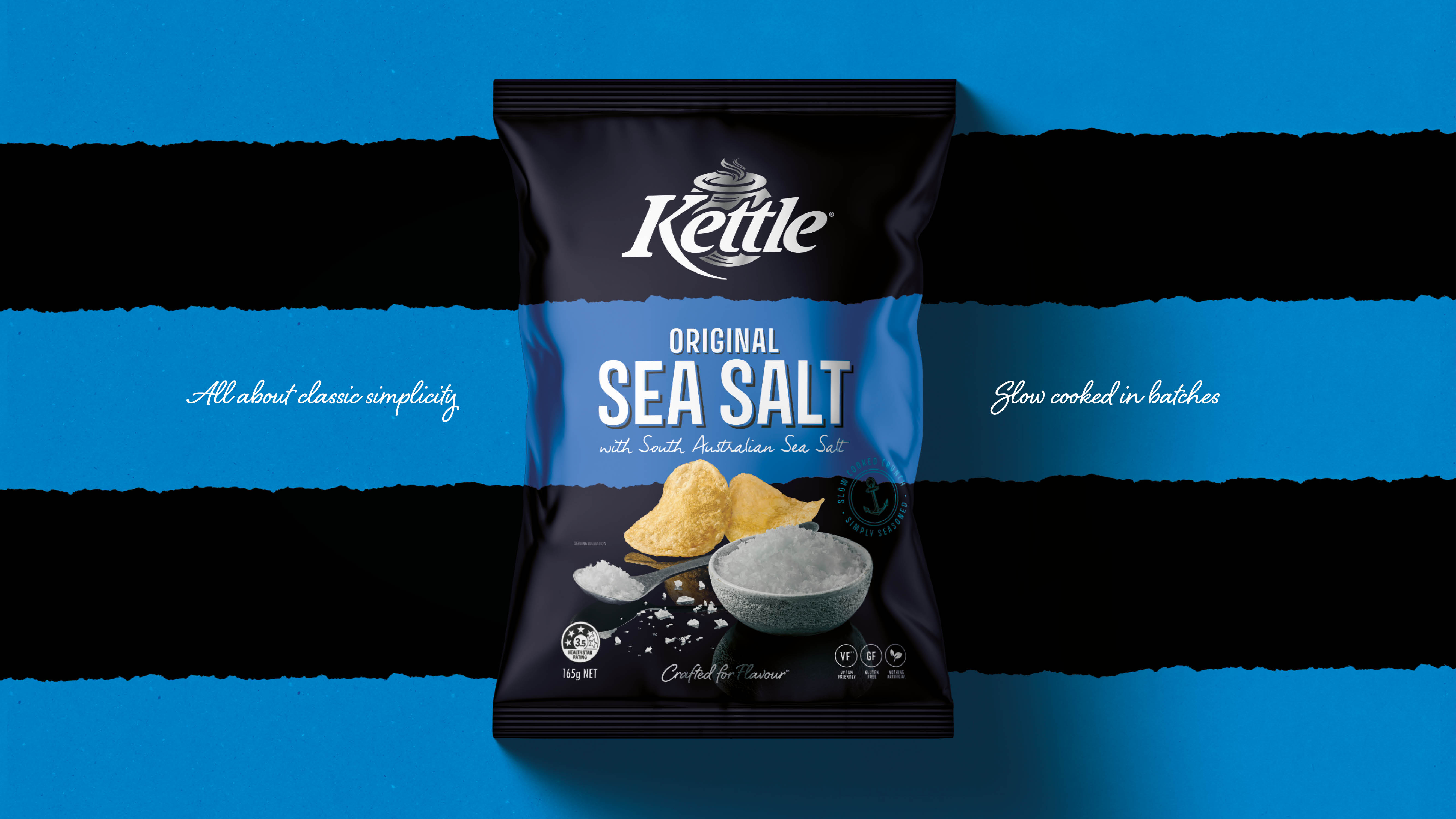

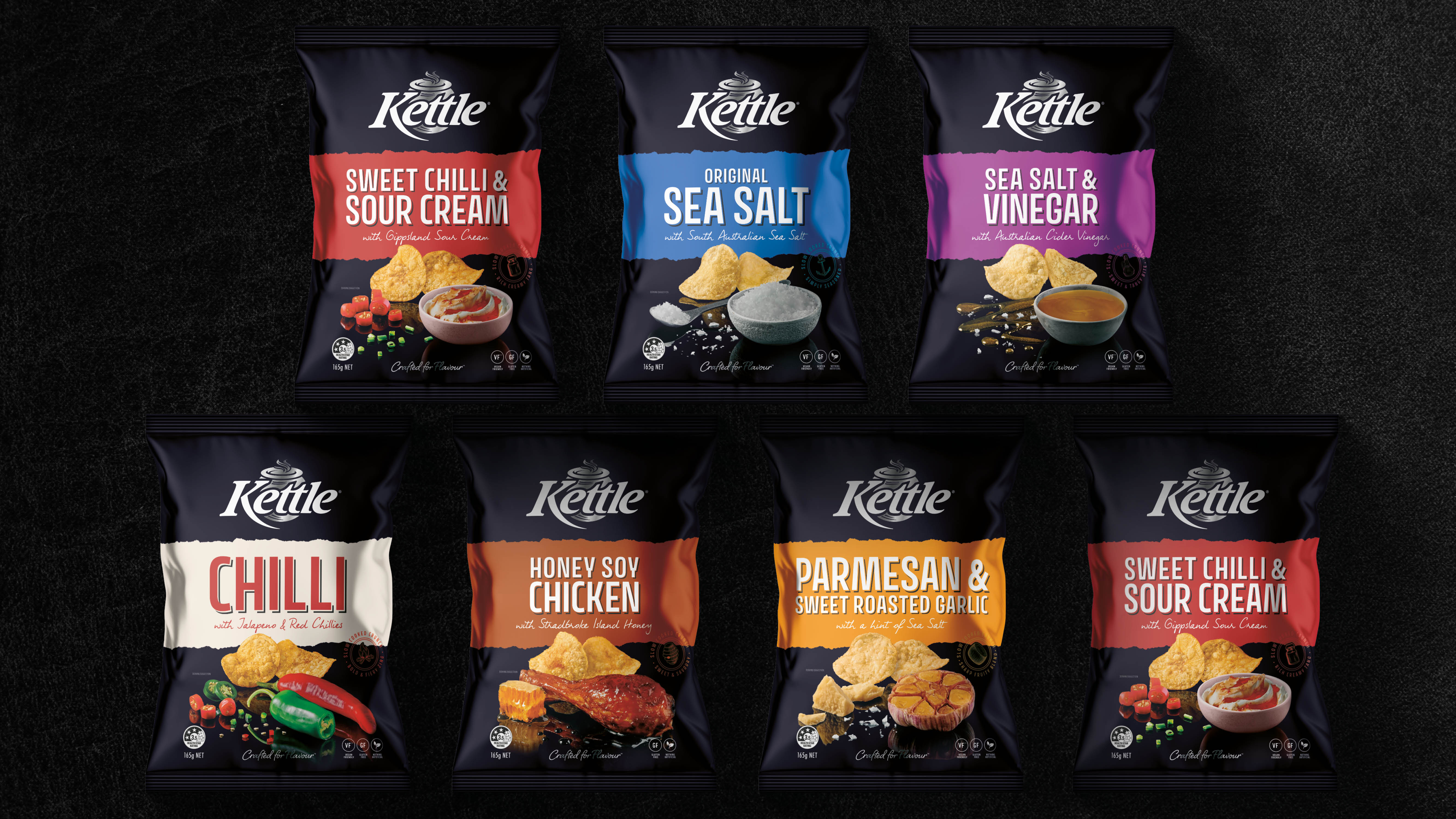
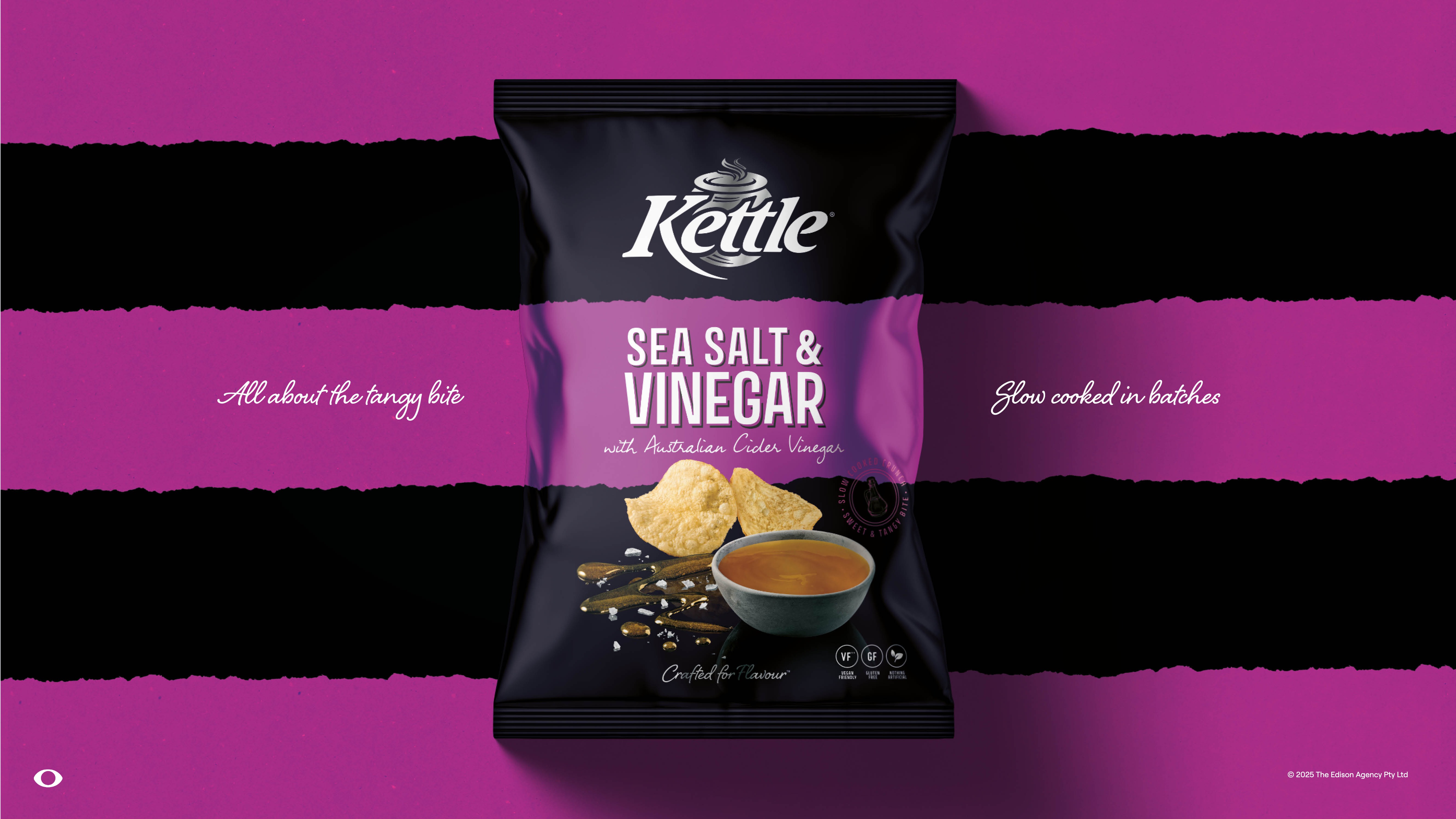
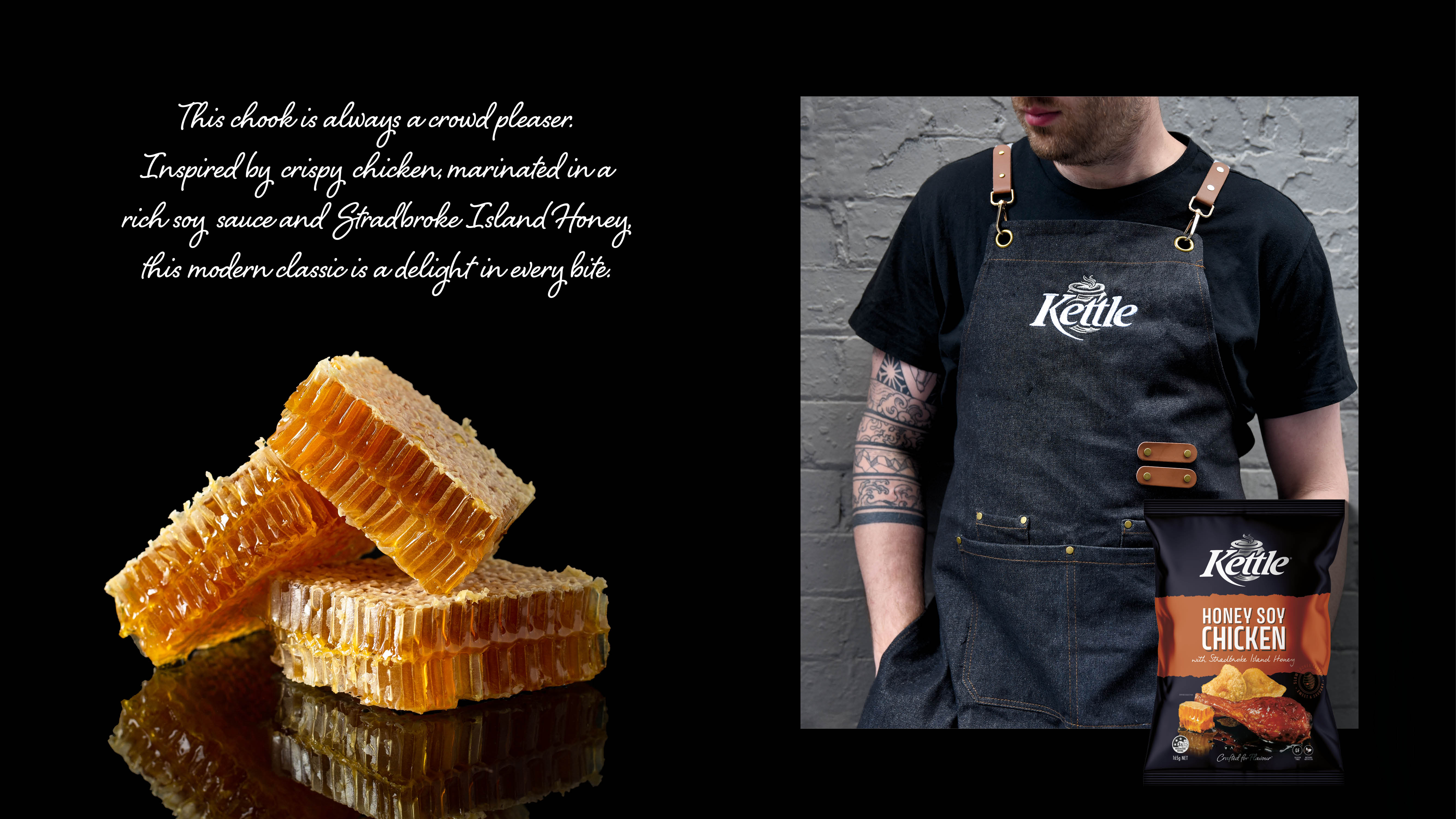
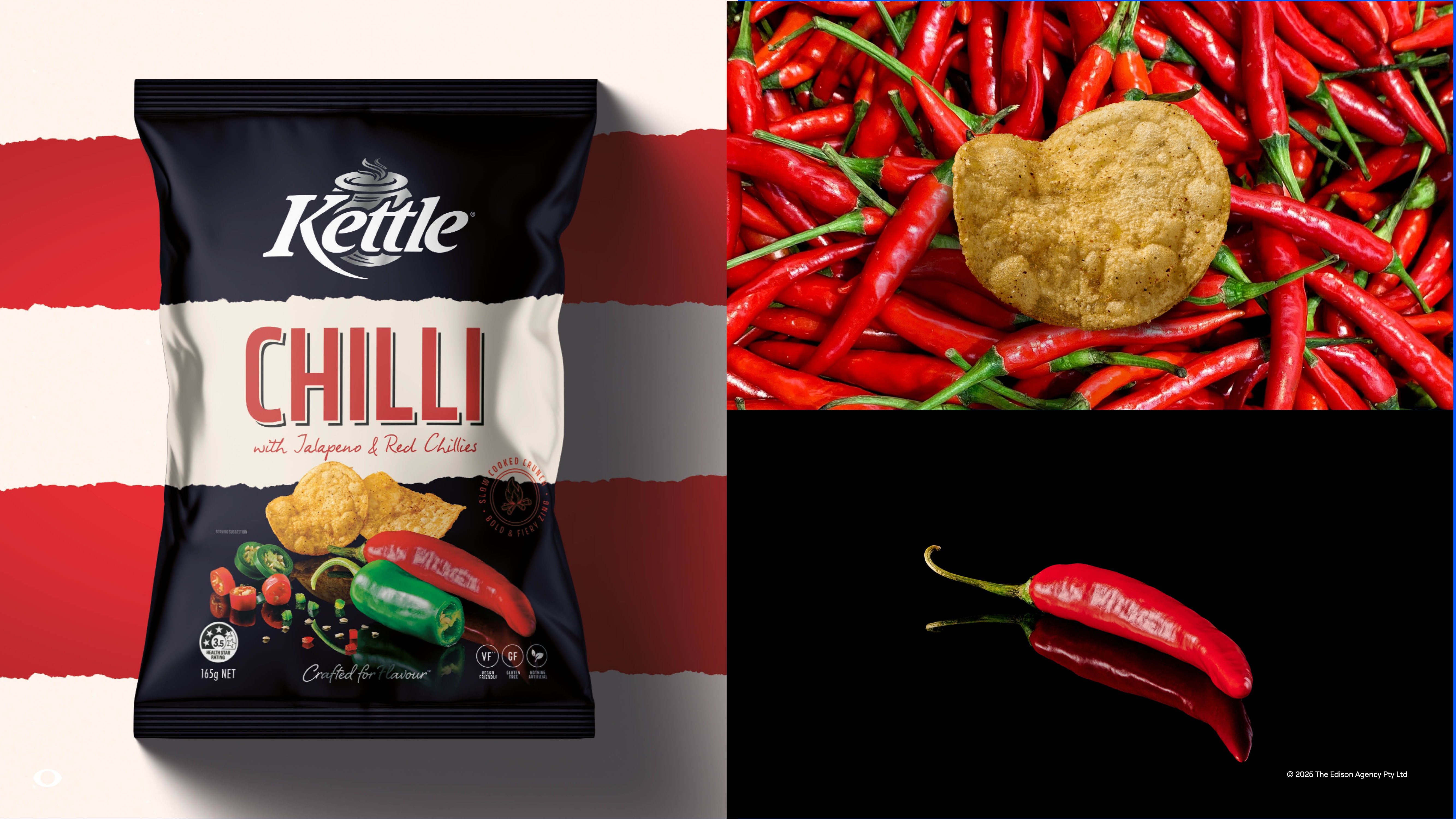

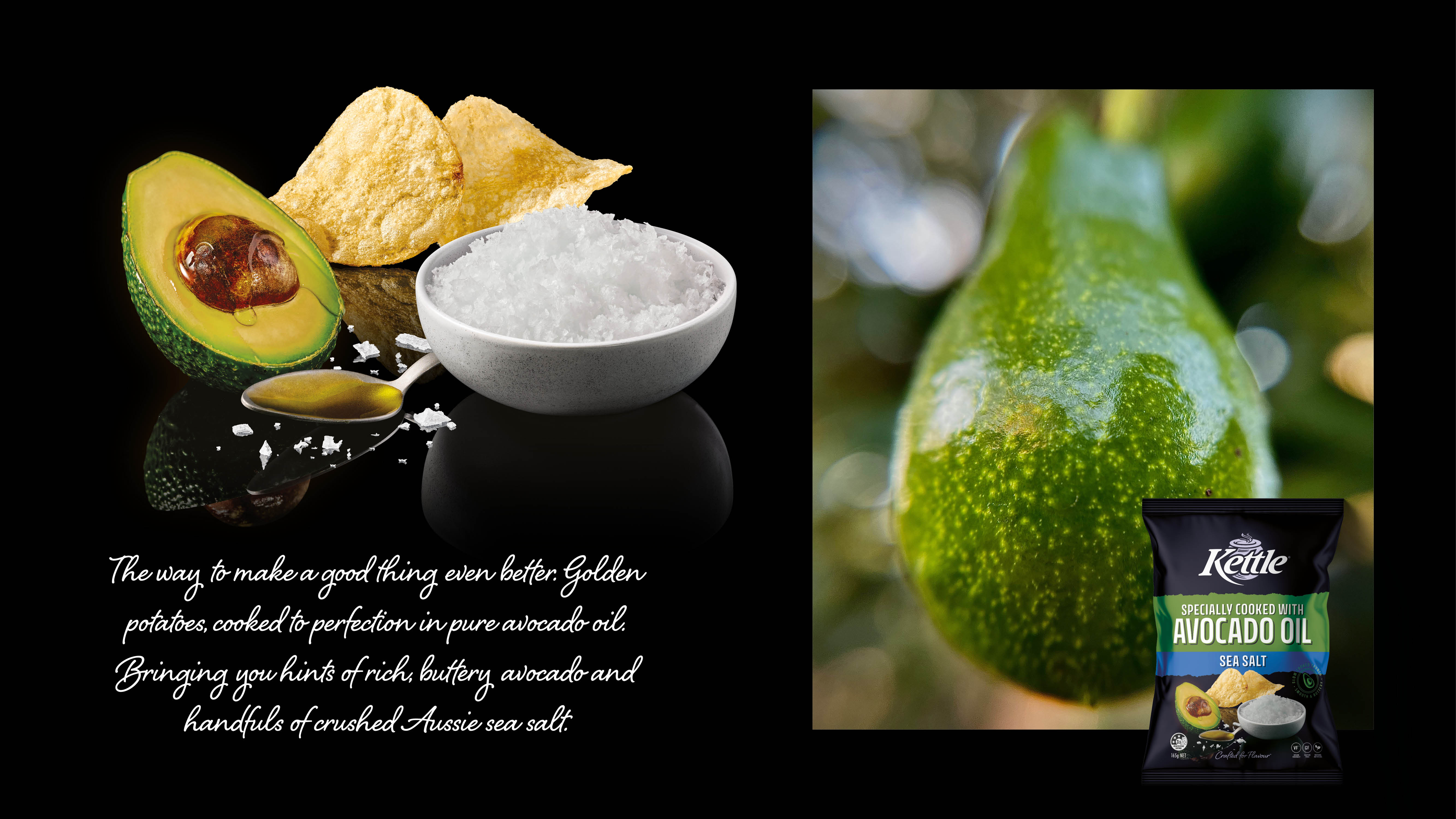
Image Credit : The Edison Agency

Project Commissioner
Project Creator
Project Overview
The Art of Slow. The Power of Storytelling.
At Kettle, tradition isn’t just remembered, it’s revered. Every chip is a quiet rebellion against the rush of the everyday. Slow-cooked in small batches with carefully selected ingredients, Kettle Chips are made with patience, purpose, and an unwavering commitment to flavour. This spirit is rich in character and honest in craft, creating the foundations for a bold new chapter.
Kettle had long held consumer trust for taste and quality, but risked falling behind in a market that increasingly valued design, storytelling, and modern relevance. Edison was briefed on recalibrating the brand, elevating its premium status while honouring its crafted roots and outpacing its closest competitor by doubling down on what makes Kettle so damned good!
At the heart of the strategy was a single, powerful truth: Crafted for Flavour. Drawing inspiration from artisanal worlds like wine, gastro pubs and boutique cheese, Edison repositioned Kettle not just as a snack, but as a flavourful ritual, best shared or savoured slowly.
This is the story of a brand that slowed down to move forward, proving that in a world of noise, craft still speaks volumes.
Team
Amber Bonney - Strategy & Executive Creative Director Calin Barker - Strategy Caitlin Preyser - Main Designer Stephanie Ehrlich - Supporting Designer Matthew O'Connor - Production Niki Beeston - Group Account Director
Project Brief
Kettle is a brand built on patience, precision, and unapologetic flavour. Every chip is slow-cooked in small batches with carefully chosen ingredients — a defiant stand against the fast, flavourless world of mass-market snacks. But in a category where visual appeal, storytelling, and cultural relevance increasingly drive purchase decisions, heritage alone was no longer enough to hold leadership.
Despite being Australia’s original kettle-cooked chip and long trusted for taste and quality, Kettle faced a shifting competitive landscape. Red Rock Deli, once the upstart, had overtaken Kettle in premium perception, packaging appeal, and cultural relevance. Consumer research revealed gaps: Kettle’s design system was inconsistent, its artisan narrative underplayed, and its visual identity lacked the modern cues that resonate with today’s food-loving, quality-seeking shopper.
The brief for Edison was clear yet challenging:
- Reclaim category leadership by redefining Kettle’s premium positioning.
- Modernise the visual identity while retaining authenticity and familiarity.
- Amplify the crafted narrative so it feels relevant to contemporary definitions of “premium” and “artisan.”
- Create a unified, future-proof portfolio architecture for consistency across ranges.
The work required deep exploration of what “craft” means today — not fine-dining formality, but a more grounded, approachable sophistication inspired by artisanal worlds like boutique cheese, gastro pubs, and small-batch spirits. It was about slowing down the brand to speed up its relevance, rebuilding its presence from the shelf outwards, and giving Kettle the tools to compete — and win — in a more design-savvy, story-driven market.
Project Innovation/Need
To breathe new life into an iconic Australian brand, we had to redefine the benchmarks for premium and crafted snacks. But what was craft 10 years ago is not necessarily craft today. The benchmarks and codes for premium and ‘handcrafted’ have changed.
Edison conducted a series of strategic workshops to further drill down into the brand’s purpose and what 'crafted' could mean for Kettle in a way that felt distinct. Exploration began with a deep interrogation of modern craft, what it looks like, feels like, and how consumers connect with it across categories, including spirits, cured meats, cheese, and boutique FMCG, to identify new conventions
of quality and care.
We arrived at an expression that was simple, understated, and raw. Premium and quality, but authentic and unpretentious.
More gastro pub, less fine dining.
The distinctive Kettle stripe was retained, but refined as a crafted design cue. The brandmark was strengthened for increased shelf presence, while layouts were restructured to create consistency across core and sub-ranges.
Ingredient photography became the hero, replacing over-styled product visuals.
Typography was softened and refined. A subdued but premium palette was introduced to signal warmth, care, and clarity. Shaping an identity that felt cohesive and grounded — premium without the pretence.
Design Challenge
Kettle faced the challenge of redefining its position within Australia’s premium chip category to surpass its main competitor, Red Rock Deli. Despite strong foundations in taste, quality, and being a trusted premium brand, Kettle struggled with brand fame and differentiation in key areas such as packaging appeal, crafted imagery, and a modern identity.
Research showed Kettle underperformed in areas where Red Rock Deli excelled, including premium image (54% vs. 74%) and packaging appeal (35% vs. 58%). The existing design system was inconsistent across ranges, reducing overall impact and consumer recognition.
To achieve its goal of becoming Australia’s number one premium chip brand, Kettle needed to:
- modernise its visual identity
- amplify its artisan-crafted narrative
- develop a unified and future-proof portfolio architecture
system that resonates with
quality-focused, food-loving
consumers
- maintain a strong visual connection to its core brand DBA's with
authenticity and familiarity.
Effectiveness
The visual storytelling and aesthetic evolution have strengthened the brand's identity, making it resonate more deeply with modern chip lovers who value authenticity and quality. Restoring Kettle’s relevance and reasserting its place as the quiet leader in crafted snacks.
Internally, it’s brought clarity and focus, aligning teams behind a purposeful new direction. Externally, the brand now communicates its value with confidence — Initial consumer testing reveals that the already high-scoring pack design has indeed been improved with stronger taste cues, clearer navigation, a more premium feel and the signal that Kettle is a chip crafted for flavour.
As stated by James Deysel, Head of Marketing at Snackbrands:
“One of the hardest things in Marketing is striking the balance between a meaningful refresh that drives the brand forward and avoiding unnecessary radical change that weakens your distinctive assets.
By working with the team at Edison, we believe we’ve struck that ideal balance, and it’s encouraging to see the same feedback come through during research and consumer feedback.
Being on this journey with Edison has been tremendously rewarding, and it has helped us elevate one of Australia’s most beloved snacking brands to the next level.”
Graphic Design - Identity and Branding - Food
This award celebrates creative and innovative design in the traditional or digital visual representation of ideas and messages. Consideration given to clarity of communication and the matching information style to audience.
More Details