


Project Overview
The venue is an old building located in the downtown area, which is a highlight of the store. The brand is an optical retailer. The designer wanted the space to showcase the products in a simplified way, rather than using a flashy backdrop to accentuate the products. The design vocabulary expresses the concept of eyeglasses, which symbolizes the idea of seeing more with eyeglasses. The name, 'Insight', implies that one can see things for what they are when wearing glasses.
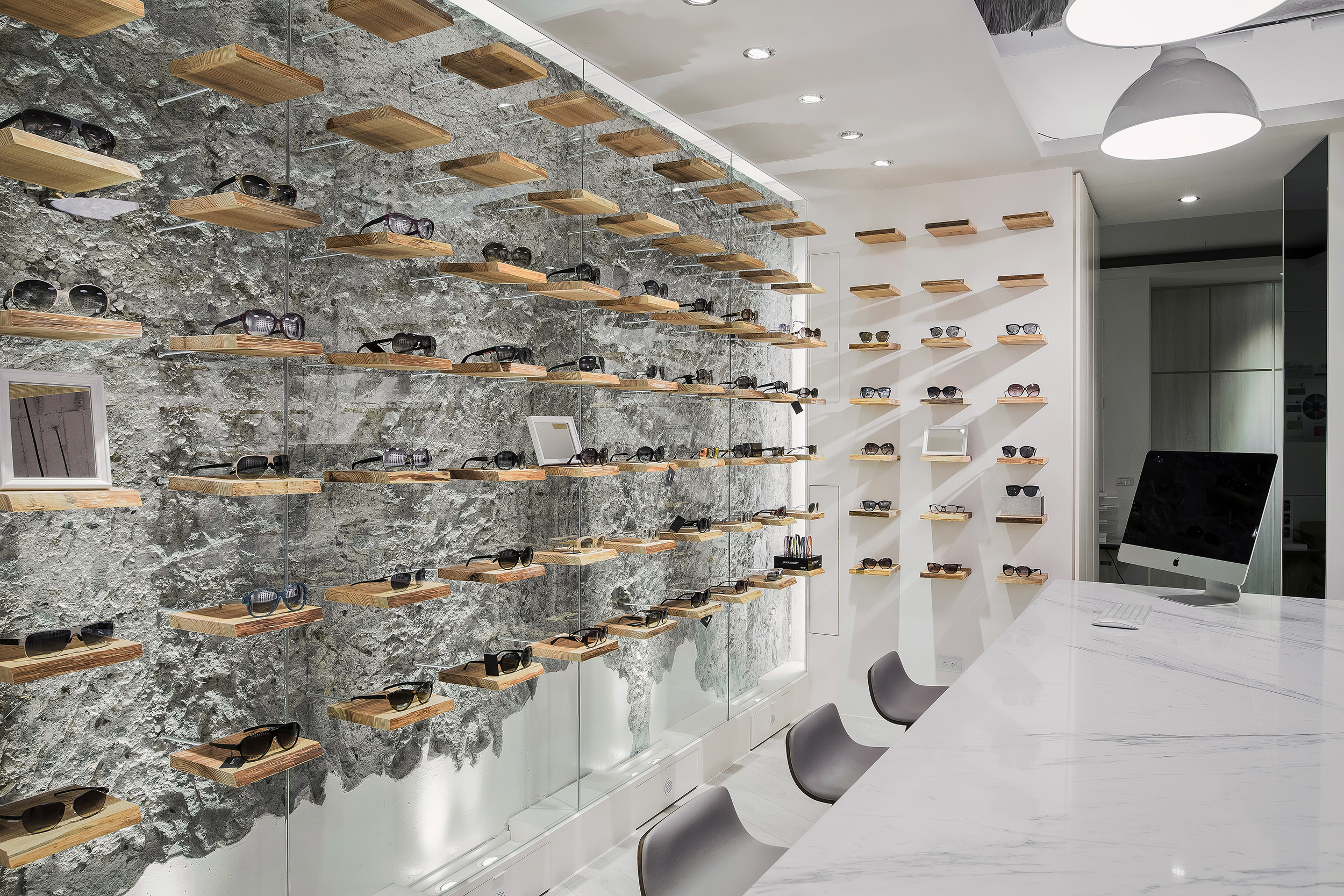
The nature of building materials is emphasized. The designer retained the original mottled reinforced concrete walls of the old building. Lighting and wood grain contrast the trace of age. The large area of glass becomes an eye-catching display wall, revealing that all details become clear when wearing the glasses. The project conveys the core spirit of the eyewear brand while minimizing the use of materials. Preserving the building as much as possible to minimize the negative impact on the environment during future renovations also creates a unique commercial space in this prime location.
Organisation
Team
WEN-YEN CHANG
Project Brief
"The beauty of imperfection: revealing truth through weathered walls"
After removing the original decor, the naturally weathered wall surfaces revealed traces of the building. Unlike the common practice of layering materials, the designer chose to minimize covering to showcase the building's authentic and pure look. To extend the concept of vision correction through lenses, the designer applied glass over the walls to interpret the world as seen through lenses. This project integrates visual imagery with the abstract expression of eyewear functionality.
The space is grounded in a white palette. Solid wood panels are neatly aligned, displaying a variety of glasses. This arrangement resembles the interplay between book pages and text, mirroring the process of reading. Customers can pick up the products that catch their eye, discover the stories behind each pair of glasses, and find the one that best suits them, culminating their fresh and engaging journey with a perfect conclusion.
Project Innovation/Need
-Original walls and glass convey eyewear imagery
One of the highlights is the exposure of the original RC board of the building, which the designer simply beautified with a white spray finish. The weathered walls, combined with transparent glass and warm wooden display shelves, reveal the essence of the space. Recessed lighting and hidden light strips accentuate the textured layers of the walls, creating a magical, cozy ambiance while maintaining the quality. The design cleverly ties into the concept of "seeing the world more comprehensively through glasses," deepening the connection between the design and the brand.
-Diagonal entrance design creates a sense of mystery
Unlike typical stores, the entrance features a distinctive diagonal design for the door and the main logo wall, preventing passersby or visitors from easily seeing the interior. By creating a sense of mystery, the designer piques the curiosity of those passing by. Inside, a large mirror is installed, not only allowing customers to try on glasses and assess their preferences but also enhancing the sense of space and openness.
Design Challenge
After the design drawings were completed and demolition began, the designer discovered the unique character of the original walls. This led to a bolder, more innovative idea: breaking away from the conventional eyewear store image and allowing the building's original "skin" to be authentically displayed. Amidst the back-and-forth between continuing as planned and starting anew, the designer ultimately chose to begin from scratch. Completing the concept within a limited timeframe and reaching a new consensus with the owner tested the designer’s skill and experience.
Sustainability
The project preserves the natural, weathered appearance of the old building’s walls, highlighting its distinctive style. By avoiding excessive decoration and embellishment, the designer maintains the space’s pure and original essence with a white color scheme. The minimalist use of materials not only reduces dust pollution and carbon footprint but also emphasizes the building's inherent beauty.
The wooden panels used are sourced from reforested secondary forest, an environmentally friendly alternative to natural timber. This choice supports sustainable forestry and conservation efforts by minimizing deforestation and carbon emissions.
On the left side, the display wall is covered with transparent glass. To prevent moisture and pest damage, a small heat exchanger was installed between the wall and the glass, circulating dry air to maintain a balanced temperature. This approach prevents condensation caused by large temperature fluctuations, effectively extending the lifespan of the installation and making maintenance easier for the owner.
Interior Design - International Retail
This award celebrates innovative and creative building interiors, with consideration given to space creation and planning, furnishings, finishes and aesthetic presentation. Consideration given to space allocation, traffic flow, building services, lighting, fixtures, flooring, colours, furnishings and surface finishes.
More Details