Key Dates
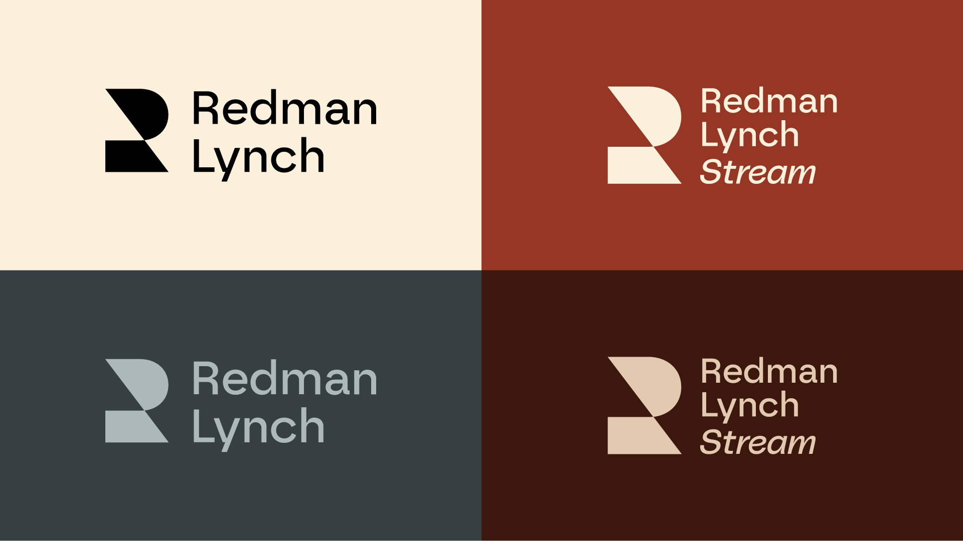
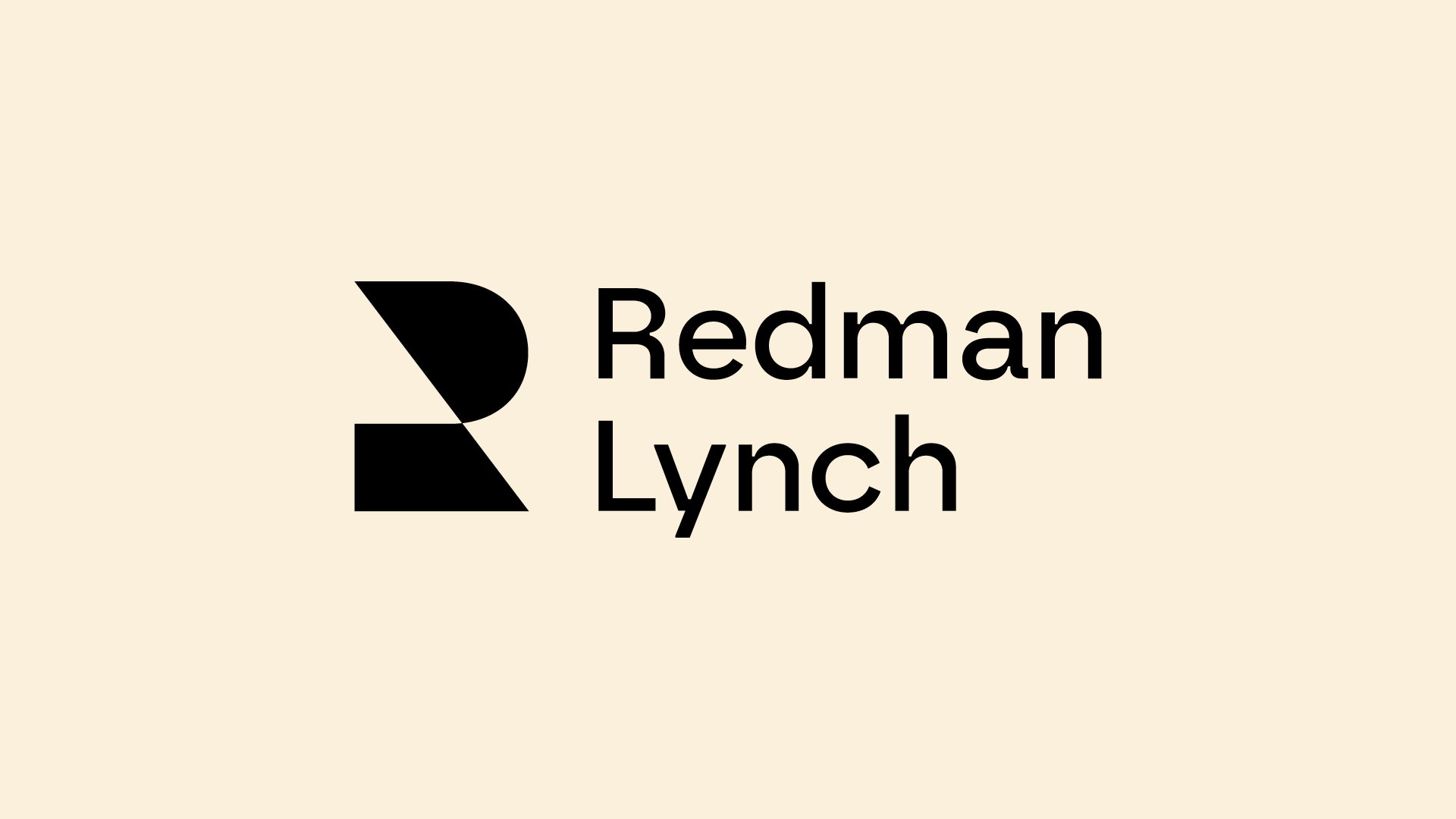

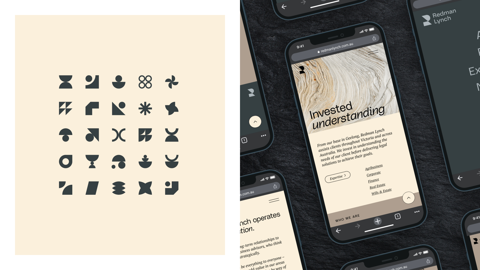
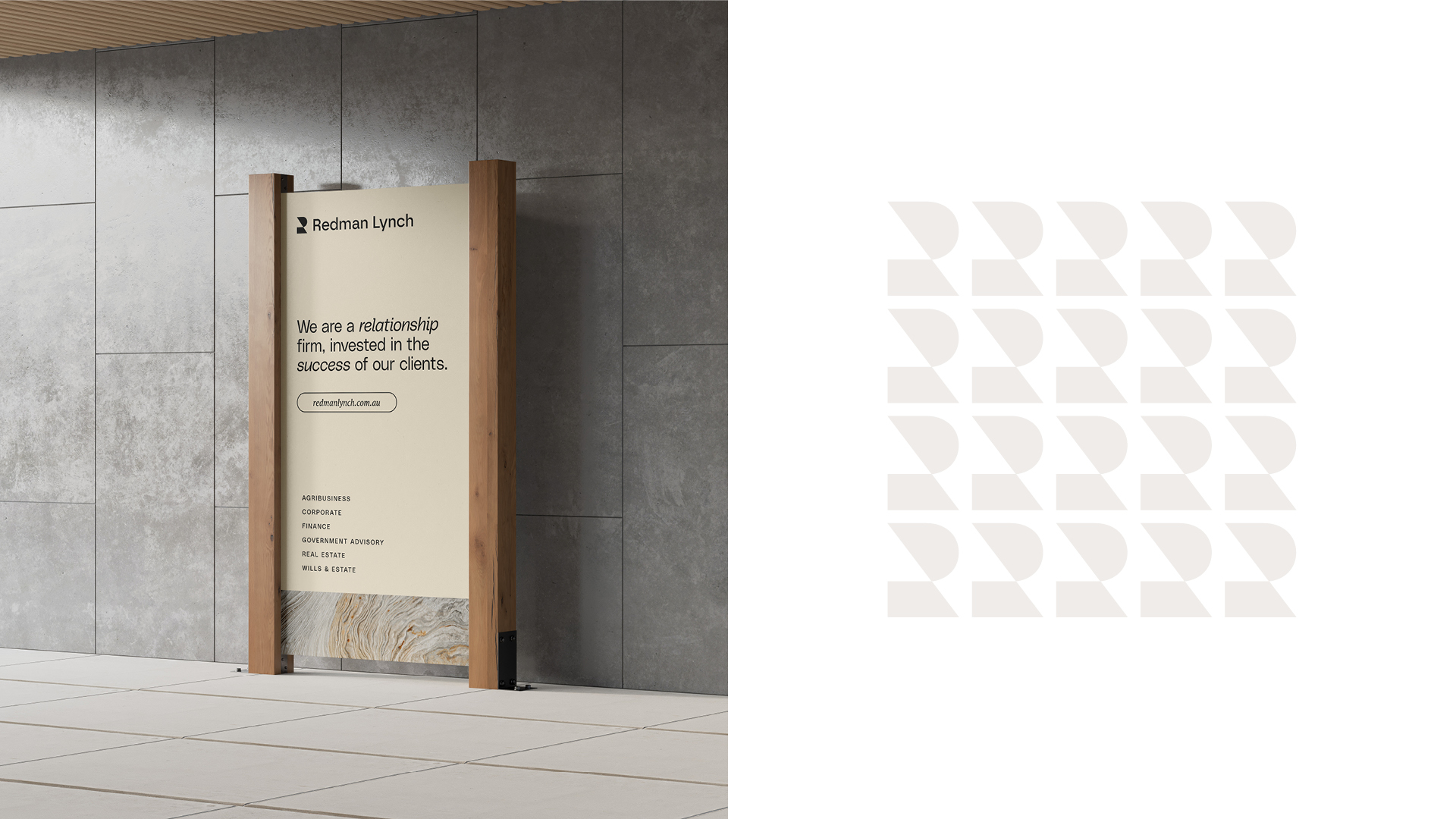
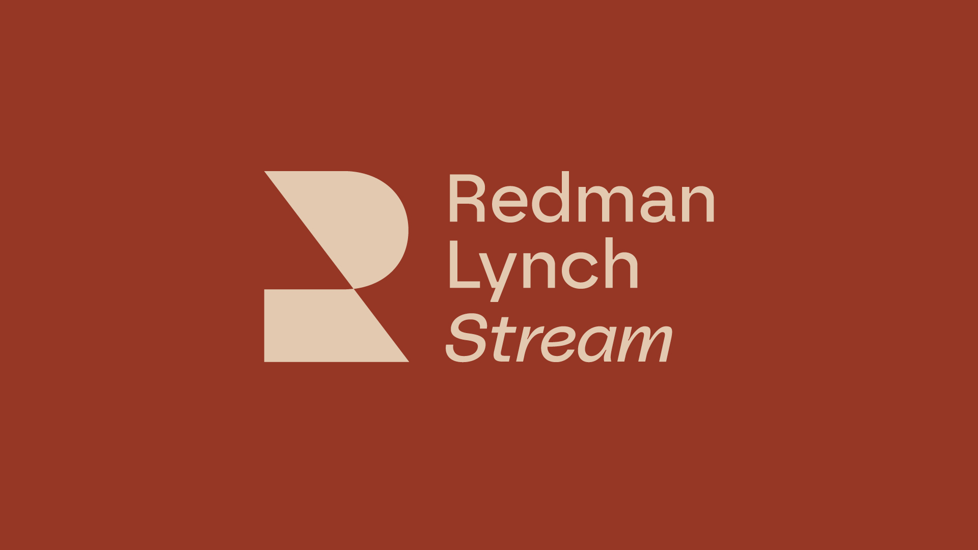
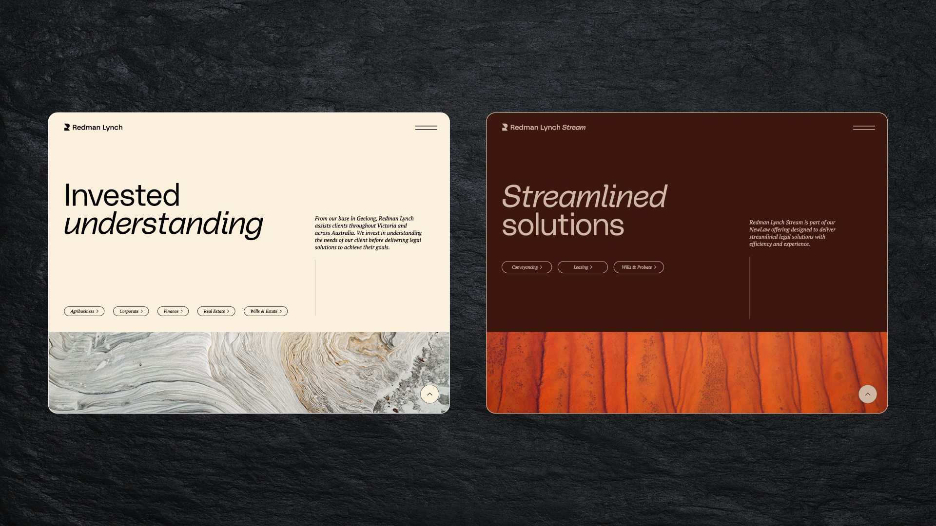
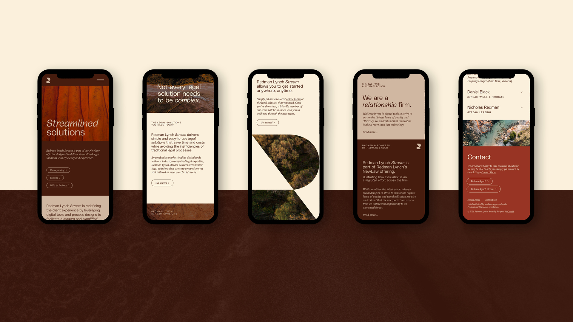
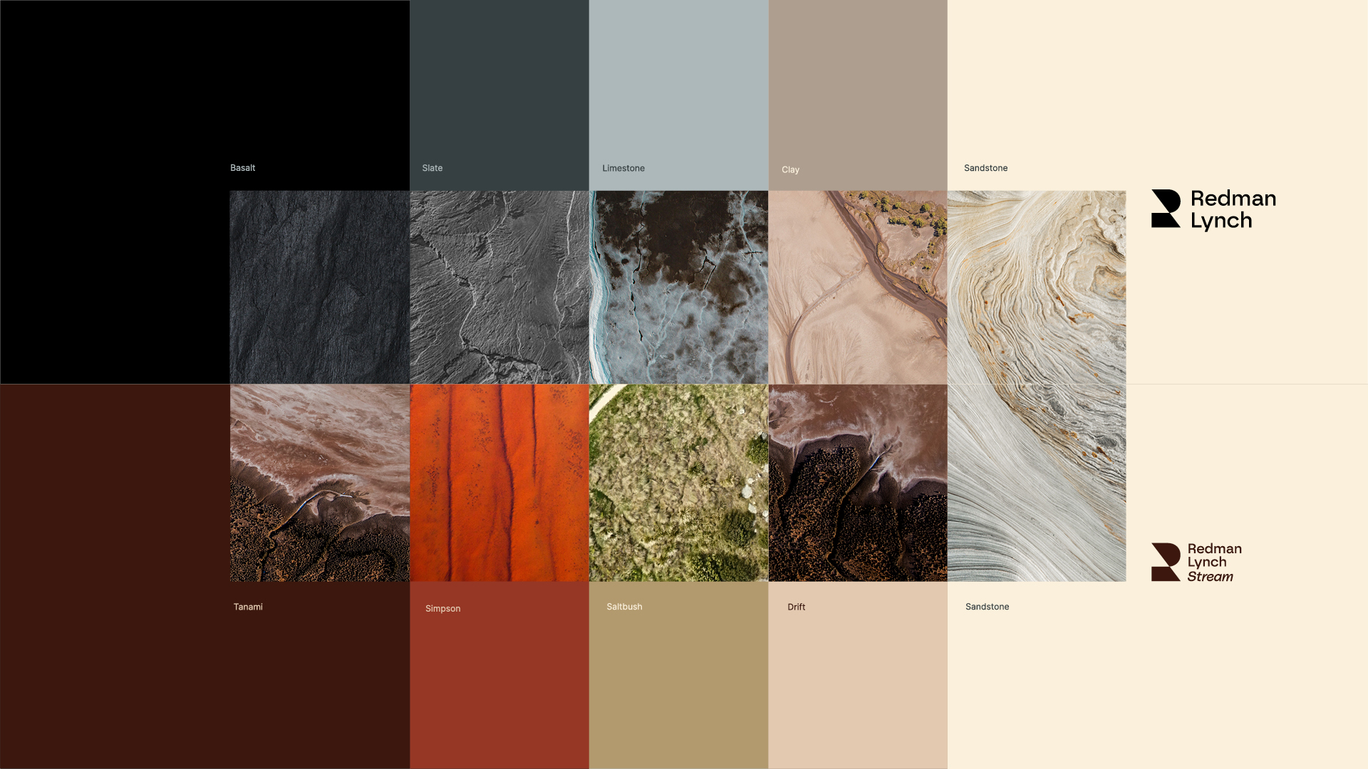
Image Credit :
Project Commissioner
Project Creator
Project Overview
Redman Lynch is a modern legal firm with deep roots and a bold future. With growing demand across both premium legal services and digital day-to-day support, the firm engaged Creatik to craft a dual-brand system that could clearly distinguish its two offerings, without diluting the credibility of either. The result is a strategic rebrand encompassing naming, identity and digital experience. Redman Lynch now leads with confidence in two clear streams: a refined masterbrand for high-end legal services, and Stream, a vibrant sub-brand delivering efficient, everyday legal solutions online.
Team
Creative Director, Dan Clark Design Director, Adelle Chang Design Director, Tracy Jack Senior Account Manager, Amy Wilson Senior Designer, Monet Maher Designer, Jess Harris
Project Brief
As Redman Lynch expanded its capabilities, the firm needed to distinguish its high-touch legal advisory work from a growing digital arm servicing day-to-day legal needs. The challenge? Create a clear, connected brand system that would elevate both service lines, reflect their respective audiences, and support a seamless user journey online. Our brief included full brand identity development, the naming of the new digital offering, and the design and build of a website capable of directing diverse clients to the right division, while presenting Redman Lynch as a progressive, design-forward legal firm in a sector still catching up.
Project Innovation/Need
The innovation was twofold: first, in conceiving Stream as a brand name and sub-brand that feels distinct yet inherently connected to Redman Lynch; and second, in creating a modular visual system that adapts fluidly across the two brands. Where Redman Lynch feels timeless and refined, anchored in a monochrome palette and natural textures, Stream injects energy and ease through a brighter colour scheme and simplified styling. The shared geometry of the identity, derived from the letterforms ‘R’ and ‘L’, holds the system together with consistency and clarity.
Design Challenge
The primary challenge was striking the right balance: giving each brand its own identity while keeping them clearly part of the same trusted firm. The brand architecture needed to be intuitive for users but also efficient for the business to manage internally. Another key challenge was tone. The Redman Lynch masterbrand needed to convey professionalism, discretion and gravitas. In contrast, Stream needed to feel accessible, efficient and un-intimidating, particularly for clients unfamiliar with legal processes. The shared design language had to flex across this spectrum without losing coherence.
Effectiveness
The rebrand has transformed how Redman Lynch presents itself and operates online. The new website funnels users clearly and confidently toward the right offering, premium or digital, while strengthening the brand’s presence across all touchpoints. Client engagement has improved, lead quality has lifted, and internal feedback reflects a renewed sense of clarity and confidence in how the brand supports their business goals. The rebrand is now a key asset in business development, proof that thoughtful brand design can drive both perception and performance in a traditionally conservative sector. As the Redman Lynch team put it: “The website elegantly represents both our premium and everyday legal offerings with a seamless user experience, giving us a digital presence that truly works for our business.”
Graphic Design - Identity and Branding - Corporate
This award celebrates creative and innovative design in the traditional or digital visual representation of ideas and messages. Consideration given to clarity of communication and the matching information style to audience.
More Details