
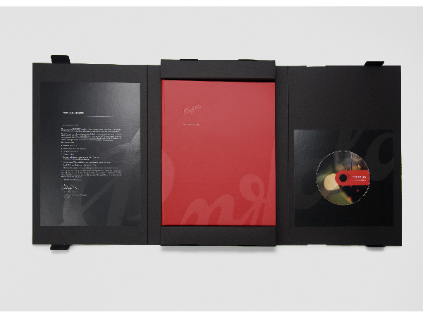

Informative kit used to launch Penfolds 2010 vintages to the global markets.
Team
Pip Castle (creative director), Lizzie Deller (graphic designer), Hayden Castle (photographer)
The primary purpose of the kit was to launch Penfolds 2010 annual release of two of their wine ranges, the Bin wines and the Icon and Luxury wines. The brief included developing and executing all photography, which along with the design, needed to communicate the heritage and quality credentials of the brand. The photography and information contained in the kit would be distributed to the global markets to be used across their promotional campaigns.
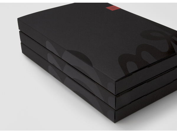
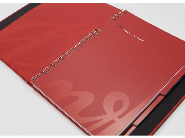
Working within the limitations of digital printing due to small print quantities, the format and finishing techniques had to reinforce the luxury positioning of the brand. This included foiling, case binding and custom wire-o. The use of the HP Indigo’s Digital Matte ink was used to create a subtle 'spot varnish' effect. An outer box was created to house the book, giving the kit a presence and weight representative of its contents.
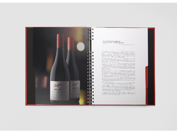
Each year a new set of vintages are released, yet the individuals wines themselves change little from year to year. The challenge was to create excitement around the new release by creating new imagery and design that was current and contemporary, yet still aligned to the philosophy and traditions of such a well-established brand as Penfolds.
The primary stock chosen was FSC Mixed Source to ensure all pulp was sourced from well-managed and controlled sources. The digital printing process allowed for less wastage during production, and an FSC certified printer was used for production.
2010 Melbourne Design Awards
Graphic Design - Publication
This award recognises traditional or digital visual representation of ideas and messages. Consideration given to clarity of communication and the matching information style to audience.
More Details
